The hardest question wasn’t how the products should look. It was deciding what actually counted as a product.
PROJECT
eyeo.com redesign
ROLE
Visual Design, UX/UI, Information Architecture
PERIOD
2016–2017 · Unreleased
The website I inherited
When I joined eyeo in 2016, the website was still organised mainly around the company itself ~ its mission, team, press information and a broad Services section. Meanwhile, eyeo had grown into several products, initiatives and different audiences that were becoming difficult to explain through that structure.
The interface showed the age of that structure too: dense pages, small type, rigid templates and navigation that gave little sense of how eyeo’s products and initiatives related to one another. So the redesign quickly became more than a visual refresh.


What exactly are we selling?
One of the first problems was simply deciding how to describe what eyeo offered. Adblock Plus was a browser extension with enormous reach. Adblock Browser was a standalone product. Acceptable Ads was both an initiative and a business proposition. Flattr introduced another model again.
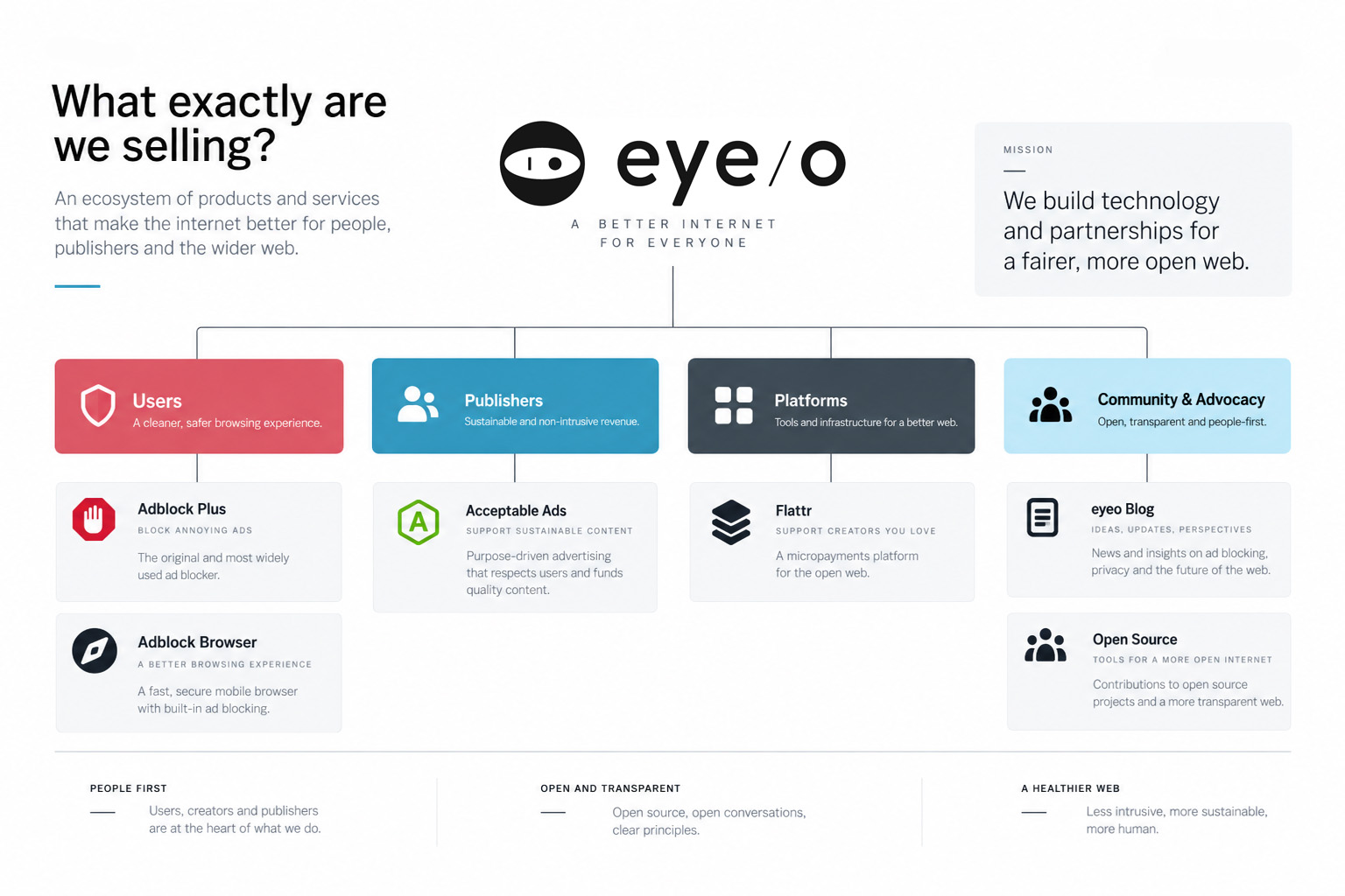
We kept coming back to the same question internally: what is a product, and what is a service? If we had to stop and discuss the distinction ourselves, the website wasn’t going to make it obvious to somebody arriving for the first time.
That discussion shaped the navigation and content structure. Products got their own identities, descriptions, metrics and calls to action, while the publisher-facing propositions were separated from the consumer software.


Translating strategy into visual language
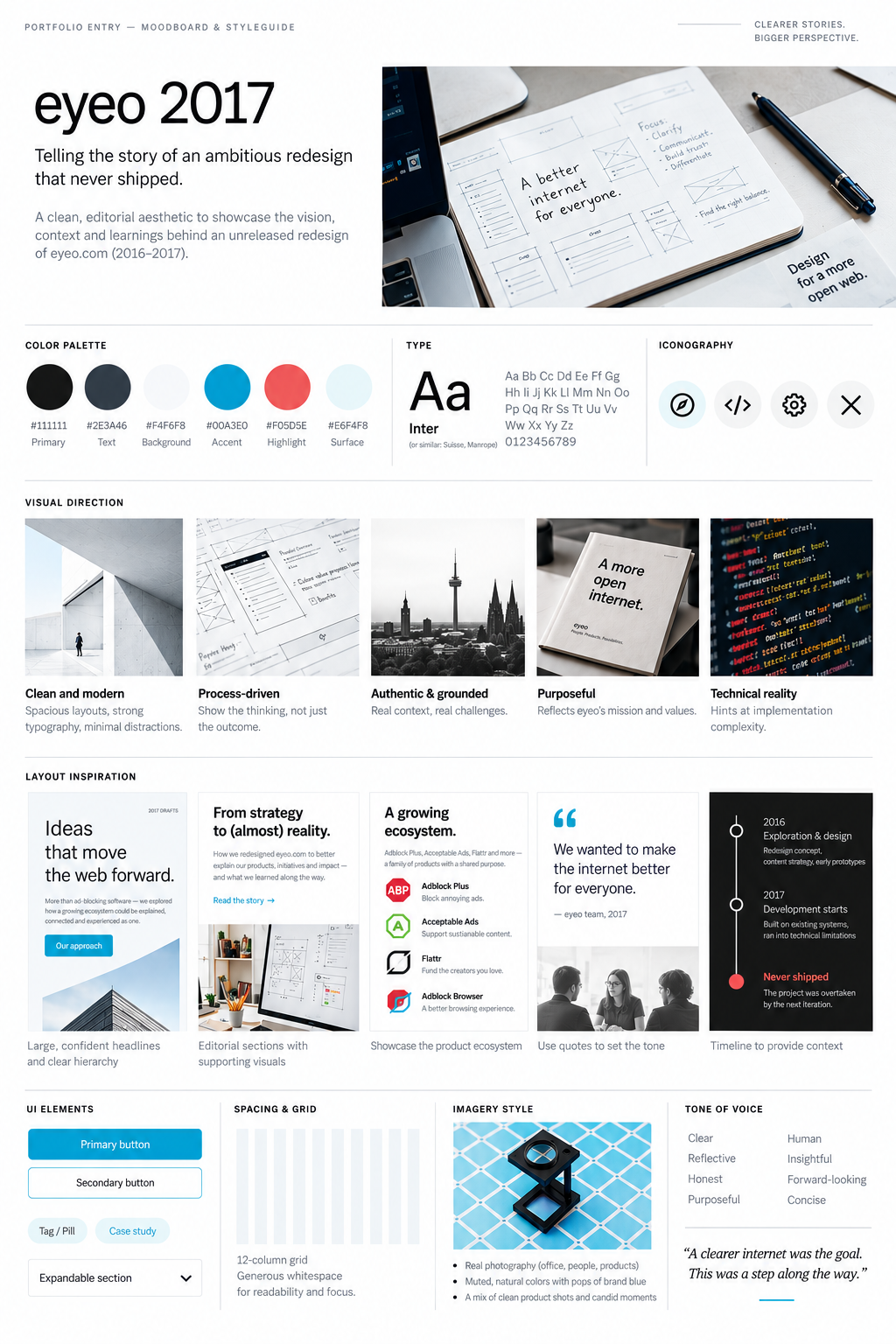
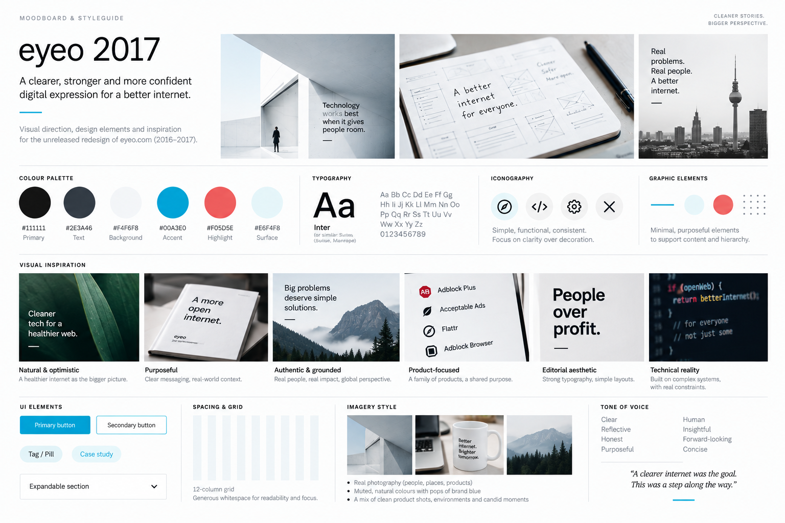
Once the structure was clearer, I moved into the visual direction. I wasn’t trying to replace the eyeo brand. I wanted the website to feel less corporate and compressed, and give the products more room to speak for themselves.
I explored larger typography, more whitespace, restrained colour, photography and simple graphic elements. I used the moodboard to test that direction before moving into the full-page layouts.
Designing around the answer
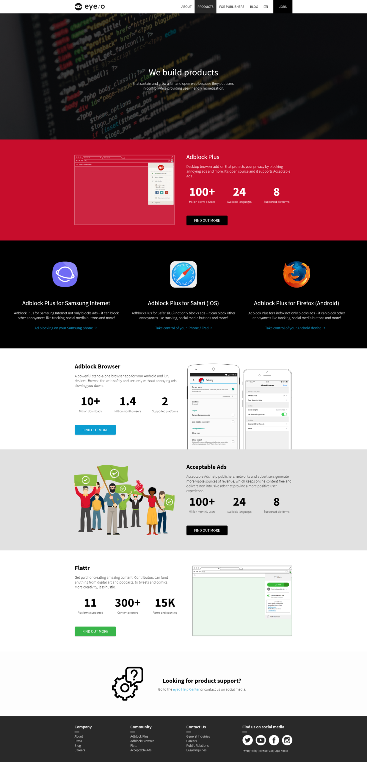
The site was reorganised around clearer sections. About covered the company and its history. Products gave the software and initiatives their own space. For Publishers separated the propositions aimed at that audience, and Jobs became a proper recruitment section rather than a link in the header.
The new layouts used larger type, stronger contrast, photography, product imagery and more space between sections. Each product could keep its own colour and identity while still sitting comfortably inside eyeo.com.


When design met legacy
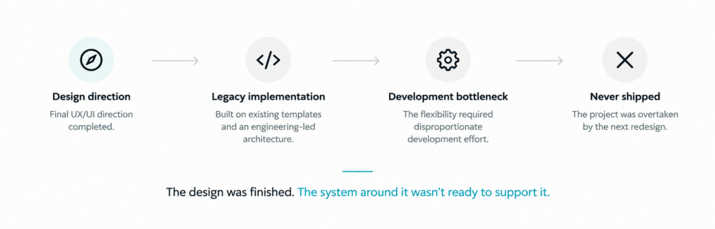
Implementation became the problem. The website relied heavily on legacy code and hand-built development patterns, so changes that looked straightforward in a mockup could take far more work than expected.
Even fairly basic things became points of friction. Flexible page structures, reusable content patterns and SVG graphics weren’t handled particularly well by the existing setup. The further the designs moved from the old templates, the more development time they required.
Finished, but never shipped
The designs reached a final direction, but implementation never caught up. Development delays stretched the project out until it was eventually overtaken by the next iteration of eyeo.com.
The work wasn’t lost, though. We had clarified the product structure, reworked the information architecture and tested a different way of presenting eyeo online. Some of those decisions carried into the redesign that followed and eventually shipped.
Not every finished design becomes a finished product.