The website was only one part of the problem.
PROJECT
MED-EL digital ecosystem
ROLE
Web Design, UX/UI, HTML/CSS, Content
PERIOD
2012–2016
The website I joined
When I joined MED-EL in 2012, I knew how to make websites. I didn’t really know how to design them.
I had built small WordPress sites before and knew enough HTML and CSS to make things work, but most of what I understood about design was instinctive. MED-EL was my first professional web design role, and for almost four years I learned by working on the real thing.
MED-EL’s website had already been through several visual iterations before I arrived. Underneath, however, the experience still relied on a custom-built platform and a fairly rigid approach to page construction. Responsive behaviour existed, but layouts were limited and content largely stacked from one block to the next.
I was learning visual design at the same time as I was learning how browsers behaved, how HTML and CSS translated into production, and how much the existing platform determined what I could actually design.
HISTORICAL CONTEXT
The website before I joined
A look at earlier versions of medel.com, sourced from the Wayback Machine, to provide context for the design and technical state of the website when I joined in 2012. These were not my designs.
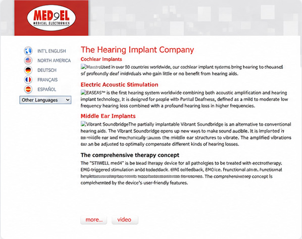
2009
Early corporate site
A simple, table-based layout with static content and language selection. The focus was on core products and company information.
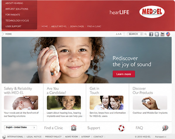
2010
Richer content, Flash elements
A more visual layout with Flash-based components, expanded navigation and lifestyle imagery. This version introduced a more branded look and feel.
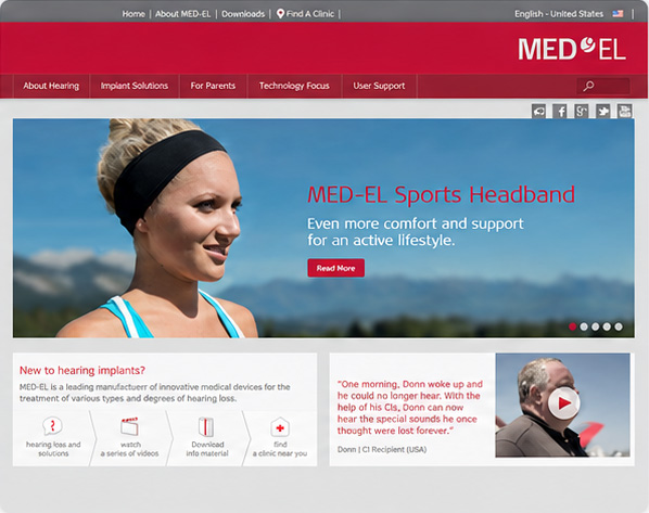
2012
A more structured experience
A modernised layout with clearer navigation, video content and updated visuals. This was the version in place when I joined MED-EL in August 2012.
Designing for more than one screen ~ and more than one language
The work quickly expanded beyond individual pages. I designed and built digital campaign elements, Facebook HTML experiences, sliders and video overlays, managed large amounts of website content and spent a significant part of my time working with localization.
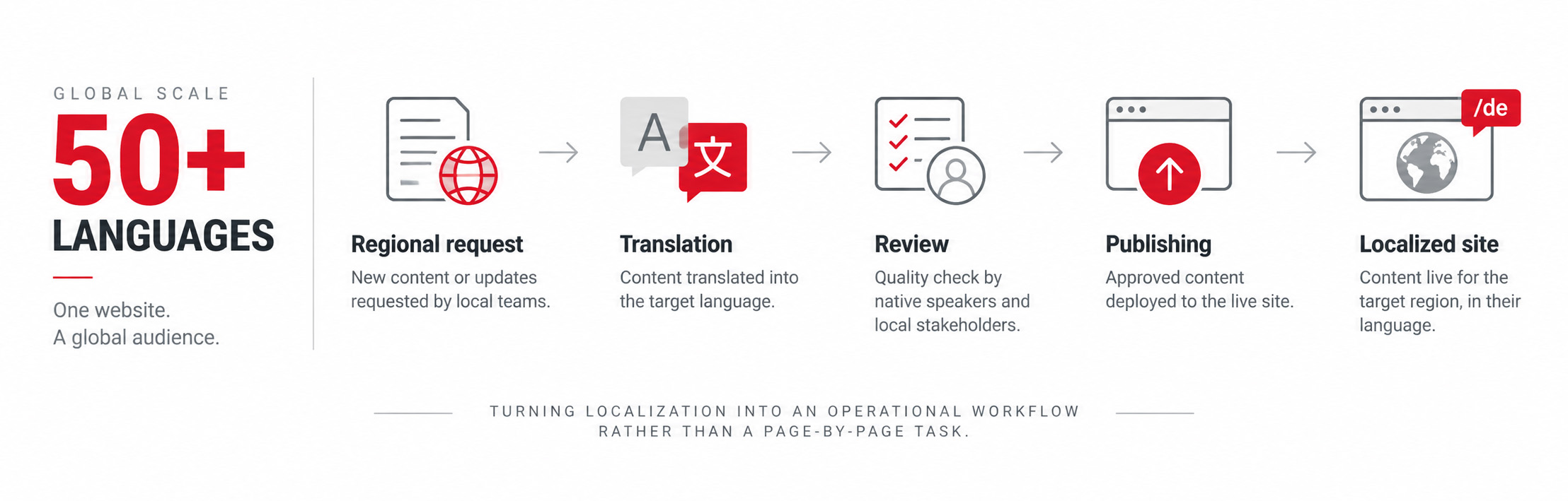
The ecosystem covered more than 50 languages, including regional variants such as Spanish for Spain, Mexico and Latin America, and Portuguese for Portugal and Brazil. New product launches created a constant flow of requests from regional teams. In the early years, localization was remarkably manual: translations moved through Excel files and were copied page by page into each language version.
Over time that workflow moved to dedicated translation management and an external agency with its own translation platform. Localization was a large part of keeping the website running, not a final step after a page had been designed.
When the platform becomes the constraint
Over the next few years, the limits of the custom platform became harder to work around. Mobile was becoming more important, responsive layouts were getting more ambitious, and our page-building options were still fairly rigid.
Where the platform allowed it, I increasingly used HTML and CSS to push beyond the default building blocks. Some days the work was mostly design; other days it looked much closer to front-end development. There was never a particularly clean boundary between the two.
HearLife Clinics gave me a chance to work differently. I helped move the sites to WordPress, redesigned and rebuilt them responsively, migrated the content and showed the content owner how to create and update material herself using a draft-and-review workflow.


Building consistency before I knew what to call it
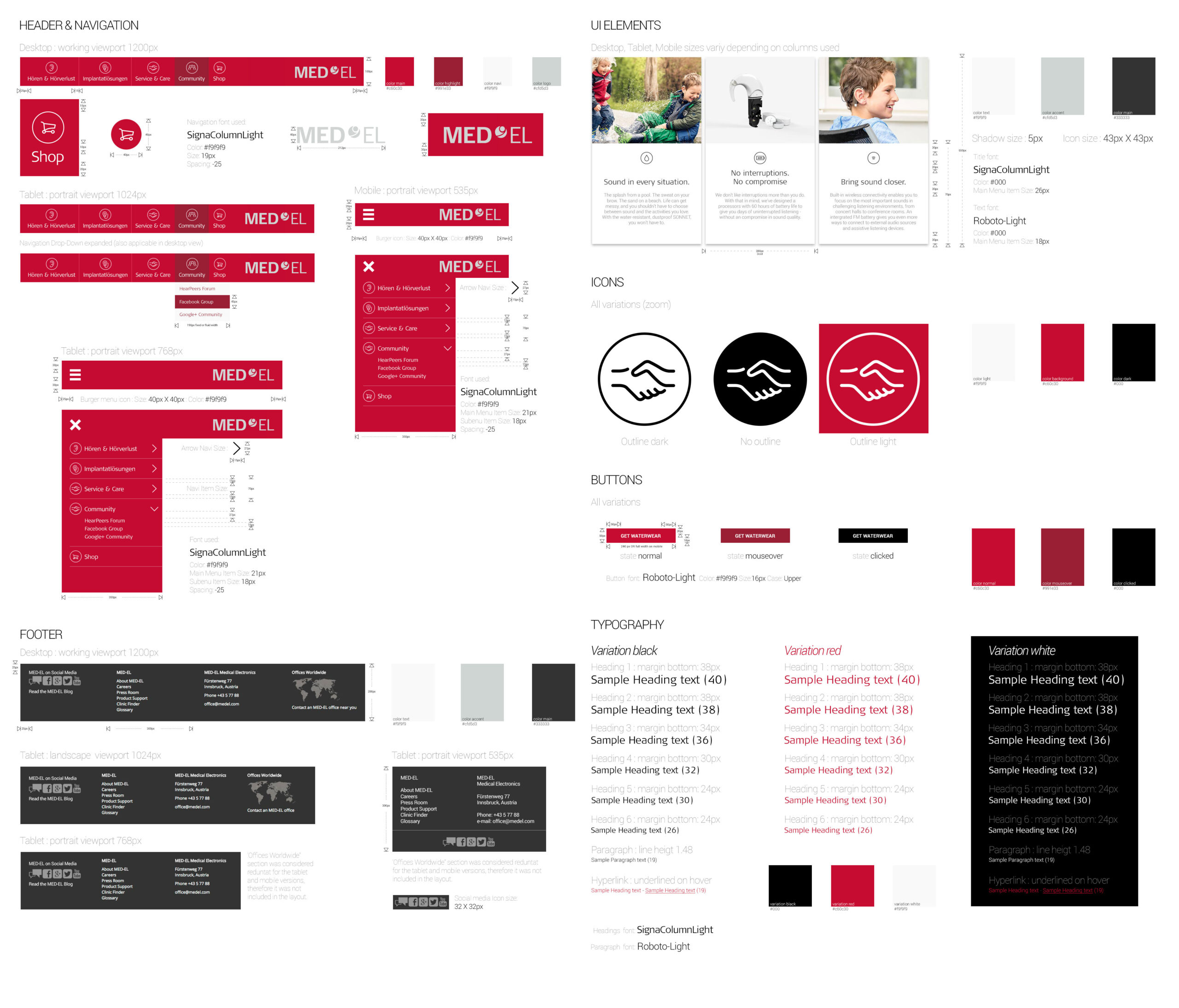
By 2016 I had started documenting the interface on my own initiative: navigation across breakpoints, typography, buttons, icons, colours, UI elements and recurring page patterns.
We kept running into the same UI decisions, so I started writing them down instead of solving them again on every page.
What became possible
Toward the end of my time at MED-EL, the corporate website moved away from the old custom platform to a vendor CMS with Bootstrap on the front end. The new setup gave us more room to work with page structure and responsive layouts.
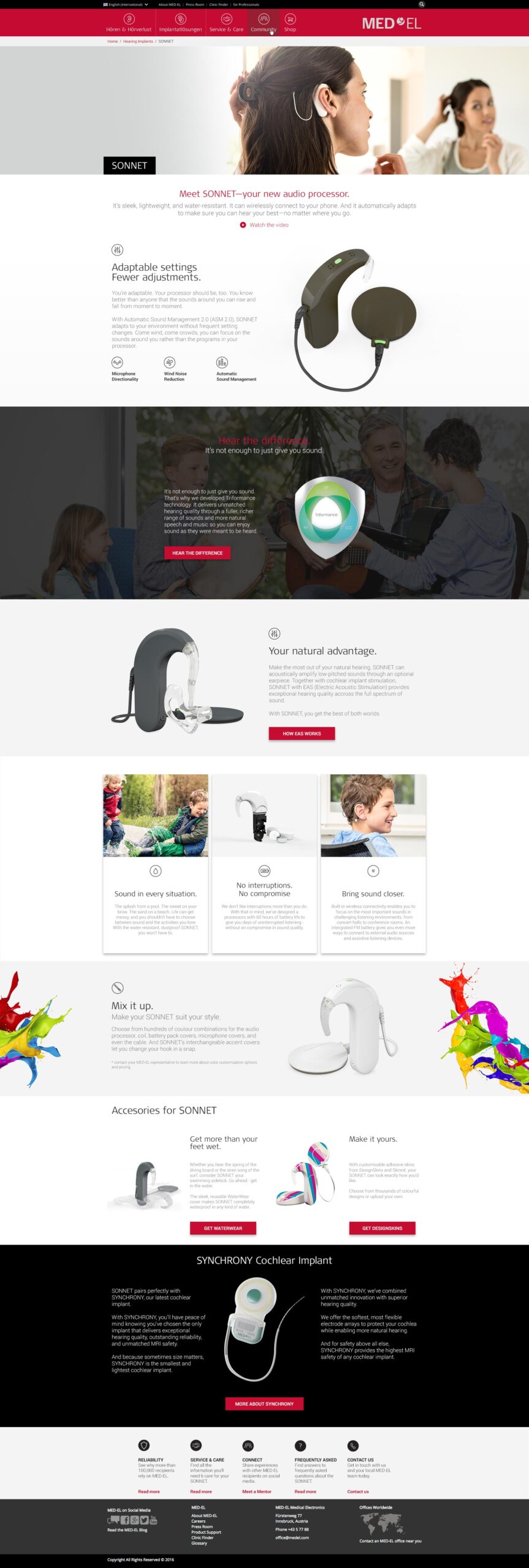
After the migration, I used the SONNET product page to propose a different direction. I moved away from the usual banner, copy and CTA rhythm and designed a richer product page with clearer hierarchy, modular sections and layouts for desktop, tablet and mobile.
It remained a concept rather than a finished redesign. I completed it shortly before leaving MED-EL in 2016.
Looking back
When I joined MED-EL, most of what I understood about design was instinctive. I had no formal design education, no established process and very little vocabulary for explaining why one solution worked better than another.
Whenever I didn’t know how to solve something, I went looking for examples and tried to understand how other designers were doing it. Behance, Dribbble, articles, videos, new prototyping tools ~ I consumed pretty much everything I could find.
By the time I left, I was thinking about more than the finished page: how it behaved across screen sizes, how translations got published, how the localized sites were maintained, which UI decisions could be reused and whether content owners could update things without needing us every time.
By 2016, I still had a lot to learn. But I had learned how to learn. That may have been the most important thing MED-EL gave me.