SPORTS BETTING · DESIGN SYSTEMS · 2026 · home assignment
Problem: Kaizen Gaming asked for a mobile design system foundation in three days: tokens, one interactive component, documentation and a considered view on AI.
What I did: Built role-based tokens with Light and Dark modes, a List Item with three content structures and two states, and documentation that also states what the component should not do.
Outcome: Interview-stage assignment. After submission, I extended the system with a composite Player Card to test how it scales.
SURFACE
Mobile list item
Light + Dark modes
Figma library
ROLE
Design system design
Tokens + component API
Documentation + AI approach
SCOPE
Color, type, spacing, radius
3 structures × 2 states
QA, presentation, extension
THE BRIEF
In September 2026 I was invited to interview for a Design System Designer role at Kaizen Gaming, the company behind Betano. Their design system had been evolving for more than two years across brands, markets and platforms, and the home assignment reflected that: establish a small foundation, build and document one interactive component, and show how AI fits into the work, including where human judgment has to lead.
The deliverables were mobile-focused and the timebox was three days. That constraint shaped everything that follows: one component done properly, rather than a broad library done thinly.
WHY A LIST ITEM
I wanted a component that appears everywhere, carries real content and has rules that matter. A list item runs through navigation, account settings, league and event lists. In a sportsbook it is the unit people scan most. It also let me show live and final sports data without guessing at proprietary betting mechanics I had never seen.
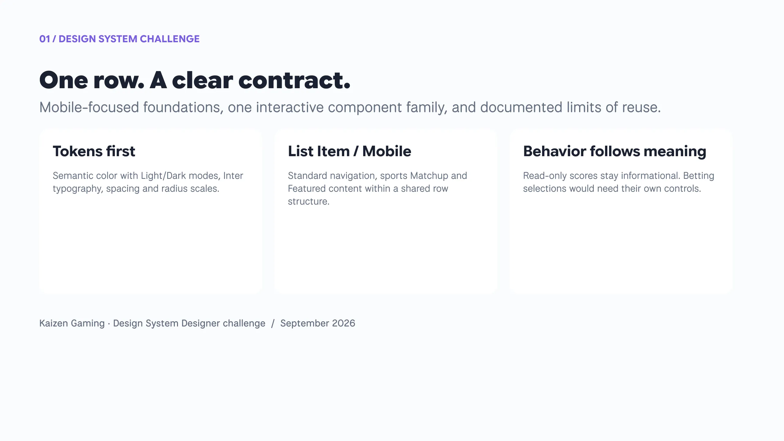
The aim was a clear contract: stable anatomy, constrained flexibility and documented limits.
FOUNDATIONS · TOKENS
A small vocabulary, named by role
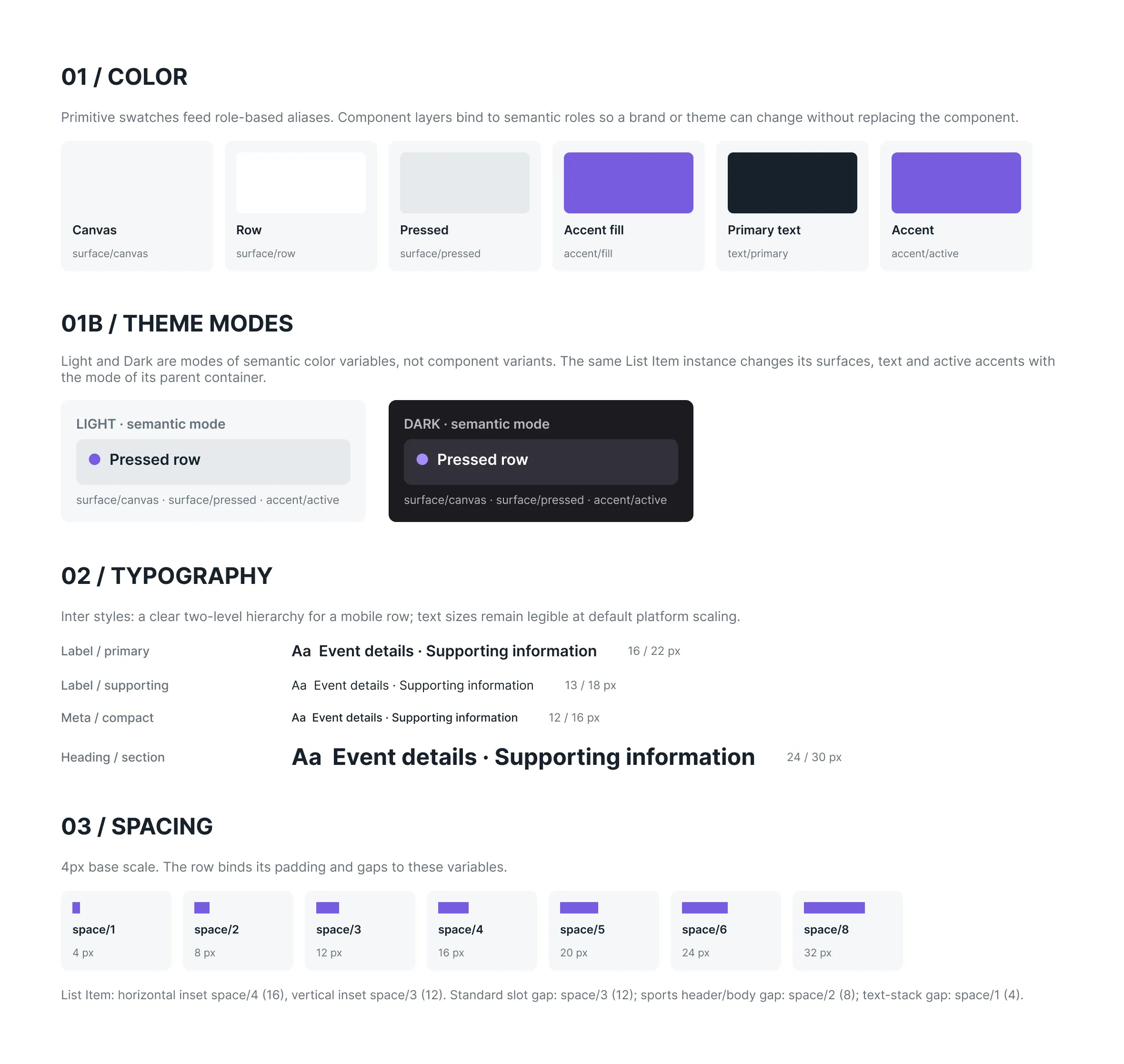
Primitives are named by value (neutral/500, accent/500), semantic tokens by role (surface/row, text/secondary, accent/active). The component binds only to semantic roles, so a brand or theme can change without touching the component.
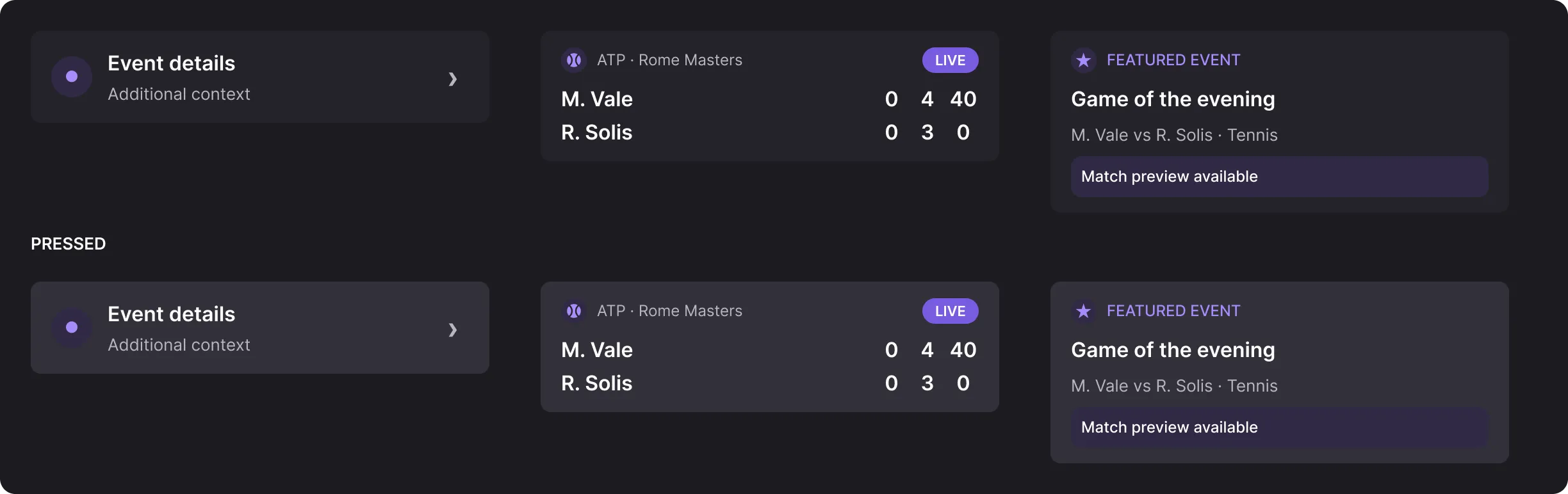
Light and Dark are modes of the semantic collection, not component variants. An instance changes its surfaces, text and accents with the mode of its parent frame, so one component set serves both themes.
Typography is a two-level Inter hierarchy for the row, plus meta styles for competition and status. Spacing follows a 4 px scale and radius has two values. Every variable has explicit scopes and WEB code syntax, so the file reads like a contract developers can map.
COMPONENT · ANATOMY
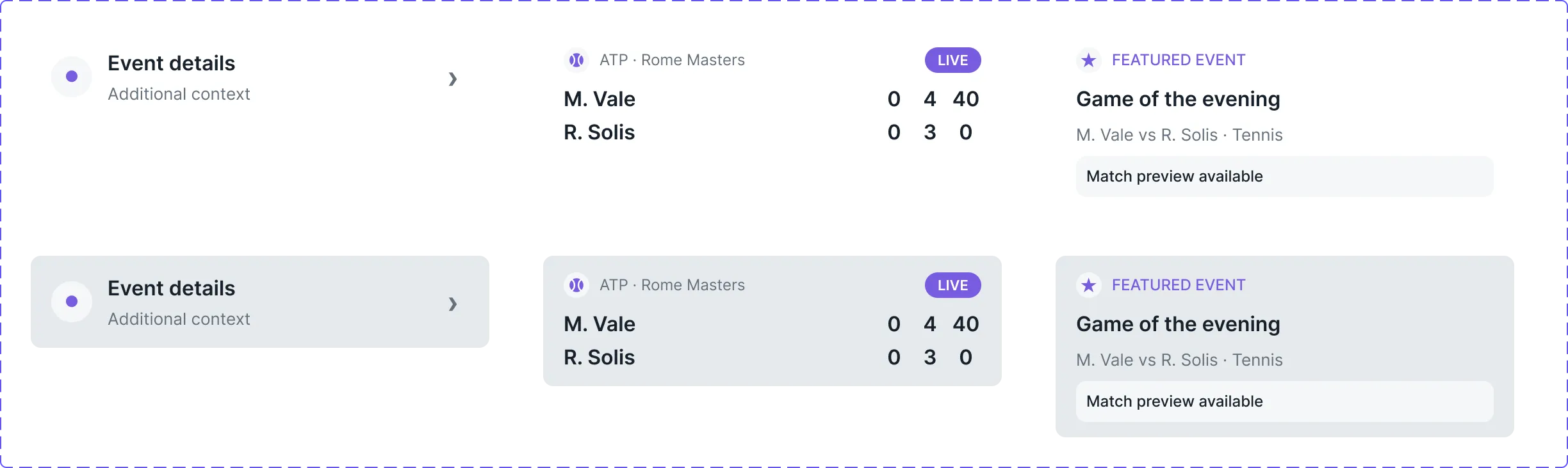
One row, three structures
The row shell stays the same; the structure inside changes with the information it carries.
- Standard · a title, optional supporting text, an optional leading symbol and a trailing chevron for navigation.
- Matchup · sport, competition and live or final status above two participants, with aligned, read-only scores.
- Featured · a star and eyebrow above the event title, context and an information highlight.
All three are variants of one component set, with text properties named the way a front-end prop would be.
ONLY MEANINGFUL STATES
Default and Pressed, nothing else
Every structure supports Default and Pressed. Pressed is transient touch feedback while details open.
Selected and Disabled were explored, then removed
Both are valid list item patterns, but this row opens details. It has no persistent selection and no defined unavailable action, so adding them would have meant states without behaviour.
Scores inform, they don’t act
A row has one target. Scores stay read-only; independent betting selections belong in a separate composite pattern with states of their own.
QA · REAL CONTENT
Validate with the content it has to survive
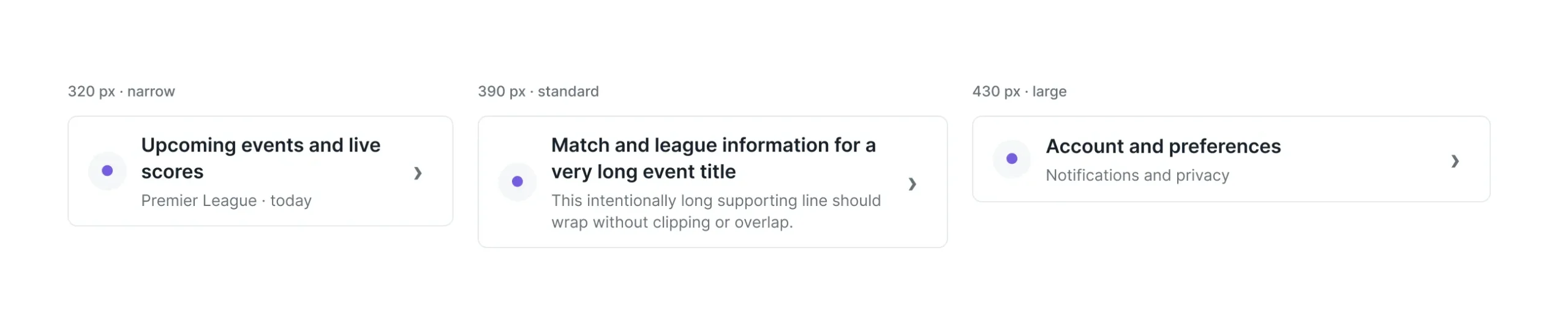
I checked the same instances at 320, 390 and 430 px with long titles and supporting copy: text wraps and the row grows, nothing clips. Matchup was tested with live tennis scores and a final football result, where winner emphasis changes hierarchy, not interaction state. Both themes were checked by switching the variable mode of the parent frame.
AI IN THE DESIGN SYSTEM
AI accelerates, judgment decides
The brief asked for three things: hands-on use, critical judgment and a view on standardising AI in a team.
Where AI helped
Exploring row structures, comparing component candidates, and the repetitive production: building Figma variants, binding tokens to every property, populating states and drafting documentation.
Where I didn’t rely on it
Metadata placement, score alignment, winner emphasis and the decision to drop Selected and Disabled. These are calls about meaning and behaviour. Output that looks plausible is not the same as a correct contract.
In a design system team
I would use AI for exploration, repetitive production and draft guidance within approved conventions, never to define the conventions themselves. Design and engineering owners still validate accessibility, behaviour, design/code parity and versioning before anything is released.
Does the system extend?
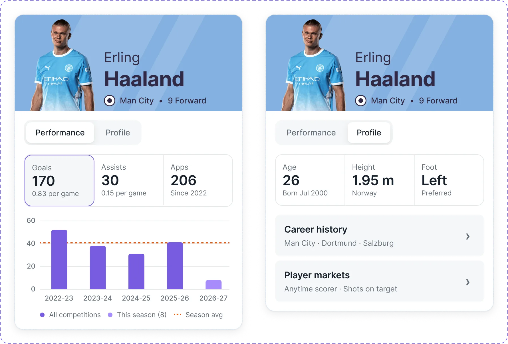
The brief asked me to emphasise how the system can be extended and maintained over time. Claiming that is easy, so after submitting I tested it with a composite Player Card for one featured player: a hero, a Performance / Profile tab control, three key stats and a goals-by-season chart.
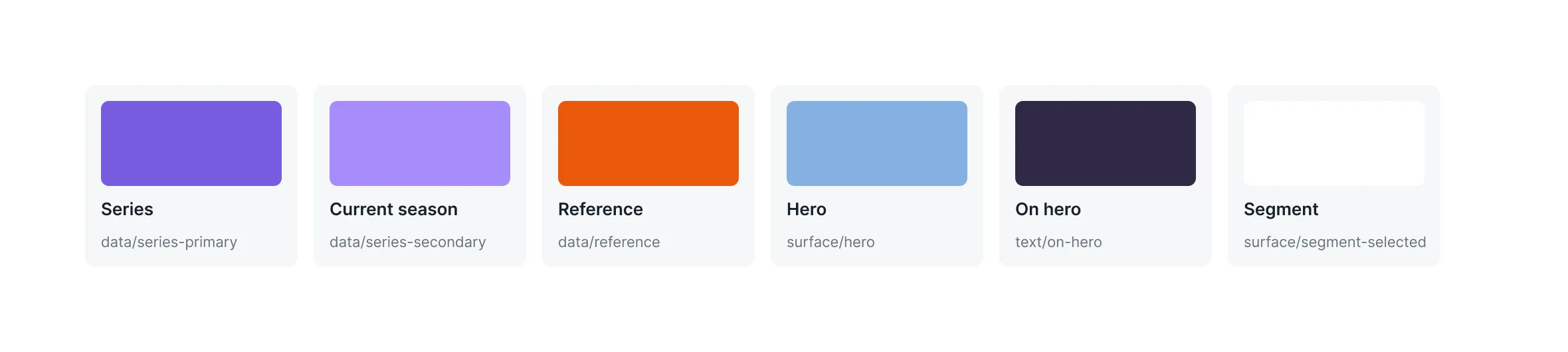
The rule was reuse first. Spacing, the Inter styles and the List Item itself carried over; the Profile tab uses List Item rows for career history and player markets. New tokens were added only where the card carried meaning the row never had: two data series, a reference line, a fixed hero surface and a raised tab segment, plus two radii and four text styles.
The behaviour boundary held too. Tabs switch content, the selected stat marks what the chart plots, and markets open through the nested List Items. No betting control lives inside the card.
AFTER SUBMISSION · TESTING THE CONTRACT
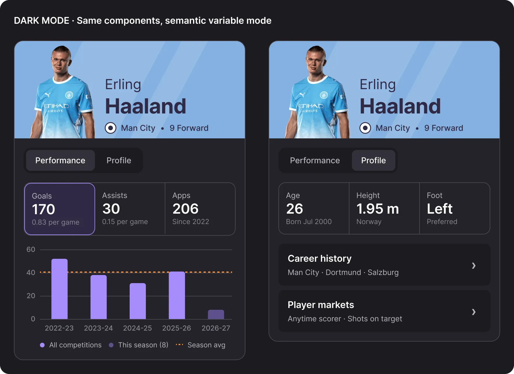
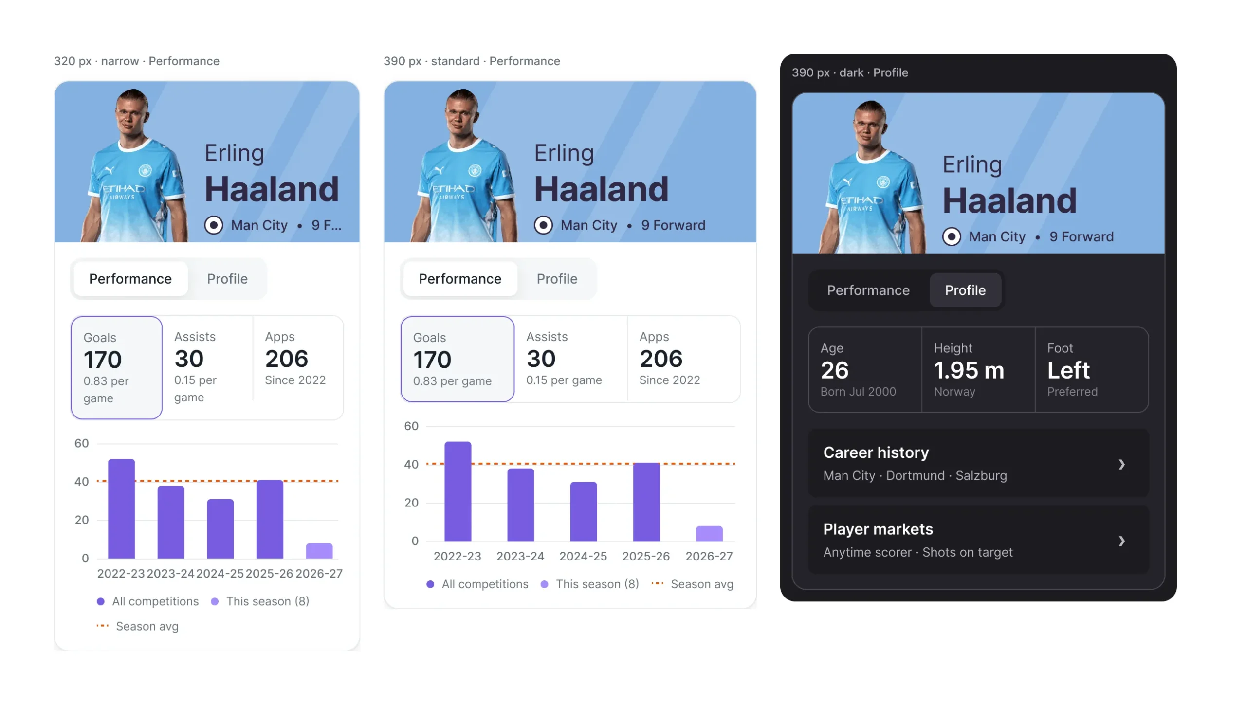
The width check paid off again. At 320 px the position label overflowed the hero; fixing it once in the main component fixed every instance in both modes.
This time the Figma construction was done by an AI agent writing to the file through the plugin API, against the existing variables. I set the scope, the sample data and the boundaries, then reviewed contrast, truncation and the dark-mode rows and asked for targeted fixes.
OUTCOME · A SMALL SYSTEM THAT EXTENDS
ROLE-BASED TOKENS
Primitives, semantic roles and Light/Dark modes, with scopes and code syntax.
ONE CLEAR CONTRACT
Three structures, two states and documented limits for one mobile row.
A TESTED EXTENSION
A composite card built from the same vocabulary, adding only what it needed.
REFLECTION
Keeping the scope small was the right call. One component with clear limits says more about how I would run a design system than a wide library assembled in three days.
With a real team, the next steps would be discovery against existing tokens and brand modes, desktop density and pointer states defined from actual requirements, code parity and Storybook mapping, and screen-reader testing of how Matchup scores and the Player Card are announced.
Home assignment for Kaizen Gaming’s Design System Designer interview process, 2026. Token values are illustrative, not Kaizen production foundations. The Player Card was added after submission. Sample data and placeholder imagery.