CONSUMER PRODUCT · MUSIC STREAMING · 2020–2023 · SHIPPED
Turning a record label into a product ~ designing and shipping a cross-platform radio app that reached more than 30,000 recorded customers.
SURFACE
iOS / Android
Music streaming
ROLE
Product & Design Owner
Founder
SCOPE
Product definition · UX/UI
Art direction · Delivery
The app was never meant to compete with Spotify. It was a focused extension of the label ~ open it, press play, and stay inside the Pueblo Vista catalogue.
THE CHALLENGE
Pueblo Vista was growing from a music project into a small label and artist collective. The catalogue was expanding, the audience was growing, and I kept returning to one idea: what if the label had its own always-on listening product instead of depending entirely on third-party playlists and platforms?
I started the product from zero ~ defining the idea, sketching the early experience and working through the initial interface. I had a Computer Science background, but no previous Swift experience, so two iOS developer friends took the first designs into production while I remained responsible for product direction and UX/UI.
The first iOS version shipped in April 2020. Archived App Store metadata still records that original release date. What began as a side idea had become a real consumer product with listeners, reviews and eventually paying subscribers.


PRODUCT DIRECTION
Familiar before novel
Use interaction patterns listeners already understood instead of inventing a new music-player language.
One job, done well
Keep the app focused on listening to the label catalogue rather than turning it into a smaller general-purpose streaming service.
Design for continuity
Let the product evolve visually and technically without breaking the simple behaviour existing listeners valued.
Treat delivery as part of the product
Technical constraints, store requirements, subscriptions and maintenance shaped what could actually ship.
PRODUCT DECISION 1/3 ~ Use familiarity instead of inventing interaction
My first instinct was to design a completely new music player. The more I explored it, the less useful that novelty became. Listening controls are highly familiar interactions, especially on iOS, and forcing users to relearn them would have added friction without adding value.
I changed direction and used the native iOS language ~ including familiar player behaviour and standard system icons ~ as the foundation. Apple Music became a useful reference point, not because I wanted to reproduce the product, but because its interaction model already matched what iOS listeners expected.
That decision also reduced implementation complexity. Instead of spending design and development effort making basic playback feel distinctive, we could focus on what actually belonged to Pueblo Vista: the catalogue, visual identity, streaming quality and listening experience.


PRODUCT DECISION 2/3 ~ Keep the product deliberately small
The app did not need to become another general-purpose music service. Its value came from being narrow: a direct way into the Pueblo Vista catalogue with as little friction as possible.
The production product stayed centred on continuous, ad-free listening, with three streaming-quality options, a Sleep / Pomodoro timer, weekly catalogue updates and access to unreleased tracks. These features supported listening rather than competing with it. The optional subscription existed primarily to help cover the infrastructure behind streaming.
Archived store listings still describe the same focused feature set years later. View archived iOS listing.


PRODUCT DECISION 3/3 ~ Rebuild without losing what listeners valued
As Pueblo Vista itself evolved, the product eventually needed to follow. The label identity had changed, the original app had aged technically, and I wanted the experience to feel like part of the same ecosystem rather than a separate visual artifact.
I initially explored rebuilding it myself. I spent time with Swift and later Flutter, building enough to understand the architecture and constraints more directly. But available time became the real constraint. Rather than compromise the product or let the rebuild stall indefinitely, I changed the delivery model.
I handed implementation to a dedicated developer while remaining the product and design owner. I kept responsibility for the experience, visual direction and product decisions, worked directly with implementation, and retained the full source repository in GitHub.
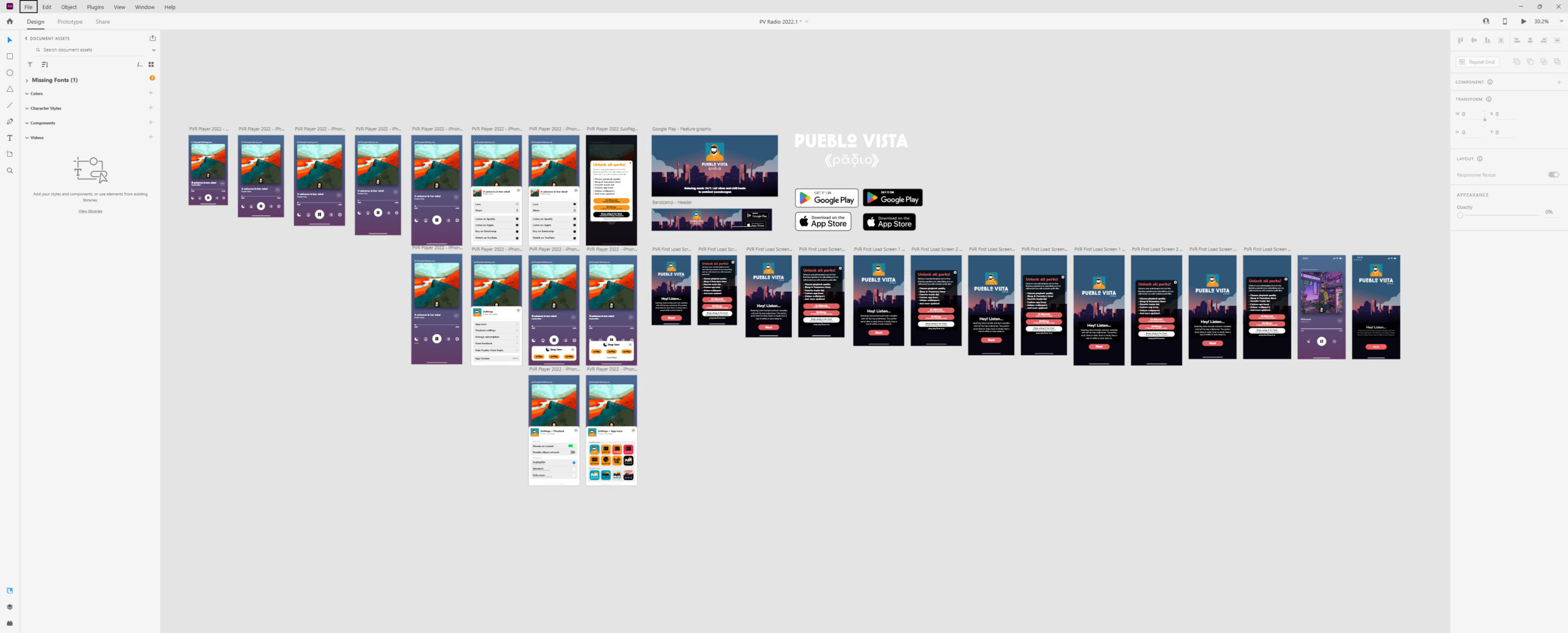
SHIPPING IS PART OF THE PRODUCT
The rebuild made one thing particularly clear: designing the screens was only part of the job. Store policies, testing, subscriptions, technical maintenance and release processes all influenced what users could actually receive.
Getting the rebuilt iOS version through testing and review took roughly two months and 18 builds. That process involved live testing, bug fixing, resubmission and repeated coordination with development.
The rebuilt product eventually shipped across both iOS and Android. Archived Google Play data records version 2022.7.7 at 14,960 downloads and a 4.64/5 rating from 179 ratings before the Android listing was removed in December 2024.


OUTCOME
33,614
recorded customers¹
14,960
documented Android
downloads²
4.8 / 5
iOS · 608 ratings³
4.64 / 5
Android · 179 ratings²
The product also ran a real paid subscription in production. Archived App Store metadata records the $1.49 monthly plan, while my RevenueCat project still contains the historical customer and transaction data.³
¹ RevenueCat project data, September 2026 · ² Archived Google Play data · ³ AppBrain archive / AppsHunter archive
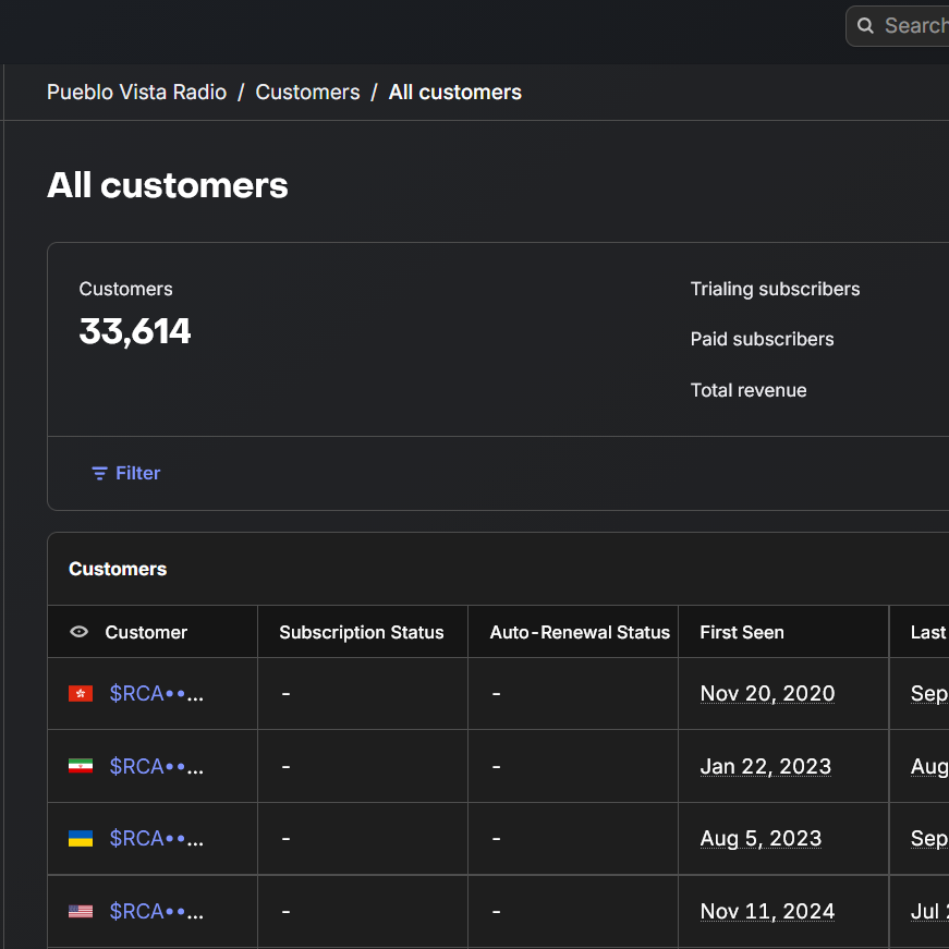
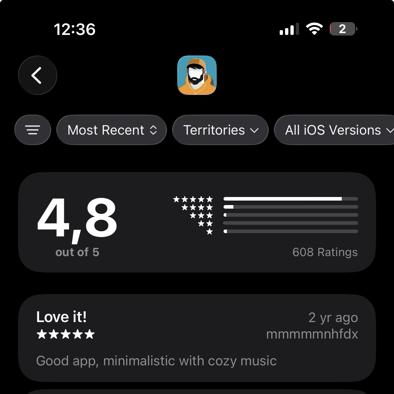
Evidence note: The app is no longer distributed through either store. The metrics above combine first-party RevenueCat project data with archived public store records. I have intentionally left the RevenueCat revenue figure out of the headline metrics until I can reconcile exactly what the historical total represents.
REFLECTION
The most useful lesson was not how to design a music player. It was learning where product ownership ends and collaboration begins. I could define the product, design the experience, understand enough of the implementation to work closely with developers, and still recognise when writing the production code myself was no longer the best use of the project’s time.
The product also changed how I think about simplicity. Pueblo Vista Radio worked because it resisted becoming more than it needed to be. The catalogue and brand supplied the differentiation; the interface mostly needed to stay out of the way.
Eventually the stores and publishing requirements moved faster than I could maintain alongside the rest of my work, and the app was retired. The product is no longer available, but the lifecycle remains useful evidence: an idea moved from sketches to a shipped, monetised cross-platform product, reached tens of thousands of recorded customers, survived a major rebuild, and taught me as much about maintenance and delivery as it did about interface design.
A focused product does not need to do more. It needs to make its reason for existing obvious.