MOBILE UX/UI · PUBLIC TRANSPORT · 2022 · CONCEPT
Reducing the distance between “I need to get there” and “I have the right ticket.”
SURFACE
Mobile app
Journey planning
ROLE
Product Designer
UX/UI
SCOPE
UX audit · Interaction design
UI design · Prototyping
A public transport app can contain everything a rider might need. The harder question is deciding what they need right now.
THE CHALLENGE
This project began as a 7-day product design challenge during an interview process with Deloitte. The brief focused on the Journey functionality in the ATM Milano mobile app ~ from the homepage to journey details ~ and asked me to identify opportunities for improvement through low-fidelity exploration and a high-fidelity interaction.
I already knew the product as a traveller, but I did not want to redesign ATM Milano from scratch. With limited context and no access to internal product decisions, I focused on one frequent task: getting from point A to point B and purchasing the ticket needed to make that journey.
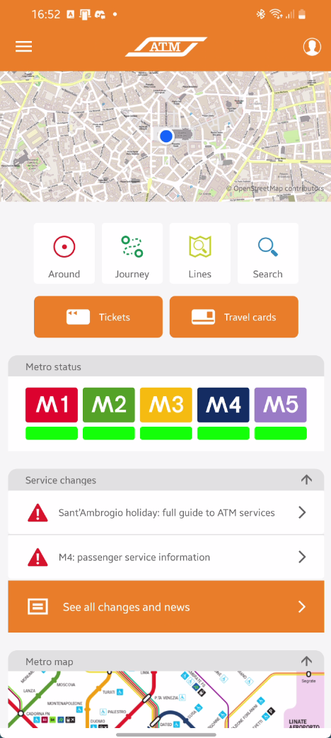
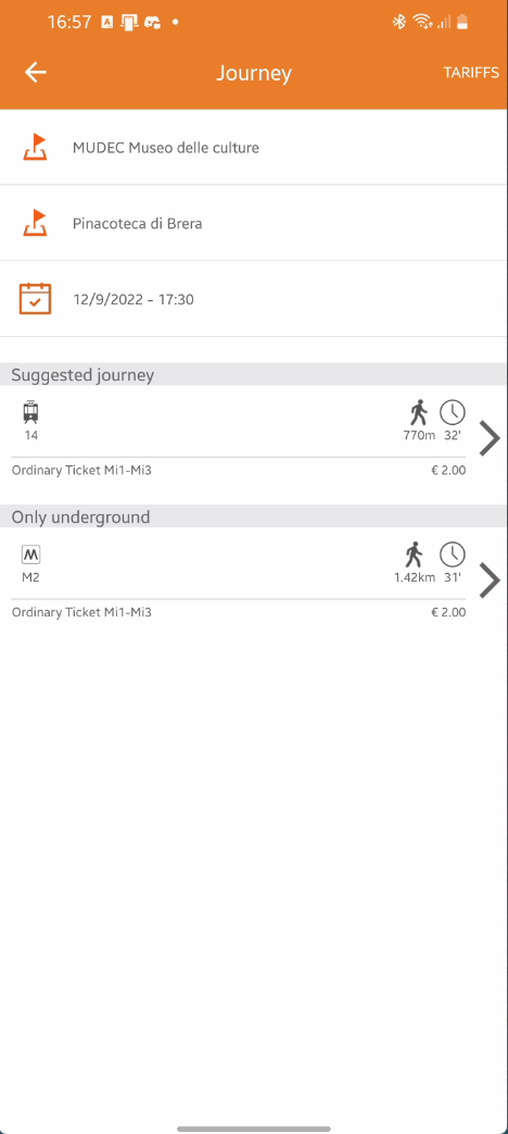
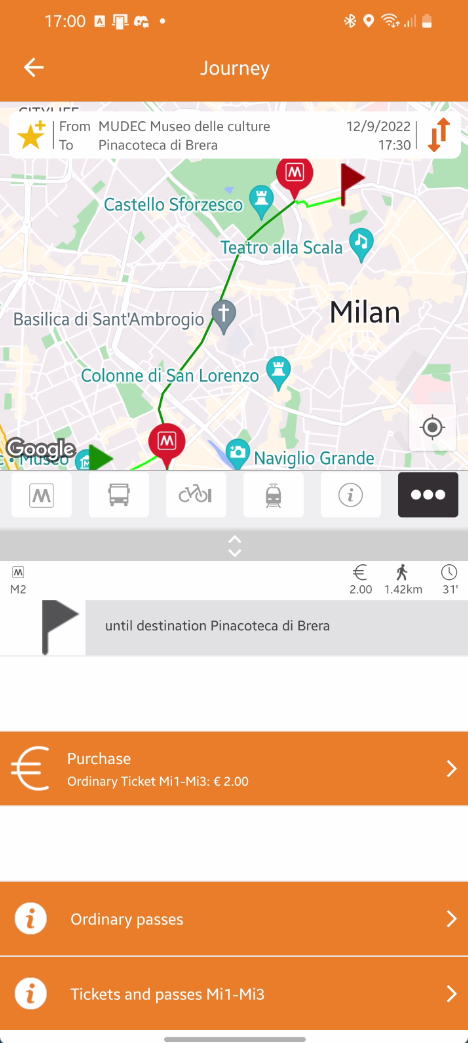
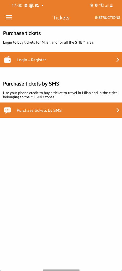
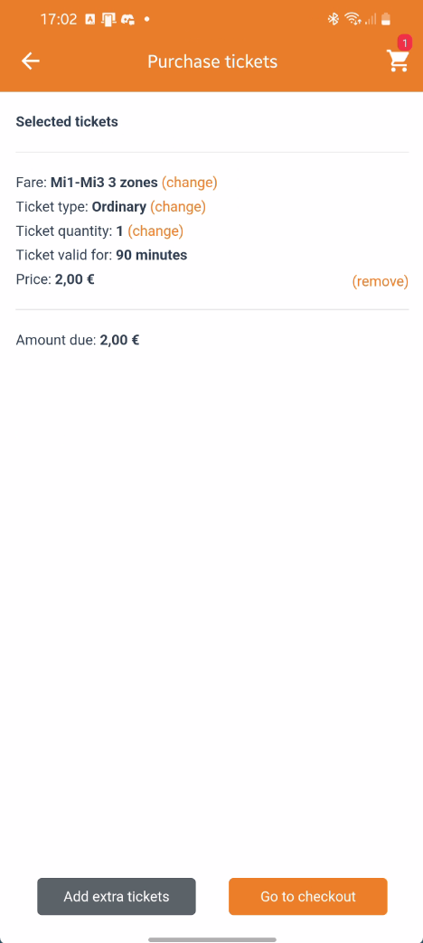
Walking through the existing flow revealed a product with plenty of useful functionality, but also considerable interaction overhead. Information, colours, icons, terminology and navigation patterns often competed for attention, while the path to the final ticket stretched across multiple screens.
A small, directional sample of domestic and international users helped me sense-check the experience. This was not formal research, and I would not present it as such. The useful signal was the spread in completion time: I noted roughly 45 seconds to 4.5 minutes to reach the ticket outcome, including my own attempts.
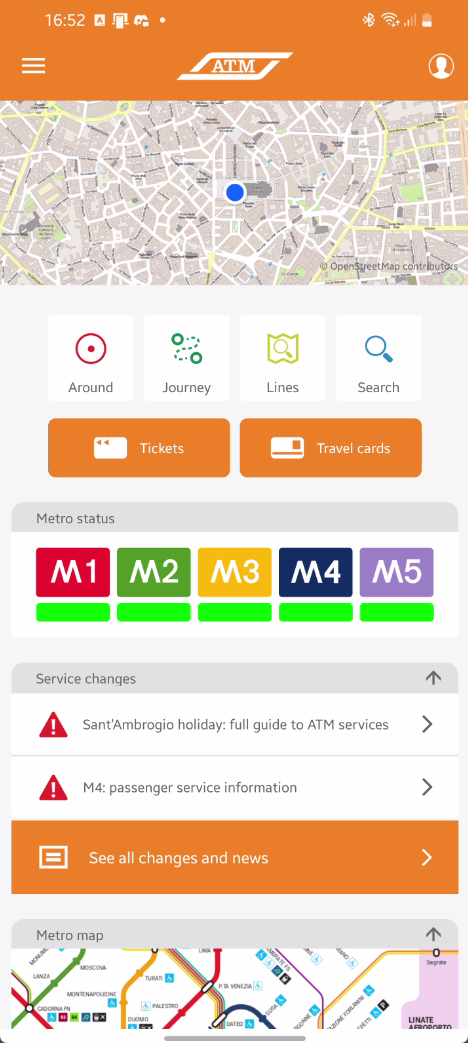
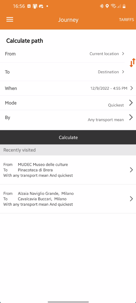
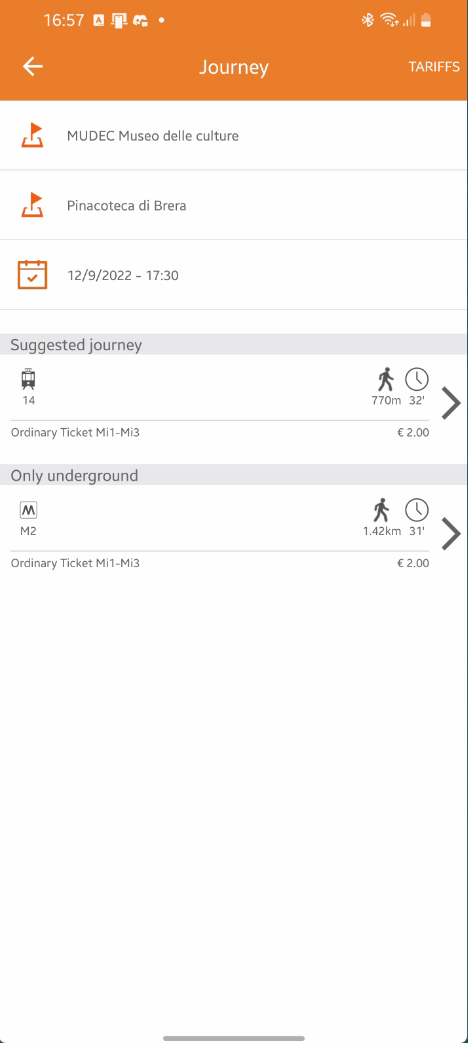
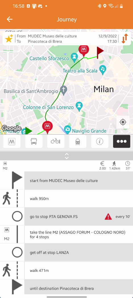
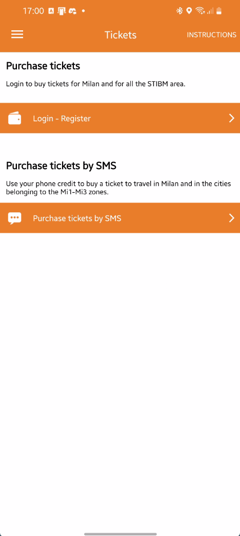
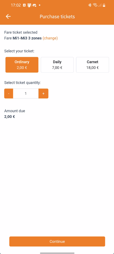
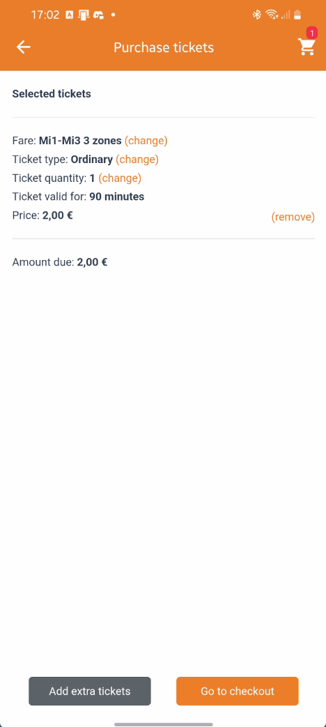
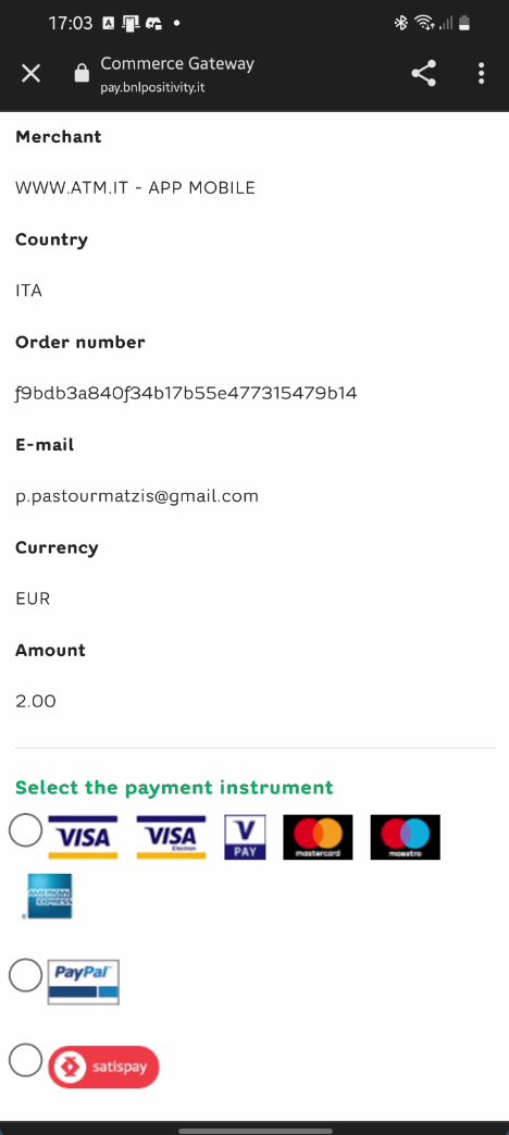
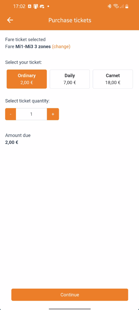
The existing Journey flow ~ useful functionality distributed across a relatively long sequence of screens.
DESIGN DIRECTION
Prioritise the next decision
Make the most relevant action obvious instead of giving every function equal visual weight.
Progressively disclose complexity
Reveal supporting information when it becomes relevant rather than explaining the entire transport system at once.
Remove steps, not capability
Merge screens and actions where a separate decision is not actually required.
Keep riders in context
Let route comparison, journey details and ticket purchase feel like one continuous task rather than disconnected procedures.
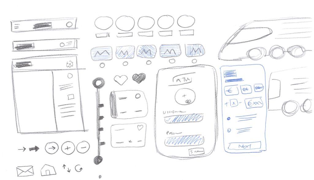
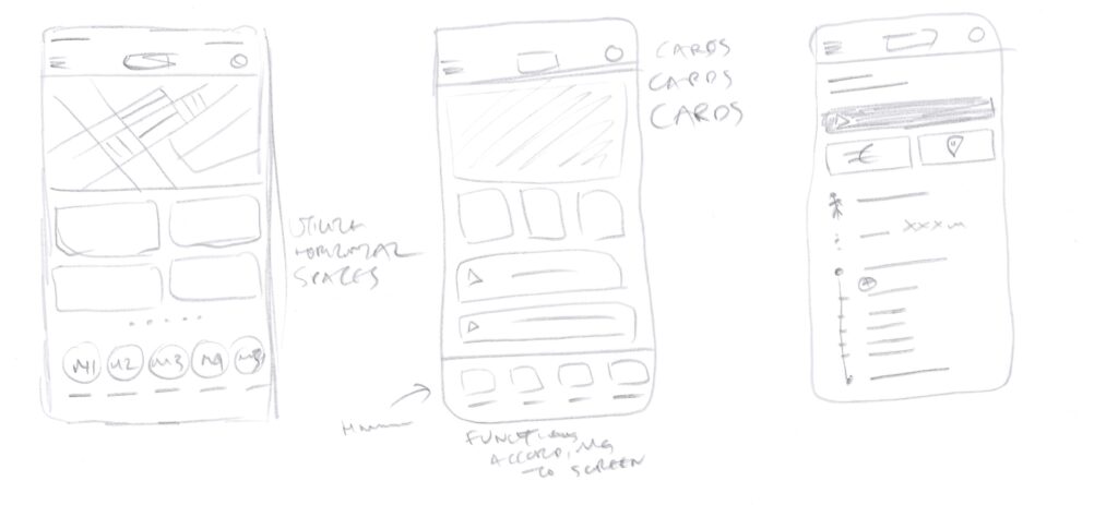
Because the exercise was time-boxed, I moved quickly from analysis and rough sketches into high fidelity. The sketches were not meant to be polished wireframes; they helped test hierarchy, grouping and the number of decisions each screen was asking the rider to make.
The working principle was simple: every screen should help the rider make the next decision ~ not explain the entire transport system.
DESIGN DECISION 1/4
Make the first action obvious
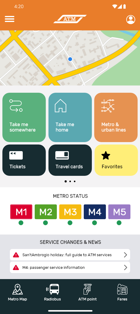
The original homepage exposed a broad range of functions. My concept retained that capability but reorganised it around larger, clearer actions. “Take me somewhere” became the direct entry into Journey, while “Take me home” used a saved home address or prompted the rider to add one.
Metro status and service changes stayed visible because they can alter a journey before it starts. Metro and urban lines, tickets, travel cards and favourites remained available, but no longer competed equally for attention.
DESIGN DECISION 2/4
Turn journey setup into journey selection
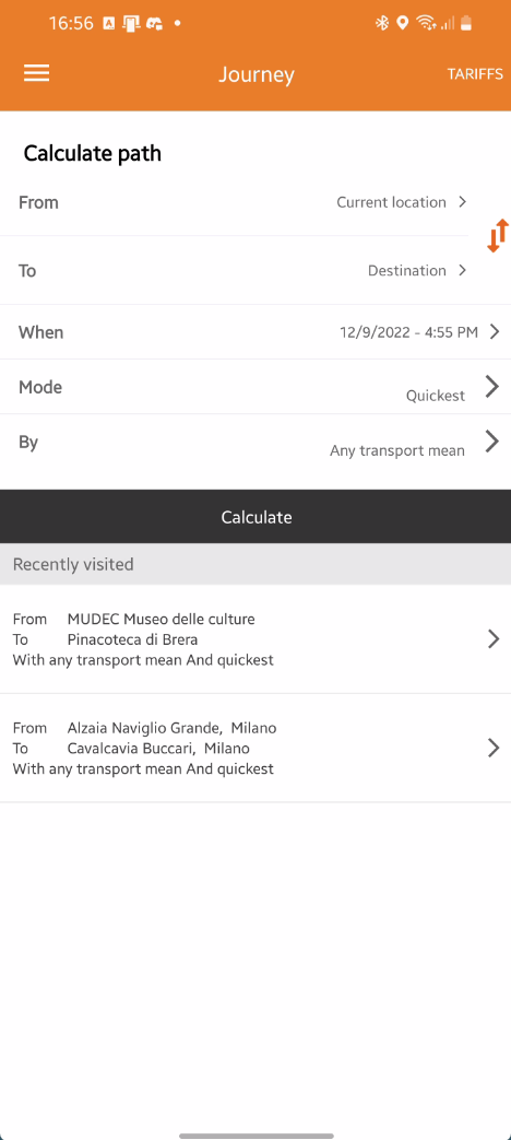
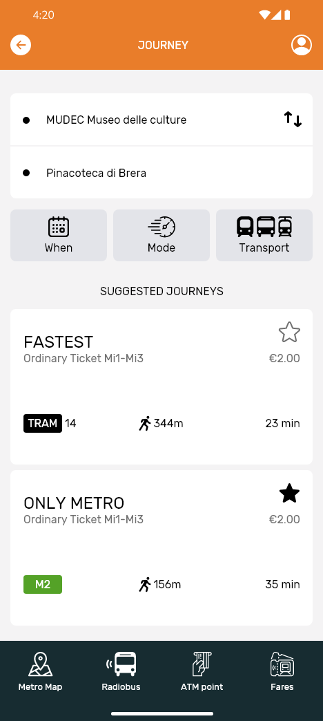
After “Take me somewhere”, the rider needs two things first: origin and destination. I brought those fields together and treated When, Mode and Transport as secondary filters rather than separate pieces of the journey.
The larger change was removing the explicit “Calculate” step. Once valid locations are entered, available journeys can populate dynamically as cards. That removes an extra action, keeps the rider in context and makes route comparison part of the same interaction.
DESIGN DECISION 3/4
Prioritise what matters after route selection
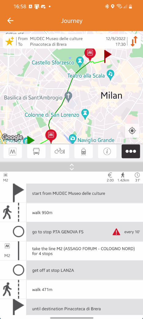
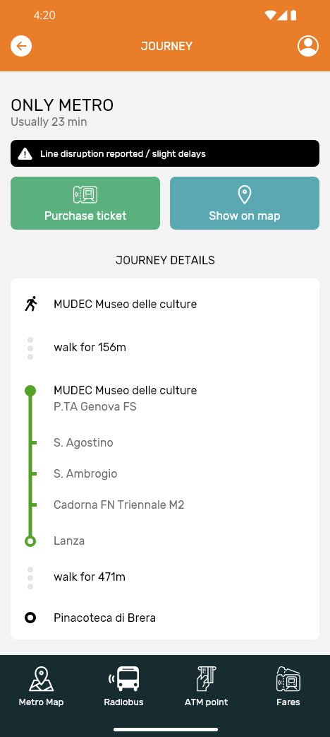
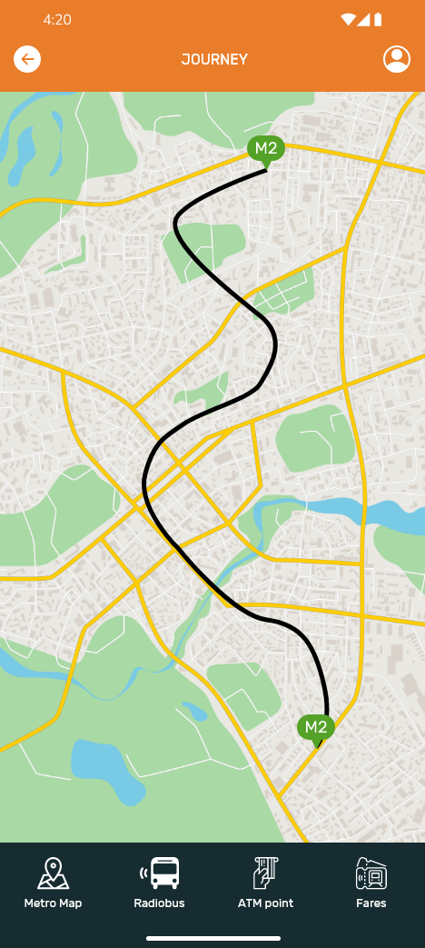
Once a route is selected, the hierarchy changes. The rider needs the journey details, any disruption affecting the route and a clear way to purchase the ticket. In the existing flow, reaching the purchase action could require scrolling, so I moved “Purchase ticket” higher in the screen where the primary next step was immediately available.
I also removed the embedded map from the details view to create more room for the actual journey. The map was not discarded; “Show on map” opened the route as a dedicated fullscreen view, with the back action returning to details.
DESIGN DECISION 4/4
Compress the path to the ticket
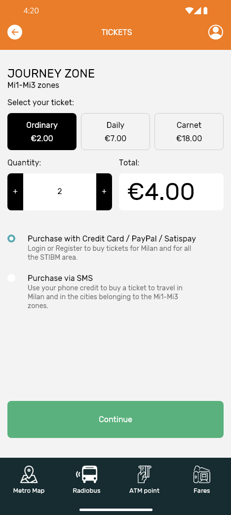
The ticket step was another opportunity to compress the flow. I merged information that had previously been spread across multiple screens and removed a redundant overview, since the rider could already go back and edit previous choices.
I also simplified labels that I found difficult to parse, replacing wording such as “Fare ticket selected” and “Fare zones Mi1–Mi3 (change)” with a clearer fare-zone presentation. Quantity, total and payment options were brought into the same step.
At the time I noted that card, PayPal, Google Pay or Apple Pay could potentially be handled in-app, but intentionally left that as a hypothesis. Implementation would depend on product, technical, testing and budget constraints. SMS payment already followed a straightforward pattern and did not need redesign for the sake of redesign.
THE EXPERIENCE
The concept did not try to invent a different transport service. It tried to shorten the distance between intent and outcome:
Home → Journey selection → Route choice → Journey details → Ticket
Where the existing experience often explained more at each stage, the concept progressively disclosed information and removed steps that did not require a separate decision.
VALIDATION & REFLECTION
This was an interview design challenge, not production work for ATM Milano. The research sample was small and directional. I did not have access to analytics, technical constraints, business requirements, accessibility audits or the internal reasoning behind the existing information architecture.
Within those limits, the exercise was useful because it forced prioritisation. Instead of adding features, most of the design decisions involved merging screens, removing actions, changing hierarchy and deciding what information deserved attention at each point in the journey.
The goal was never to make public transport look simpler. It was to make the next decision feel simpler.