CORPORATE WEB · IA/UX/UI · 2016–17 · unreleased
Reorganising eyeo.com around a growing ecosystem of products, initiatives and audiences ~ then learning what happens when finished design cannot reach production fast enough.
SURFACE
Corporate website
Product ecosystem
ROLE
Visual Designer / UX/UI
Full design ownership
SCOPE
Information architecture · UX/UI
Visual design · Responsive · Prototyping
The hardest question wasn’t how the products should look. It was deciding what actually counted as a product.
THE CHALLENGE
When I joined eyeo in 2016, the website was still organised mainly around the company itself ~ its mission, team, press information and a broad Services section. Meanwhile, eyeo had grown into several products, initiatives and different audiences that were becoming difficult to explain through that structure.
The interface showed the age of that model too: dense pages, small type, rigid templates and navigation that gave little sense of how eyeo’s products and initiatives related to one another. I owned the information architecture, UX/UI and visual design, so the project quickly became more than a visual refresh.
Discovery was primarily internal. I worked through stakeholder conversations, the existing site and what I was learning about the company and its products. The central problem emerged surprisingly early: even inside eyeo, the boundaries between product, service, initiative and commercial proposition were not always obvious.


DESIGN DECISION 1/3 ~ Define the product before designing the page
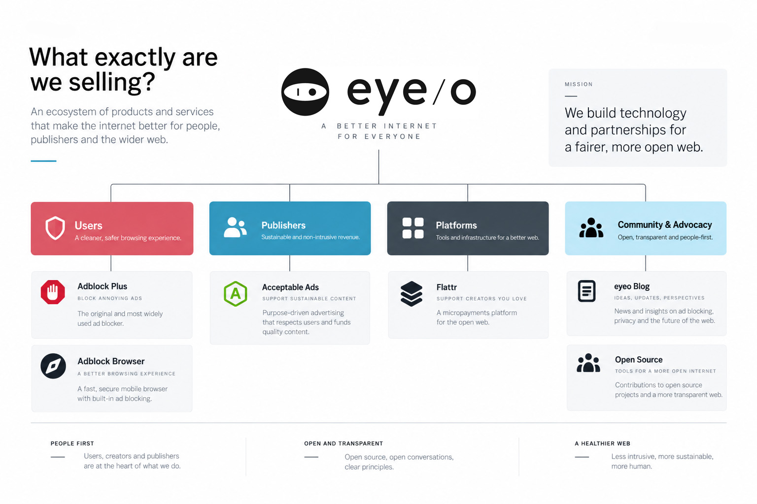
Adblock Plus was a browser extension with enormous reach. Adblock Browser was a standalone product. Acceptable Ads was both an initiative and part of the business model. Flattr introduced another model again. Publisher-facing propositions added another layer.
We kept returning to the same question internally: what is a product, and what is a service? If the people inside the company needed to stop and discuss the distinction, the website was unlikely to make it obvious to someone arriving for the first time.
DESIGN DIRECTION
Extend the system, change the character
Keep enough shared DNA with eyeo to feel related, while giving Acceptable Ads its own palette and personality.
Make abstract ideas visual
Use original illustration to explain concepts such as fairness, transparency and user choice without relying on stock imagery or literal ad-tech clichés.
Reduce room for interpretation
Use a limited palette, repeatable components and explicit patterns so the intended system remained clear across pages.
Keep what already worked
Start from the existing navigation and structure, then change it where research and stakeholder discussions showed a reason to.
DESIGN DECISION 2/3 ~ Turn company structure into user-facing structure
Once the ecosystem was clearer, I reorganised the site around clearer destinations. About covered the company and its history. Products gave software and initiatives their own space. For Publishers separated the propositions aimed at that audience, and Jobs became a proper recruitment section rather than simply another header link.
The important change was moving away from an organisation-centric structure and toward one that helped different visitors understand where they belonged and what eyeo offered them.


DESIGN DECISION 3/3 ~ Give different products one place to belong
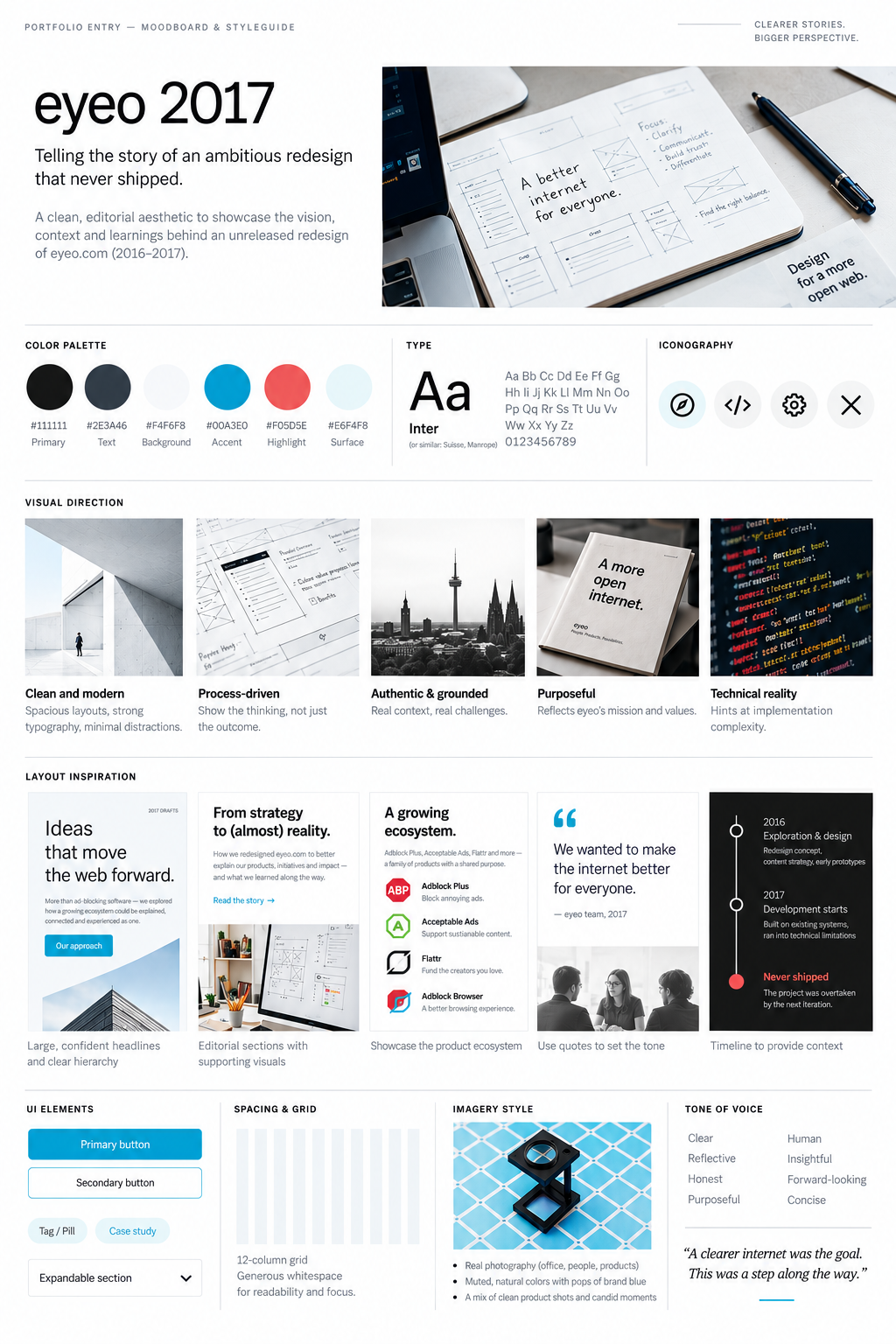
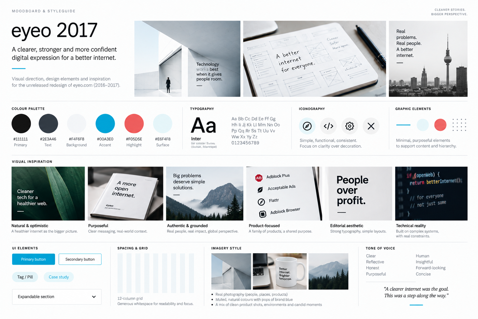
The visual direction followed the same principle. I was not trying to replace the eyeo brand. I wanted the website to feel less corporate and compressed, while giving individual products enough room to retain their own identity.
I explored larger typography, more whitespace, restrained colour, photography and simple graphic elements. Products could use their own colour and imagery while still sitting inside a recognisable eyeo.com system.
FINISHED DESIGN ≠ SHIPPED PRODUCT
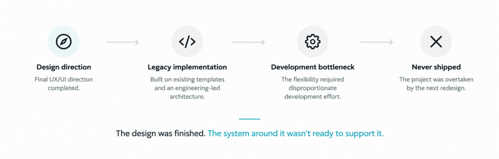
By the end of the design phase, this was not an unfinished concept. I had a complete high-fidelity website direction, responsive states and interactive InVision prototypes. The design problem had been worked through.
Implementation became the problem. eyeo.com relied heavily on legacy code and hand-built development patterns. Flexible page structures, reusable content patterns and even SVG graphics could require considerably more development effort than the designs suggested. Although several developers were dedicated to the company websites, implementation repeatedly became the bottleneck.
The designs sat ready while development lagged behind. Eventually enough time passed that the company, the product landscape and web standards had moved on. Rather than finally shipping a direction that had been waiting for roughly a year, we had to revisit the problem and design the next version.


WHAT CARRIED FORWARD
The unreleased work was not discarded intellectually. It clarified the product architecture, challenged the old information model and established a more product-led direction for eyeo.com. Those lessons became inputs to the 2018 redesign that followed.
The difference was important: the first redesign explored what eyeo.com could become. The next one had to preserve that ambition while treating implementation constraints as part of the design problem from the beginning.
OUTCOME · superseded
COMPLETE DESIGN
Full high-fidelity website direction
RESPONSIVE
Desktop and responsive states
PROTOTYPED
Interactive experience in InVision
REFLECTION
The frustrating part was not failing to find a direction. It was watching a complete direction remain un-shipped long enough for the context around it to change.
That experience changed how I thought about finished design. High-fidelity screens, responsive states and a working prototype can make a design complete as an artifact, but they do not make it a product. Delivery has its own constraints, timing and shelf life.
The lesson became directly useful in the redesign that followed: implementation reality had to enter the design process earlier, not after the design was already considered finished.
A finished design has a shelf life. If implementation takes long enough, the problem eventually changes underneath it.