BRAND SYSTEM · CORPORATE WEB · 2021–2022 · SHIPPED
Turning a growing technology company into a digital system people could understand ~ and teams could reuse.
SURFACE
Corporate website
Digital brand system
ROLE
Product / Visual Designer
UX/UI
SCOPE
IA · UX/UI · Visual system
Responsive design · Components
The redesign was not really about giving eyeo a newer website. It was about making a more complex company easier to understand.
THE CHALLENGE
By late 2021, eyeo had grown beyond the story its existing corporate website was telling. Products, initiatives and audiences had multiplied, while the site still leaned heavily on team photography and a company-first narrative. The visual refresh mattered, but the deeper problem was structural: people did not always understand how eyeo, its products and its initiatives related to one another.
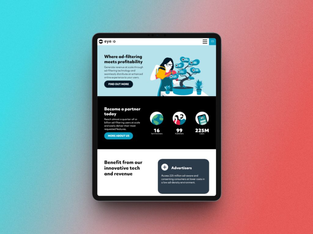
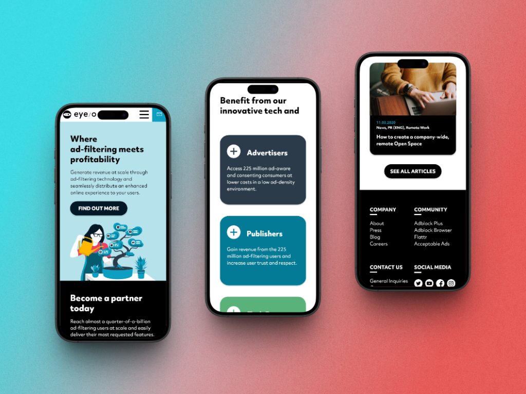
The Creative Director established the high-level art direction ~ a small palette of core colours and a move towards a more illustration-led identity. From there, I owned how that direction became a website: information hierarchy, UX/UI, visual language, responsive layouts and the reusable system behind the pages.
I worked actively with UX research, content, product and stakeholders on the structure. The UX researcher led the formal analysis, while I participated in workshops, reviewed interview and questionnaire findings, watched recorded reactions to design directions and used that evidence to iterate before shipping.
DESIGN DIRECTION
Explain before decorate
Use hierarchy and information architecture to make the relationship between company, products and initiatives easier to understand.
Illustration with a job to do
Move away from photography without letting illustration become another layer of noise.
Build rules, not pages
Translate the visual direction into reusable grids, type, components and content patterns.
Design for real content
Let accessibility requirements, responsive behaviour and varied page types test whether the system actually holds together.
DESIGN DECISION 1/3
Make the company easier to understand, not just nicer to look at
The research kept pointing back to the same issue: the organisation made sense internally, but that structure was not always obvious to someone arriving from outside. A visual redesign alone would not solve that.
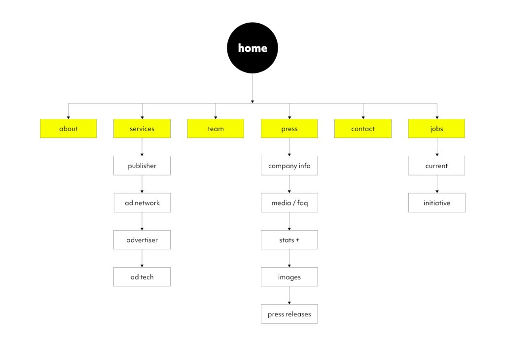
We simplified the main navigation and reorganised Projects and Solutions so the site could explain the relationship between the company, its products and the different audiences it served. I was directly involved in those decisions rather than receiving a finished information architecture to decorate.
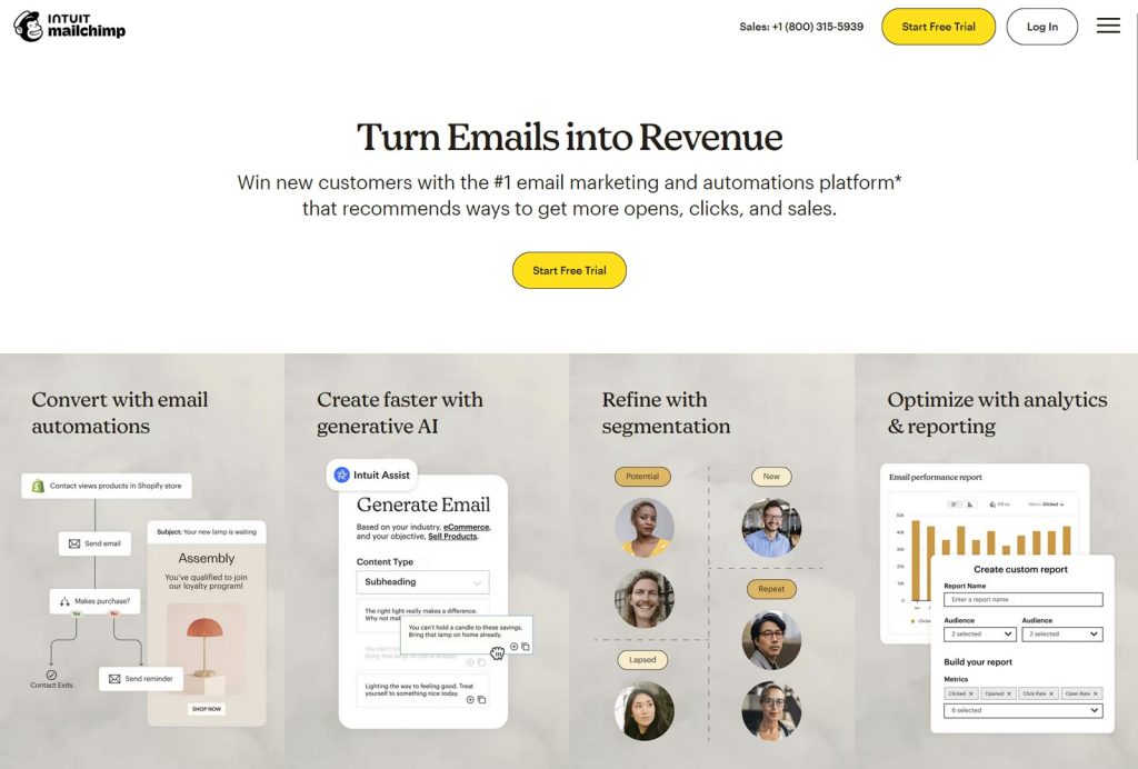
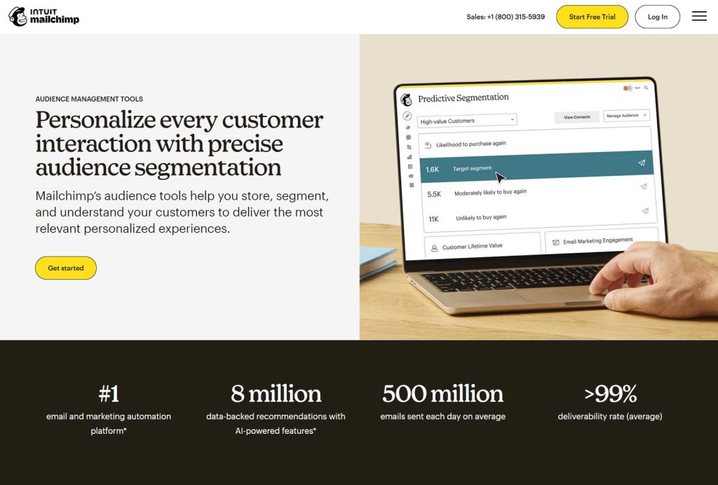
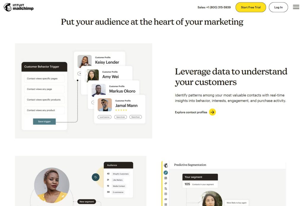
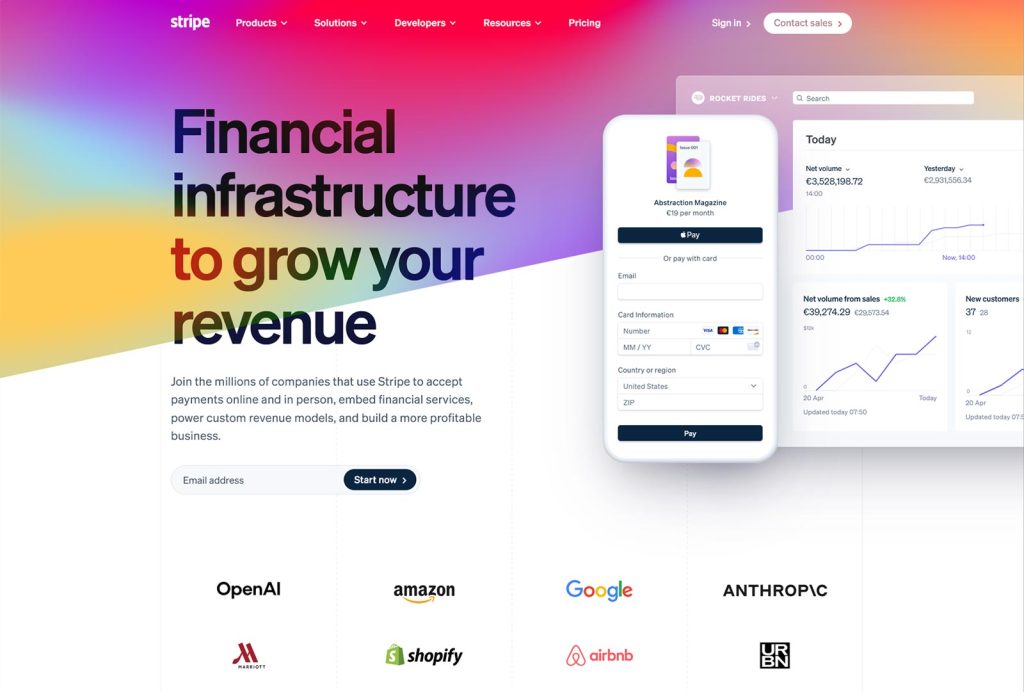
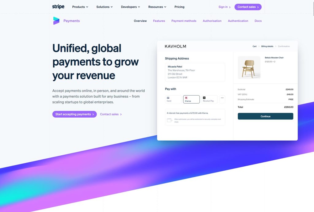
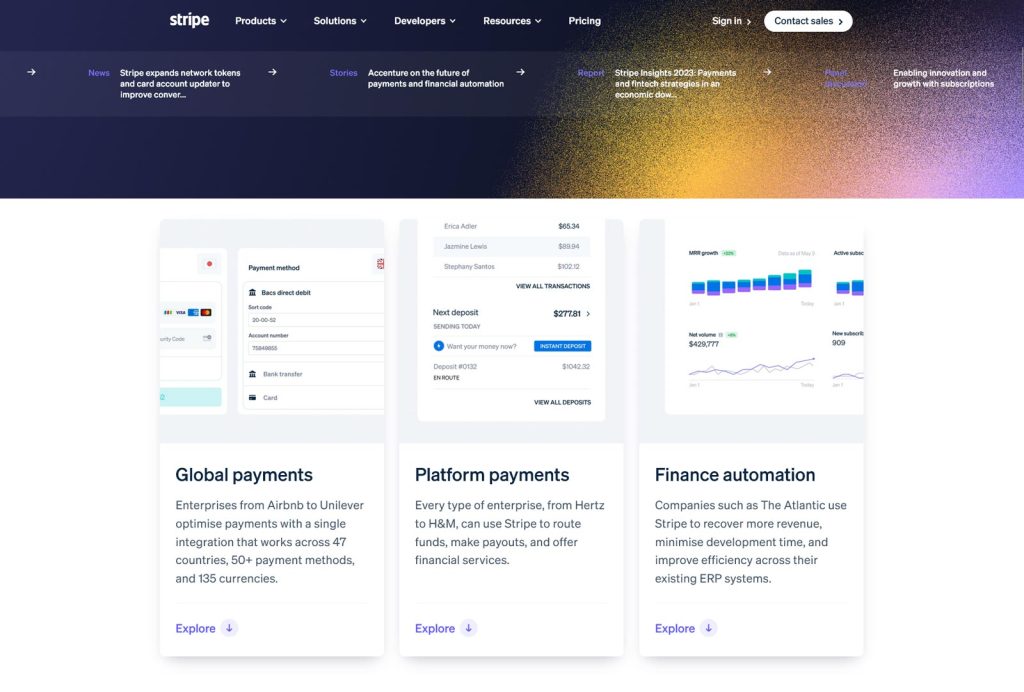
We also looked beyond ad tech. Stripe was useful for explaining a complicated technology business without making the interface feel complicated. Mailchimp showed how illustration could carry personality without overwhelming the content.
DESIGN DECISION 2/3
Turn a loose art direction into a usable visual language
The starting direction was intentionally broad: work with a small set of core colours and make the brand more illustration-led. The challenge was turning that into rules that could survive real content, multiple page types and responsive layouts.
I explored directions that pushed the brand much harder and others that were deliberately quieter. Some worked as isolated compositions but became difficult once accessibility, long-form content and different use cases entered the picture. The direction we continued with balanced personality with enough restraint to remain usable.
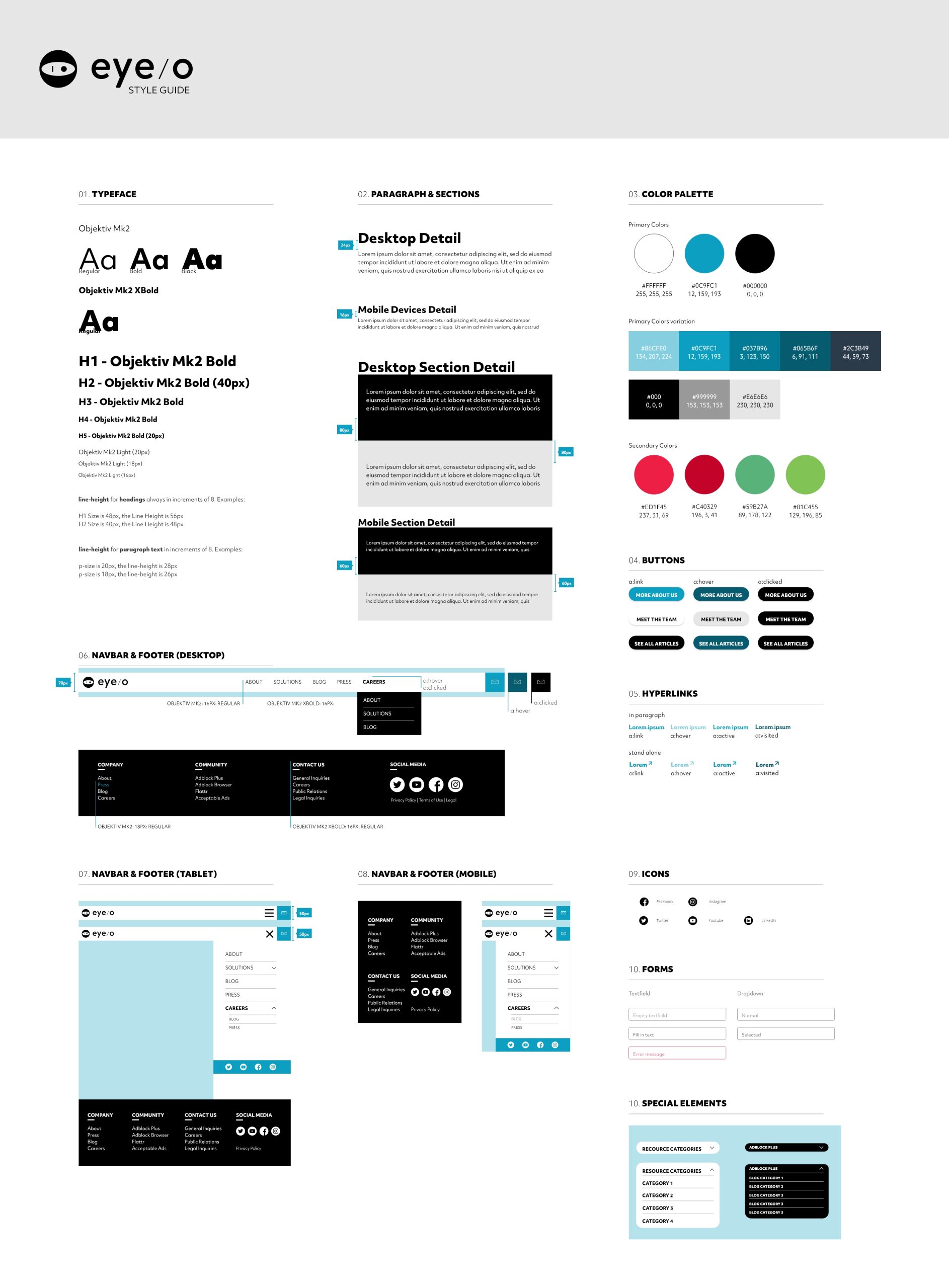
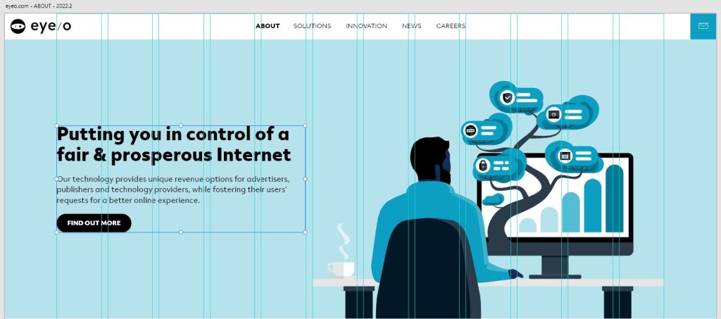
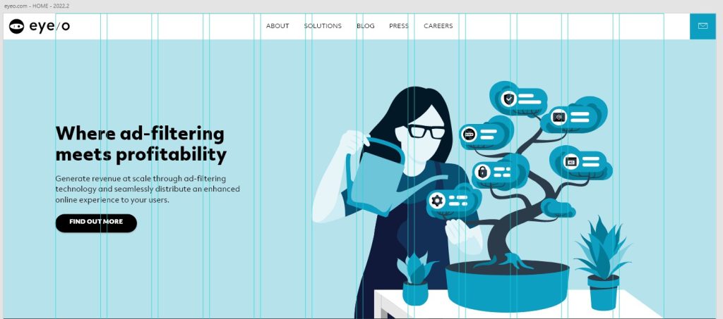
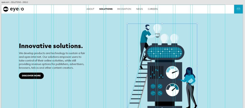
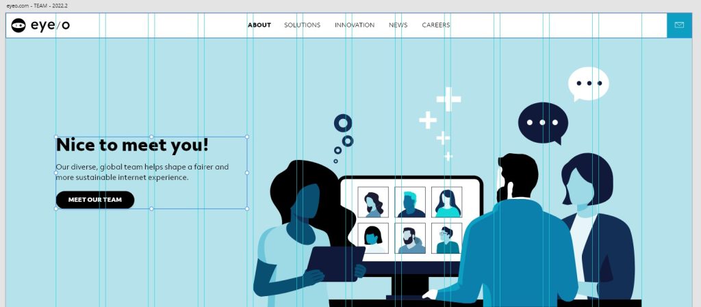
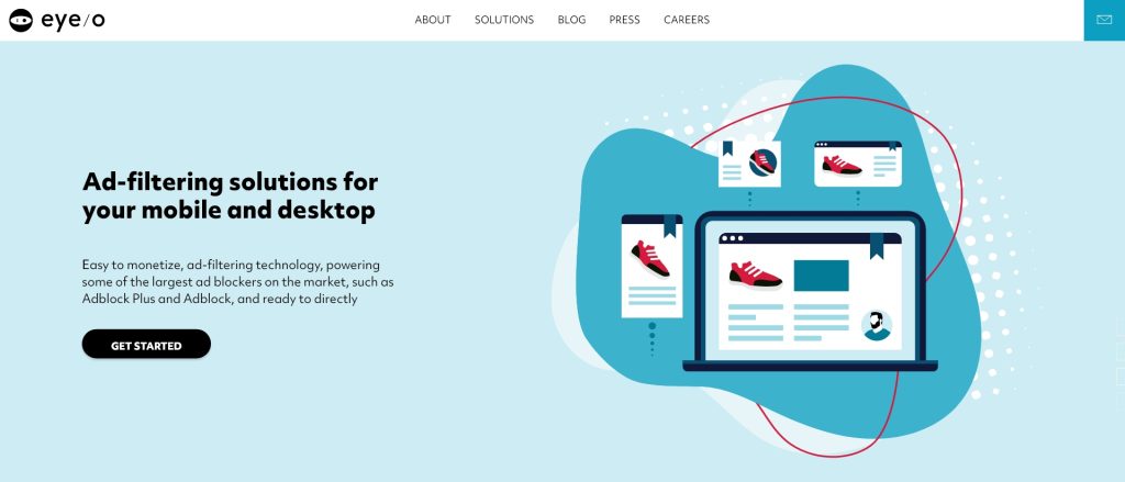
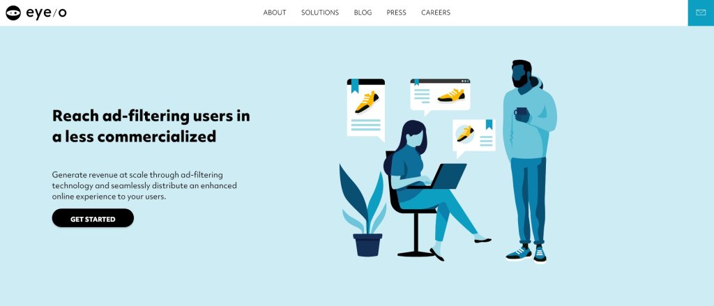
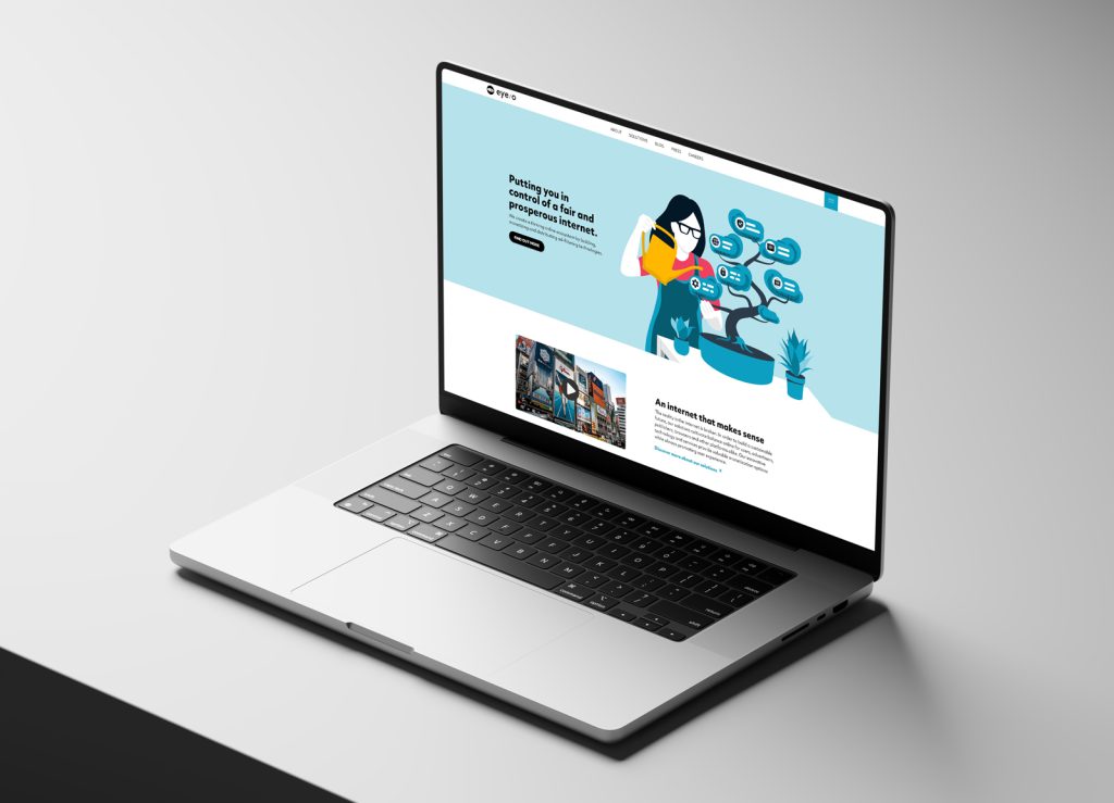
The resulting language combined bold typography, eyeo’s iconography, soft depth, illustration and a deliberately limited colour palette. We also performed contrast checks and worked within accessibility requirements, without presenting the project as a full accessibility audit.
DESIGN DECISION 3/3
Design a system instead of a collection of pages
Once the direction started working, the next problem was scale. The site could not depend on every new page becoming another bespoke composition.
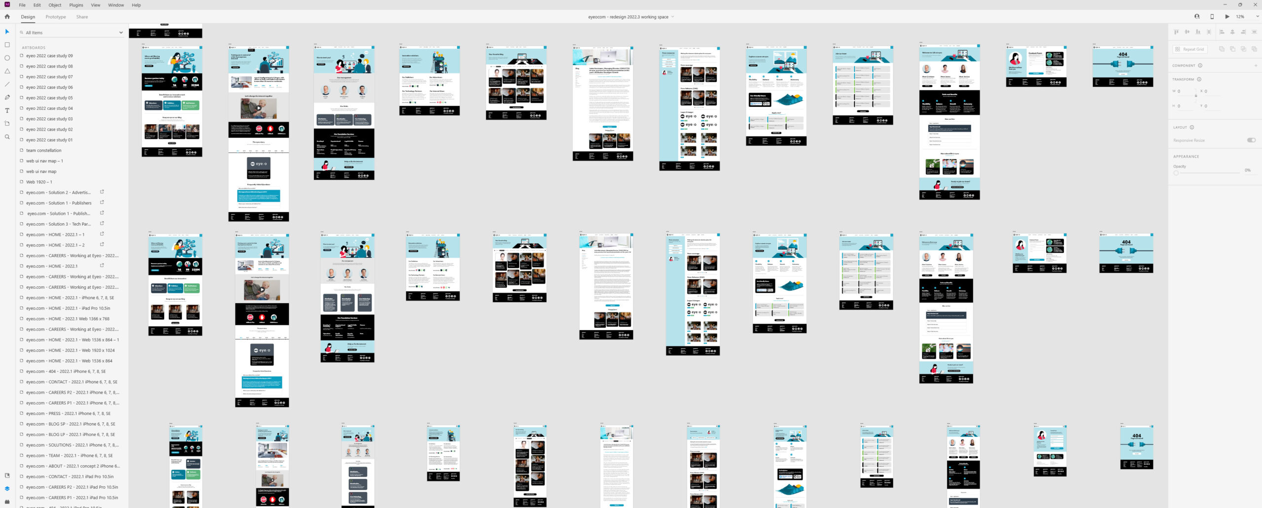
I built a modular system in Adobe XD around shared grids, typography, buttons, navigation, form elements, cards and repeatable content modules. That required a lot of self-directed research at the time: I studied emerging design-system practices, component thinking and responsive behaviour, then translated what was useful into the tools we had.
XD helped create consistency, although its limitations became increasingly obvious as the system grew. The important shift was conceptual rather than tool-specific: I stopped treating pages as individual deliverables and started treating them as combinations of reusable decisions.
VALIDATION BEFORE SHIPPING
The work was not designed in isolation. The UX researcher handled the formal research analysis and shared findings with the team; I participated in much of the research process and used the results to refine the interface. We reviewed recorded reactions and questionnaire feedback around design directions before the site shipped.
I also shadowed two product-team members using prototype builds, which helped expose smaller hierarchy and layout inconsistencies that were easy to miss while designing the system itself.
FROM DESIGN TO PRODUCTION
The handoff to development happened through project management rather than through direct designer–engineer collaboration. That created distance once implementation began: I could provide the design system and handoff material, but I had less influence over how individual decisions evolved in production.
That limitation became one of the most useful lessons from the project. A design system does not end when the component library is organised. The quality of the feedback loop between design and engineering determines how much of the intended system survives implementation.
OUTCOME · SHIPPED
REUSABLE
Shared UI and visual patterns across pages
RESEARCH-INFORMED
Design feedback and questionnaire findings informed iterations
CROSS-FUNCTIONAL
Creative · UX Research · Content · Product · Development
REFLECTION
Looking back, the biggest limitation was not a missing design technique. It was the distance between design decisions and implementation. I had strong ownership of the interface and visual system, but less influence once the work entered development.
That experience changed how I think about product design today. Reusable components, clear documentation and thoughtful handoff matter, but they are not substitutes for collaboration. A system is only as useful as the process that carries it into production.
The project also marked an important shift in my own work ~ from thinking primarily in screens and visual compositions towards thinking in relationships, reusable patterns and the rules behind them.
Consistency is not created by making every page look the same. It comes from giving different pages the same underlying logic.