INTERNAL PRODUCT · LEGACY UX · 2016–2017 · SHIPPED
Modernising an IT-built ticketing system for the wider organisation ~ without pretending the legacy product underneath had disappeared.
SURFACE
Internal web app
Ticketing · Task tracking
ROLE
Product / UX/UI Designer
Full design ownership
SCOPE
Research · IA · UX/UI
Visual design · Prototyping
It started as a visual refresh. It became an exercise in translating how IT thought about the system into how everyone else needed to use it.
THE CHALLENGE
eyeo Hub began as a custom internal tool built by the IT department for its own ticketing and task-tracking needs. It worked well enough for the people who had created it. The problem appeared as usage expanded across Legal, HR, Product and other teams: a system designed around IT’s own logic was suddenly expected to make sense to a much broader group of users.
I was initially brought in to make the interface look better. Once I started auditing the product, it became clear that visual polish alone would not solve the problem. Information hierarchy, navigation, ticket relationships and common actions all reflected assumptions that were obvious to the original builders but much less obvious to everyone else.
The backend and core logic were not being rebuilt. My job was to improve the experience around them ~ understanding enough of the IT model to preserve what worked, while making the product easier for end users to understand.

RESEARCHING THE GAP
I interviewed approximately 12 frequent users across different departments and specialties. These were conversations I conducted directly. The recurring issues went beyond aesthetics: users struggled with information density, hierarchy, navigation and understanding relationships between tickets, projects, ownership and activity.
At the same time, I needed to understand why the system behaved the way it did. The IT team had built Hub around workflows that made sense to them, so simplifying the experience without understanding that logic risked designing something cleaner on the surface but incompatible underneath.
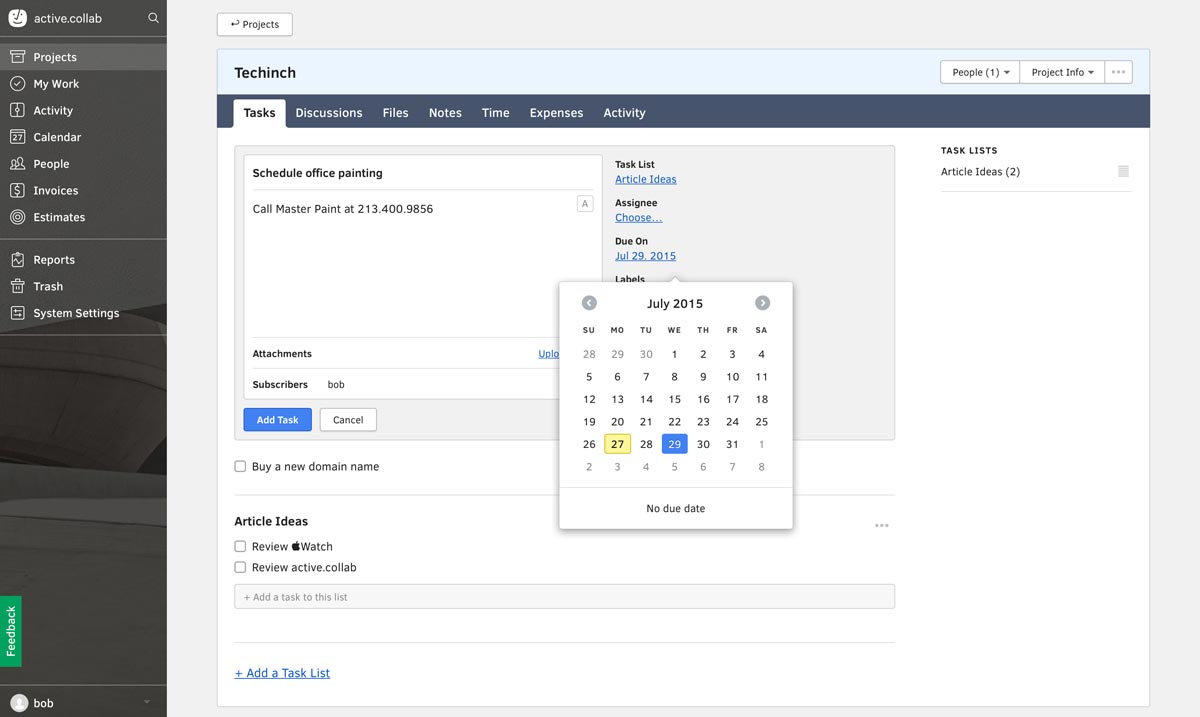
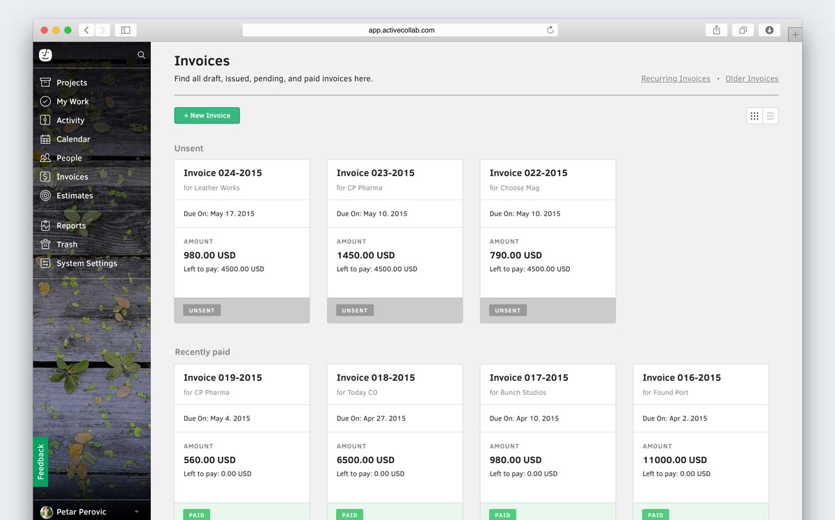
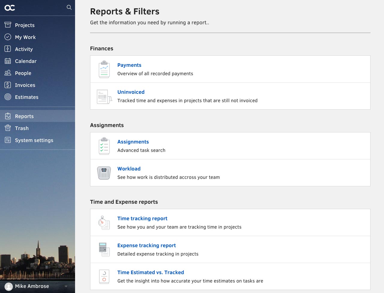
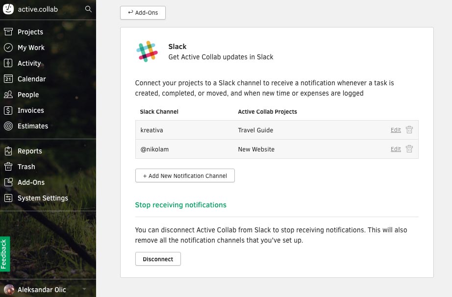
Having used ActiveCollab at MED-EL, I used it as a benchmark. I borrowed established layout and information-presentation patterns where they solved the same class of problem. The point was not to invent ticketing again ~ it was to understand how a mature product made similar complexity easier to scan.
PRODUCT DIRECTION
Design for the expanded audience
Move beyond the IT team’s original mental model and make common workflows understandable across departments.
Learn before simplifying
Understand the existing ticket logic and backend constraints before changing how information is organised on the surface.
Use proven patterns
Benchmark mature project-management tools instead of trying to reinvent ticketing from first principles.
Change the interface, protect the logic
Improve hierarchy, navigation and task flow while keeping the underlying backend architecture intact.
PRODUCT DECISION 1/3 ~ Design for the people the tool had grown beyond
The original Hub had effectively been designed by its first users: IT. As adoption spread, that became its biggest UX limitation. Internal terminology, dense screens and relationships that felt obvious to the builders required much more interpretation from everyone else.
The interviews shifted the redesign away from a cosmetic refresh. I reorganised the surface around the questions broader users needed answered quickly: what is this ticket, who owns it, what is its status, what is related to it, what changed recently and what can I do next?
That meant clearer grouping, more predictable hierarchy and stronger separation between navigation, project context, ticket content and activity.
PRODUCT DECISION 2/3 ~ Learn the system before trying to simplify it
The difficult part was not drawing a cleaner dashboard. It was understanding enough of the existing system to know which complexity belonged to the interface and which complexity was fundamental to how Hub worked.
I mapped the existing structure and key flows, then used the user interviews and ActiveCollab benchmark to challenge the presentation rather than the backend itself. Ticket creation, filtering, project overviews, activity and standalone ticket views could become easier to scan without requiring IT to rebuild the product’s core logic.
PRODUCT DECISION 3/3 ~ Change the interface without breaking the system underneath
The redesign used a lightweight dark sidebar, clearer table structures, consistent typography and repeatable modules across views. Rather than introducing a large new design system, I created enough shared rules to make the product coherent while staying close to what the existing implementation could support.
Project overviews surfaced open and closed ticket states, ownership and recent activity. Ticket lists gained clearer filters, sorting, priority and status treatment. Activity remained chronological, while standalone ticket views made related work, attachments, subtasks and progress easier to understand.


WORKING WITH THE SYSTEM OWNERS
This project had something several of my later web projects did not: direct access to the people building the product. eyeo brought me from Innsbruck to the Cologne headquarters for a week so I could work alongside the IT team.
That collaboration was not always frictionless. IT understood the system better than anyone because they had built it; the wider organisation understood where it hurt because they had to use it. My role was to work between those two perspectives ~ protecting the underlying logic where it was necessary and pushing for the end-user experience where the implementation-first view had become too dominant.
The prototypes gave us something concrete to negotiate around. Instead of debating whether the existing system was good or bad, we could walk through specific tasks, compare the proposed hierarchy with the existing logic and find a workable middle ground.
FROM PROTOTYPE TO PRODUCTION
The redesign went into production and was used internally. The backend ticket architecture remained largely unchanged, while the new interface made the same underlying system easier to scan and navigate through clearer grouping, spacing, typography and consistent interaction patterns.


A BRIDGE, NOT A FOREVER PLATFORM
Hub remained in use for roughly another year before eyeo migrated to Jira. The reason was larger than the redesign: maintaining a custom internal project-management platform became increasingly difficult as the organisation grew and needed more scalability, integrations and ecosystem support.
That transition does not make the redesign a failed product. Hub served as a bridge during a period when eyeo strongly preferred internally controlled software and privacy-conscious infrastructure. The redesign improved the experience of the system the organisation actually had while the limits of maintaining that system became clearer.
I no longer have access to the original feedback records or analytics, so I do not attach invented usability metrics to the redesign. The product did reach production and received positive internal feedback, but I treat that as qualitative evidence rather than a measurable outcome.
OUTCOME · shipped
~12 INTERVIEWS
Cross-department users informed the redesign
FULL DESIGN OWNERSHIP
IA · UX · UI · Visual Design
~1 YEAR
Used before the organisation migrated to Jira
REFLECTION
The hardest part of eyeo Hub was learning to see the same product from two legitimate but very different perspectives. The IT team had deep knowledge of how the system worked. The end users had equally important knowledge of where that logic became difficult to use.
The project taught me that simplifying a legacy product does not mean erasing the logic underneath it. It means deciding which complexity belongs to the system and which complexity should never have been transferred to the user in the first place.
It was also an early lesson in working directly with engineering around a real internal product ~ something I would value much more later in my career when design-to-development alignment became a recurring part of my work.
The people who build a system understand how it works. The people who use it understand where it hurts. Product design has to make room for both.