A project that lived rent-free in my head for almost two years after its launch.
Back then, the music label was still finding its feet—fresh, a little scrappy, but already starting to get noticed within the lo-fi community. We were building something special: a welcoming home for emerging artists and fresh sounds. Naturally, my brain decided to throw in a curveball… “What if we had our own app? Like a radio. Streaming our catalog 24/7.”
Now, my academic background is in Computer Science, and I can navigate code well enough to get around. But building a full-fledged app? That’s a different beast. So I reached out to two good friends—who also happen to be top-tier iOS developers—and pitched them the idea.
From there, things moved fast. We sketched out the scope, hashed out the features, and dove in. I may have been a bit of a perfectionist (pixel-perfect or bust), and there were moments where we all had to meet halfway, but the end result? A fully functioning, bug-free Swift iOS app that streams our releases straight from the cloud.
Below, you’ll find some of the early mockups from the discovery phase—where the dream started to take shape.


Embracing the familiar: Designing with native in mind
In true designer fashion, I initially fell into the classic trap: trying to reinvent the wheel by designing a completely new music player from scratch. Ambitious? Sure. Necessary? Not really.
Thankfully, reality (and common sense) kicked in before things went too far. People—especially Apple users—are creatures of habit. There’s no need to disrupt what already works. So instead of forcing a new UX paradigm, I pivoted and decided to lean into the native iOS design language. And what better reference than the Apple Music app itself?
With that shift in mindset, the process picked up momentum. I explored a few visual directions and UX ideas, and before long, version one of the app started to take shape. I’ll admit, I was a bit of a rookie at the time and didn’t document everything as well as I should’ve (yep, screenshot regrets). Thankfully, I wasn’t alone on the project—my teammates had my back.
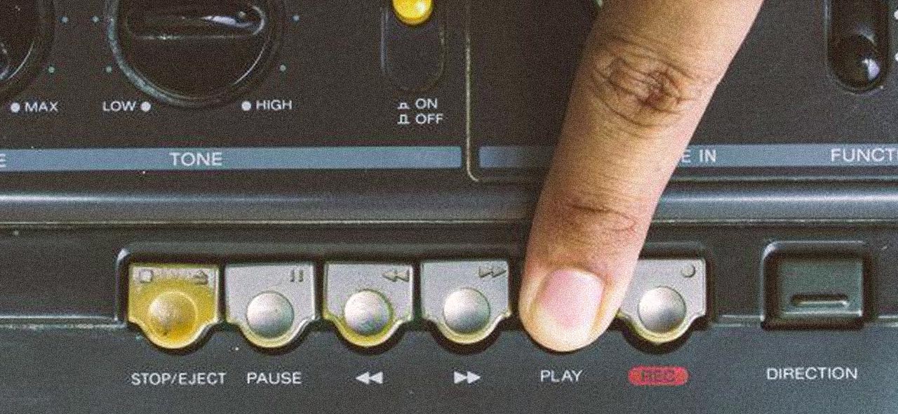
As for the icons and visual assets, nothing fancy. I stuck to the standard iOS icon set, using the tools available in the development environment. Staying native wasn’t just a choice—it was the foundation of the whole experience.


Apps Don’t Die — They Just Nap
A smart friend once told me: “Apps never really die, they just get neglected.” And yeah, I can fully vouch for that.
After we hit a stable, clean build and the audience seemed genuinely happy with the experience, I started running some light ads. I targeted countries known for strong iOS adoption, and the results? Surprisingly solid. Conversions were steady, user acquisition picked up, and then — the reviews started rolling in.
To our amazement, most of them were 5-star ratings. But even more humbling than the stars was the fact that people actually took the time to write thoughtful reviews. That meant something.
I posted a little throwback on Instagram recently — the app is sitting at around 600 reviews, with an overwhelming majority being 5-stars. Not too shabby for something that’s basically been idle for nearly two years.
Just for context: the app includes an optional subscription — $1.49/month or $9.99/year — purely to help cover cloud streaming costs. Nothing fancy. Just keeping the lights on, digitally speaking.
The version that lived on the App Store for over two years was light, slick, and simple. It did its job. And people appreciated it.
Then… life happened.
COVID hit. I had just moved homes, became a dad, and was grappling with anxiety, depression, and the loss of a close friend. The project inevitably faded into the background — not forgotten, but quietly waiting its turn again.


Why fix what isn’t broken?
So… why change a lofi radio app that was doing its job? Bringing in a consistent stream of users, mostly free, but covering its costs just fine?
Well, I finally got around to something I’d been putting off — rebranding everything. The label. The artist name. The visuals. I wanted consistency. A shared aesthetic across the board. A clear visual identity that actually felt like me.
Because here’s the thing: when you spend too much time on one part of a project, you start to miss the big picture. Tunnel vision kicks in. The edges blur. You forget what the forest even looked like while perfecting that one tree.
Thankfully, I had a good friend of mine (a WordPress design enthusiast-turned-lowkey guru) constantly calling me out — in the best way possible. Weekly reminders about tightening the brand, refining the look and feel, and most importantly: fixing my damn website. That’s where it all really started.
So yeah — thanks Jason. Love you, man.
From there, it was full-on prototyping mode. I followed the native structure of Apple Music as a base (again — users are creatures of habit), and kicked things off with a clean, minimal mockup. The discovery phase wasn’t hard this time — the vision was finally clear.

When Reality Kicks In
Not long after, I grabbed a couple of iOS devices and threw myself into Swift. Covid was slowly fading out, and I figured I’d use my downtime to learn something new — always a good idea… in theory. Eventually, I shifted over to Flutter — a hybrid framework that felt a little more forgiving — and made my first clumsy attempts at building something from scratch. It was messy, it was buggy, but it was mine.
Then reality hit. Between my day job, being a dad, running a music label, and trying to make music of my own, it became clear: there just weren’t enough hours in the day. Something had to give. Self-care? Out the window. I stopped paying attention to my health, ballooned close to 120kg, and felt burned out across the board. That’s when I made the call: I needed help. Real help. I had to let go of the idea of doing it all myself — and hand over development to someone who could really bring it to life.
And I did.
The review gauntlet (a.k.a. dealing with Apple)
If there’s one thing I wish someone had told me before diving into this whole app journey — it’s just how fun (read: unpredictable) the App Store review process can be.
Sometimes it feels like the reviewers are just vibing in a parallel universe. Other times, it’s like each new review round starts from scratch, with no memory of previous notes or context. One day you’re flying through approvals, and the next… radio silence. It’s a bit of a roller coaster — so keep a cool head and don’t take it personally.
Around April 2022, Apple started cracking down on what they called “outdated apps.” Basically, anything that hadn’t been updated in a while was getting the axe. And wouldn’t you know it — Pueblo Vista Lofi Radio hadn’t been touched in over a year (okay, maybe two), even though it was still racking up plays and had active subscribers.
So, what happened? TestFlight got nuked. No warning, just poof. (If you’re unfamiliar with TestFlight, here’s a quick link to learn more.)
The only move was to spin up a new version — I called it “New 2022” — and power through the process. We’re talking live testing, real-time bug squashing, resubmitting, and repeating. Eighteen builds later, and almost two months of back-and-forth, we finally had a stable version back on the store.
Lesson learned: app development takes patience, thick skin, and a realistic plan — especially when it comes to time and money. Keep your budget in check and roll with the punches.


Smooth sailing (for now 😎)
After all the back-and-forth, fixes, and a healthy dose of caffeine-fueled debugging, things finally reached a stable point. You know that rare moment in dev life when fixing one thing doesn’t break five others? Yeah, that’s where we landed.
The Pueblo Vista Radio App is officially out in the wild — running smoothly, looking clean, and keeping listeners happy. I pushed the latest update to the main app with zero backlash. No bug reports, no user drop-offs. Just a solid, light, and minimal app that does exactly what it’s supposed to: stream chill tunes without fuss.
What’s next? A handful of features lined up for post-summer to round out the experience. Plus, refactored versions for iPadOS and macOS are cooking — and yes, the long-awaited Android release is finally in the pipeline. Stay tuned.