GLOBAL WEB · UX/UI · 2012–2016 · shipped
Reorganising eyeo.com around a growing ecosystem of products, initiatives and audiences ~ then learning what happens when finished design cannot reach production fast enough.
SURFACE
Corporate website
Product ecosystem
ROLE
Visual Designer / UX/UI
Full design ownership
SCOPE
Information architecture · UX/UI
Visual design · Responsive · Prototyping
The website was only one part of the problem.
THE STARTING POINT
When I joined MED-EL in 2012, I knew how to make websites. I did not yet know how to think about them as products.
The information architecture and most UX decisions were already established, and as a new designer I trusted the senior people around me. My early contribution was much closer to web and visual design: working within an existing platform, learning how production behaved and gradually understanding why some decisions scaled better than others.
After roughly a year, that changed. I had enough context to form stronger opinions about structure, usability and how the wider ecosystem should work. The role became less about making individual pages and more about understanding the system around them.
The website before I joined
Earlier versions of medel.com, sourced from the Wayback Machine, show the design and technical context I inherited. These were not my designs.
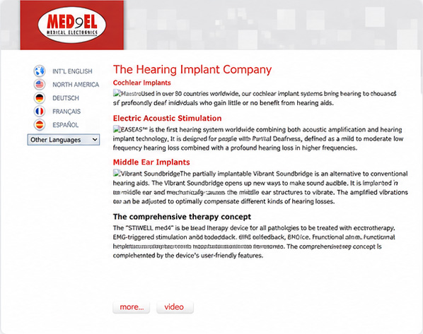
2009
Early corporate site
A simple, static corporate experience focused on products and company information.
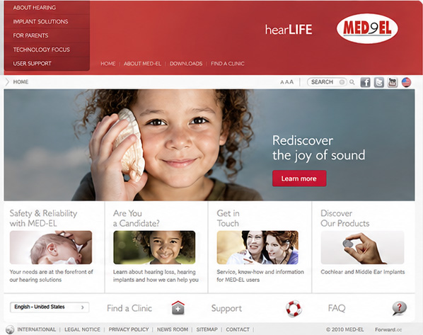
2010
Richer content + Flash
A more visual direction with expanded navigation, lifestyle imagery and richer media.
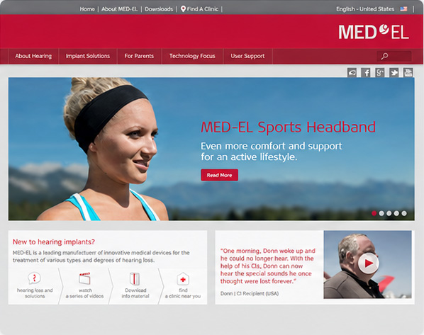
2012
The starting point
The version in production when I joined MED-EL in August 2012.
DESIGN DIRECTION
Design for the system
A page is only useful if the people and platform around it can keep it alive.
Treat content as product input
Language, translation and regional variation change the interface itself.
Push constraints deliberately
Understand what the platform can do before deciding where it needs to bend.
Document what repeats
If a decision keeps returning, it probably belongs in a shared system.
DESIGN DECISION 1/3
Design for fifty languages, not one finished screen
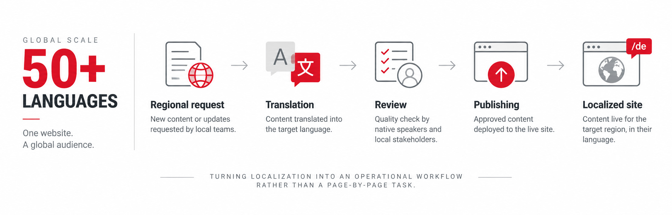
The ecosystem covered more than 50 languages, including regional variants such as Spanish for Spain, Mexico and Latin America, and Portuguese for Portugal and Brazil. New product launches created a constant stream of requests from regional teams.
In the early years, localization was remarkably manual: translations moved through Excel files and were copied page by page into each language version. Later, the workflow moved to dedicated translation management and an external agency platform.
Regional requirements reached the web team in different ways. I worked directly with several markets, including Italy, Spain and Greece, and occasionally Germany; other requests came through Territory Managers. That made localization more than translation. Regional teams brought different content needs and launch requirements, while Arabic in particular introduced right-to-left layout problems and some character sets exposed issues that were invisible in the original English designs.
That experience changed how I understood interface design. Localization was not a final production step. Different languages changed line lengths, hierarchy, maintenance effort and the practical limits of a layout. Designing the page meant designing for what happened after the English version was finished.
DESIGN DECISION 2/3
Use a smaller ecosystem to rethink the whole experience
HearLife Clinics became the first place where I had much broader ownership. Moving the sites to WordPress was my proposal. IT handled the technical migration, while I took ownership of the information architecture, UX and UI of the new experience.
The new structure grew from an inventory of the existing site and repeated discussions with the project manager, who consolidated requirements, pain points and needs from the clinical stakeholders. Reliable analytics were not available, so I did not pretend the redesign was data-led; the information architecture was built from the existing content, stakeholder knowledge and the operational realities of the clinics.
The change also reduced the distance between design and publishing. The project manager could manage content directly in WordPress, reusable templates made updates faster, and the experience was less dependent on a developer for routine publishing. My role remained hands-on through delivery: after a direction was reviewed, I implemented the front end in HTML and CSS, checked responsive behaviour across desktop, tablet and mobile, and handled localization issues as part of QA.
The goal was not only a more responsive website. I wanted the content owner to be able to manage the site without depending on us for every change, so the workflow included a practical draft-and-review model for creating and updating content.
It was an early lesson in something I would keep returning to later: the interface is only one surface of the product. The publishing model, ownership and maintainability matter too.


DESIGN DECISION 3/3
Document the interface before anyone asked for a design system
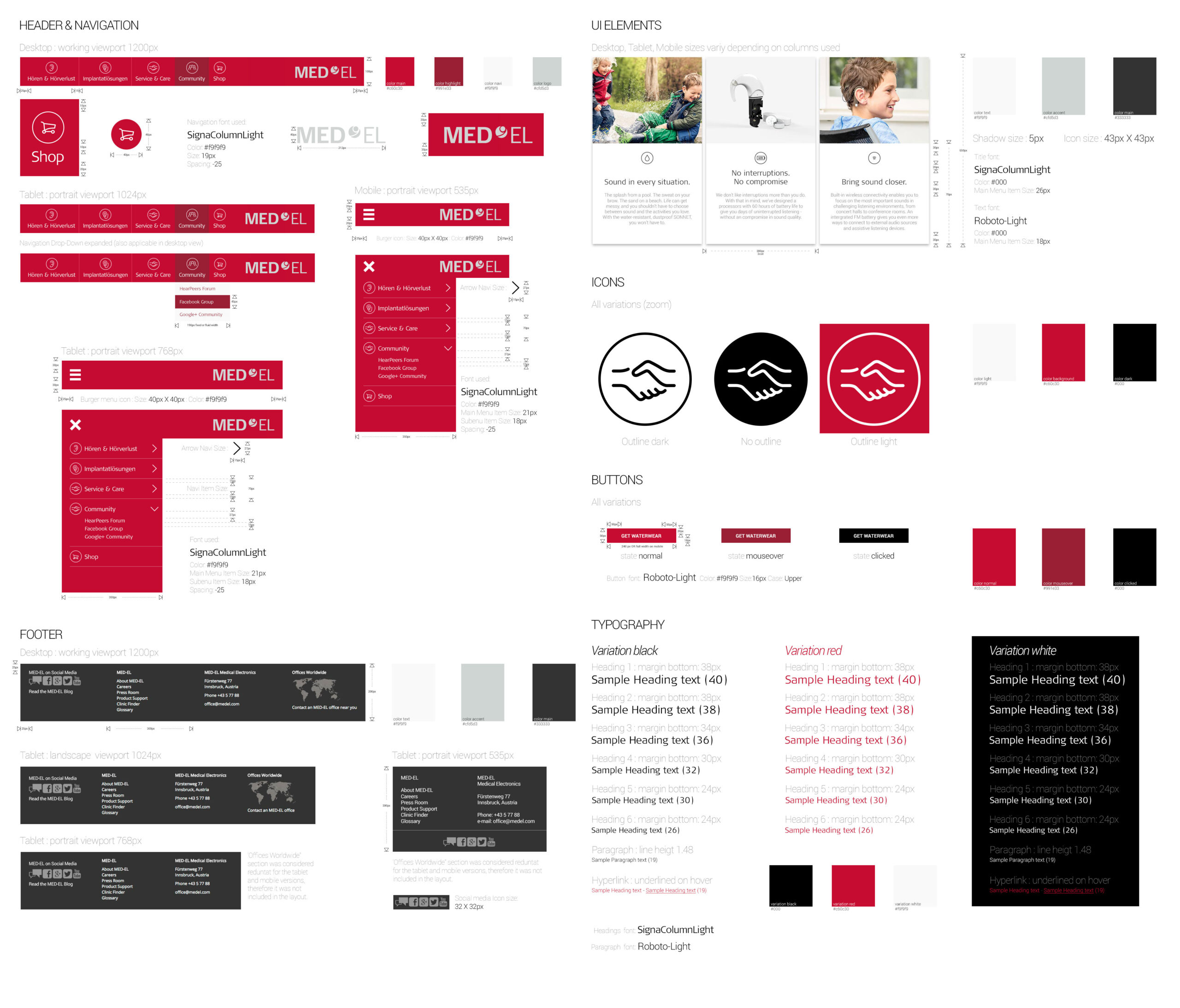
By 2016, recurring UI decisions were becoming impossible to ignore. Navigation across breakpoints, typography, buttons, icons, colours and page patterns kept returning in slightly different forms.
Nobody asked me to create a design system. I started documenting those decisions on my own because I wanted to present the interface as one coherent whole instead of solving the same problem again on every page.
I did not have today’s vocabulary for tokens, governance or component libraries. But the instinct was already there: repeated decisions should become shared rules.
FROM CONSTRAINT TO SHIPPED DIRECTION
Toward the end of my time at MED-EL, the corporate website moved away from the older custom platform to a vendor CMS with Bootstrap on the front end. The new setup created more room for responsive structure and modular page composition.
Working in medical technology also meant that visual freedom sat inside a tightly controlled content environment. Product claims and medical information passed through approval processes and could become outdated as the market changed. It taught me to treat regulatory and content constraints as part of the interface rather than something applied after design.
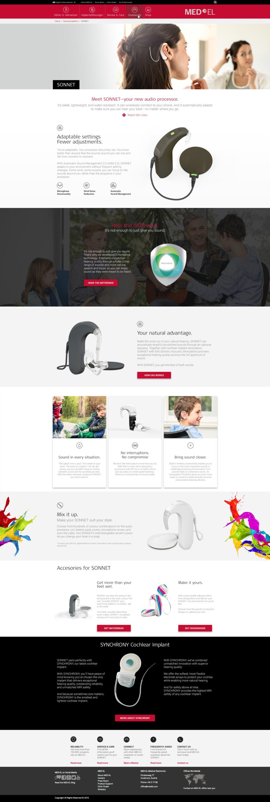
I used the SONNET product page as a personal exploration of what that could enable: moving away from the familiar banner, copy and CTA rhythm toward a richer product story with clearer hierarchy, modular sections and layouts designed across desktop, tablet and mobile.
I presented the direction shortly before leaving MED-EL. It was not simply an unused concept ~ after I left, I saw the same underlying visual and structural direction appear on the live MED-EL site. The individual product pages have evolved since then, but the design language remained recognisably connected to that proposal. For me, it marked the point where the lessons from the previous four years finally came together in one piece of work.
OUTCOME · adopted & shipped
GLOBAL SCALE
50+ languages and regional variants
OWNERSHIP
HearLife IA · UX/UI · content model
SYSTEM THINKING
Self-initiated interface documentation
REFLECTION
When I joined MED-EL, most of what I understood about design was instinctive. I had no formal design education, no established process and very little vocabulary for explaining why one solution worked better than another.
Four years later, I was thinking beyond the finished page: how an interface behaved across screen sizes, how translations changed it, how content got published, which decisions could be reused and whether the people maintaining the system could work without depending on a designer every time.
The biggest change was not that I had learned every answer. It was that I had learned how to look for the system behind the screen.
By 2016, I still had a lot to learn. But I had learned how to learn. That may have been the most important thing MED-EL gave me.