A secure, web-based portal designed for healthcare professionals like audiologists, ENT surgeons, and clinical staff.
PROJECT
myMED-EL for Professionals
ROLE
Lead Design, UX/UI, Research
PERIOD
2013–2015 · Shipped
Due to professional restrictions and / or the collaborative nature of these projects, specific research artifacts (e.g., user flows and interviews, heatmaps, internal documentation) cannot be shared; illustrative artifacts will be used instead. This case study focuses on design rationale, visual direction, and my role in the creative process.
1. Project Start
Between January 2013 and August 2015, I worked on the redesign and consolidation of myMED-EL for Professionals, a secure portal for audiologists, surgeons and other clinical partners. I was the lead designer on the project. The work covered how professionals accessed training, downloaded software such as MAESTRO and found material that had previously been spread across different parts of MED-EL’s online presence.
The portal had to work across different user types and languages, while fitting the security and regulatory requirements around a medical-device company. I worked with clinical trainers, regulatory stakeholders and the digital team in Innsbruck while the portal was being redesigned and built.
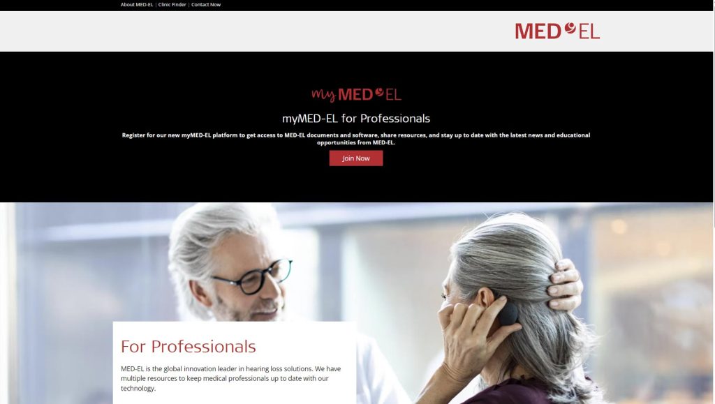
myMED-EL for professionals home page
2. Research
Research included stakeholder interviews, a content audit and the usage data we had available. I spoke with audiologists, clinical trainers and internal support staff about how they were using the existing material. Finding fitting software came up repeatedly: downloads could sit behind inconsistent menus or outdated links, alongside a large amount of documentation spread across separate pages.
We also used a simple card-sorting exercise while reorganising the resources. I mapped journeys for different roles, from an audiologist working in a private clinic to people working inside larger institutions. That work fed into decisions around access, localisation and onboarding.


Competitor dashboard references
3. Ideation
I used lightweight personas and user journeys to work through how audiologists, clinic administrators and MED-EL trainers would use the portal. We also mapped the systems behind it, including Salesforce, SFTP, regulatory content and training systems, because several of the things users saw in the interface depended on those connections.
I started with low-fidelity wireflows and later built mid-fidelity screens in Adobe’s Project Comet, which eventually became Adobe XD. We reviewed the work regularly with the team in Innsbruck. During that process, onboarding was reduced to a three-step wizard rather than asking new users to work through the portal without much guidance.
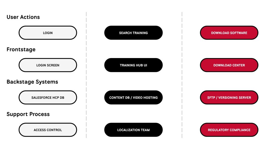
Service Blueprint Visual // user → system → regulation
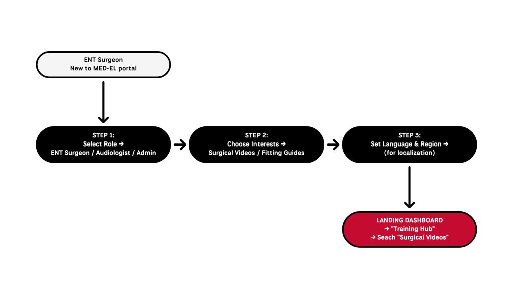
Onboarding Wizard Flow
4. Concepts
Once the main flows were in place, I started working through different interface directions.
- Modular Onboarding Wizard:
Introduced a streamlined, role-based onboarding flow to collect user context (e.g., profession, implant focus, language preference) ~ reducing friction and enabling personalized dashboard content from the first login. - Card-Based Dashboard Layout:
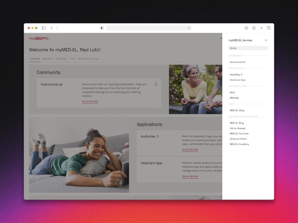
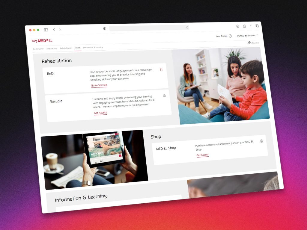
Designed a lightweight interface with core actions (Software Downloads, Training Hub, Resource Library) surfaced as interactive cards. Emphasis was placed on clarity, hierarchy, and adaptability across devices. - Exploratory UI Prototypes:
Tested more dynamic ideas like a draggable “resource shelf,” but deprioritized them due to performance concerns and the need for reliability in clinical environments. - Persistent Sidebar Navigation:
Final direction included a fixed, minimal sidebar allowing users to quickly jump between modules without losing orientation ~ ensuring role-specific workflows remained intuitive and efficient.


mid-fidelity mockups
UX Thinking in Action
The concepts were reviewed against the tasks we had heard about during research and the technical limits of the portal.
5. Implementation & Delivery
After the designs were approved, I worked with development and QA during implementation, including responsive behaviour and the different language versions.
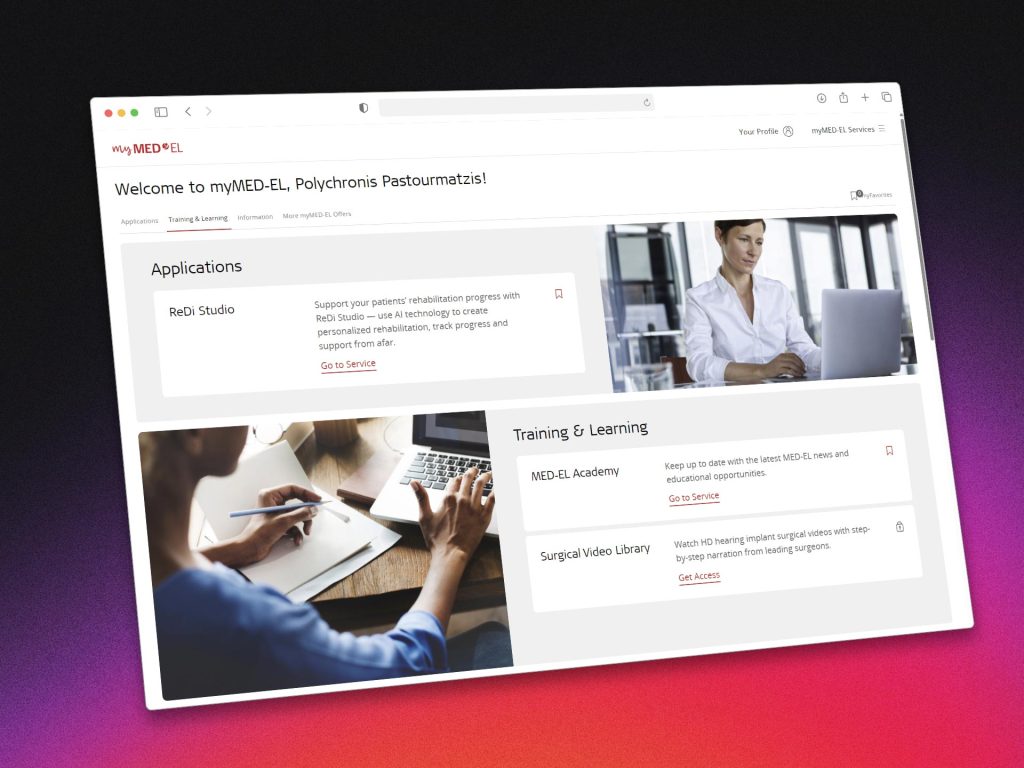
The modular onboarding wizard was implemented first, feeding user preferences directly into personalized dashboard states. Core modules ~ including the Download Center and Training Hub ~ were rolled out in stages, with built-in analytics hooks to track engagement and friction points from day one.
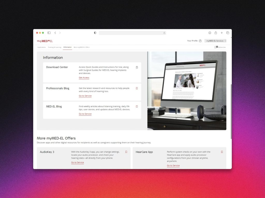
The dashboard was organised into separate cards for software downloads, training and other frequently used resources.
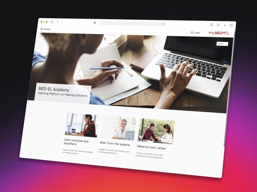
We ensured regulatory compliance by collaborating with legal and clinical documentation teams, particularly for GDPR, EU MDR, and HIPAA considerations.
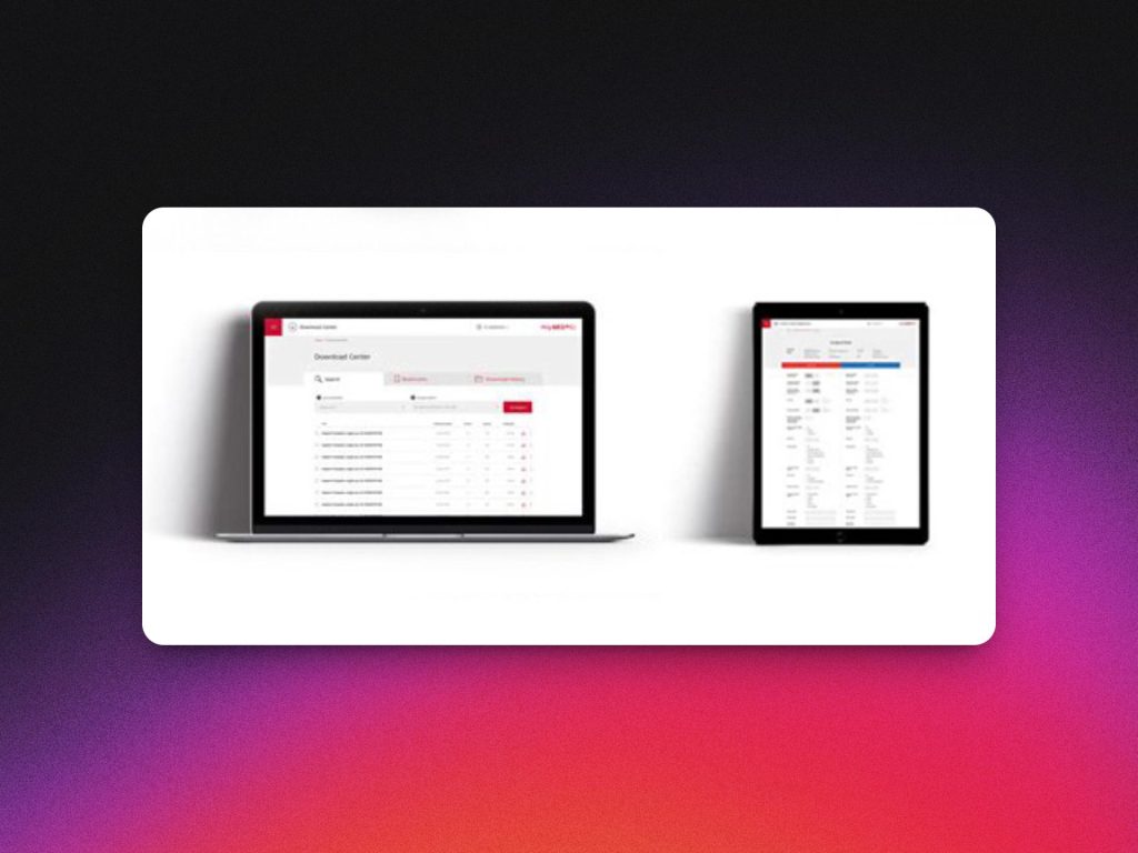
The platform launched initially in English and German, followed by 9 additional language variants. Internal feedback from clinical trainers was overwhelmingly positive, especially regarding the reduced complexity in guiding new partners through setup.
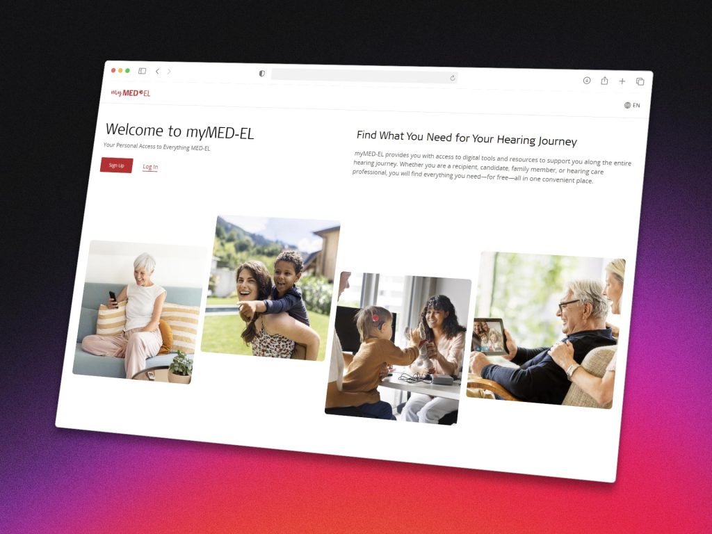
After rollout, we saw fewer support requests from people who couldn’t find resources in the portal.
6. Retrospective
This was the first time I had worked on a product specifically for healthcare professionals. Their day-to-day context was very different from a public website: they were logging in to find software, training or documentation and usually had a specific task they wanted to finish.
The work involved clinical trainers, regulatory, development and localisation, so changes often had consequences outside the interface itself. One piece of feedback I remember was that trainers found it easier to guide new clinics through setup after the new onboarding was introduced.
If I were to revisit this project, I’d love to go deeper into personalization based on implant types, and explore lightweight ways to visualize patient progress as part of the HCP experience.