BRAND IDENTITY · PACKAGING · 2024–2025 · SHIPPED
Building a Greek food brand from the ground up ~ from naming and research to an identity that could stretch across olive oil, olives and herbs.
SURFACE
Brand identity
Packaging
ROLE
Brand Designer
Art Direction
SCOPE
Naming · Research
Identity · Packaging
Visual system
The strongest source material was already there ~ in the land, the trees and the story behind them.
THE CHALLENGE
Platolea began with no existing brand to inherit. I was responsible for creating it from the ground up ~ from the name and visual identity to the packaging system and individual product labels.
The challenge was broader than designing an olive oil bottle. The identity needed to feel rooted in Greek agricultural tradition while working across a growing family of products including olive oil, olives and herbs. It had to communicate provenance without becoming nostalgic, and feel refined without losing the character of the land behind it.
Research combined first-hand observation with market and cultural references. I visited the area and olive groves, gathered context directly from Stathis Karakalpakis, and studied regional imagery, Greek visual references and the packaging language surrounding artisanal food products.
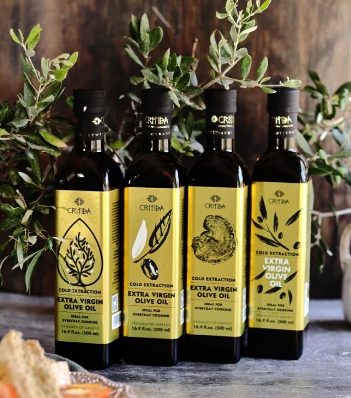
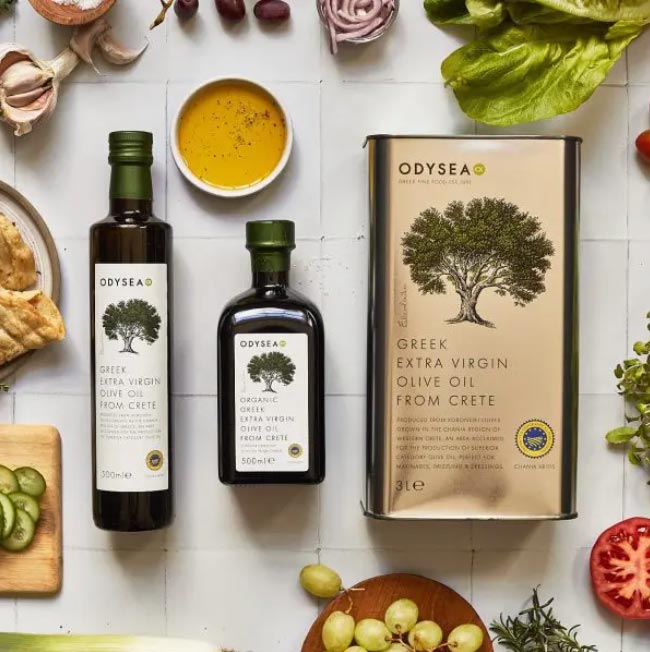
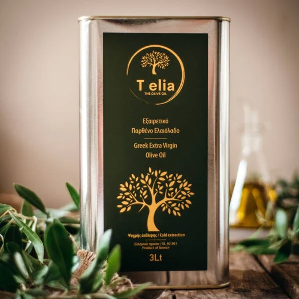
Early visual research ~ looking for a language that could feel rooted without becoming nostalgic.
BRAND DIRECTION
Let the place lead
Use the actual land and its stories as source material rather than applying generic Mediterranean cues.
Heritage without nostalgia
Reference history and agricultural tradition without making the brand feel old-fashioned.
One identity, many products
Build a system flexible enough to move from olive oil to olives and herbs without losing recognition.
Design for the shelf
Keep the core identity distinctive when applied to physical products, different formats and changing amounts of information.
BRAND DECISION 1/3
Turn a story about the land into the identity
The name began with a story connected to Plato and the olive tree ~ a local narrative about the philosopher resting beneath the shade of an olive tree. Rather than treating that story as decoration, it became part of the conceptual foundation for Platolea: a name designed to connect place, olive culture and a longer Greek cultural memory.
The symbol came from something even more immediate. During my visit to the olive grove, one of the old trees stood out for its twisted trunk and irregular silhouette. Its form became the visual starting point for the logo. Instead of drawing an idealised olive tree, I developed the mark from a tree that actually belonged to the landscape behind the product.
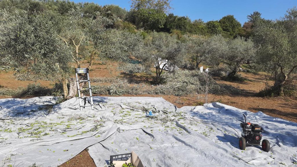
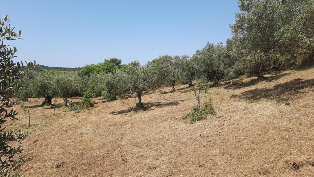
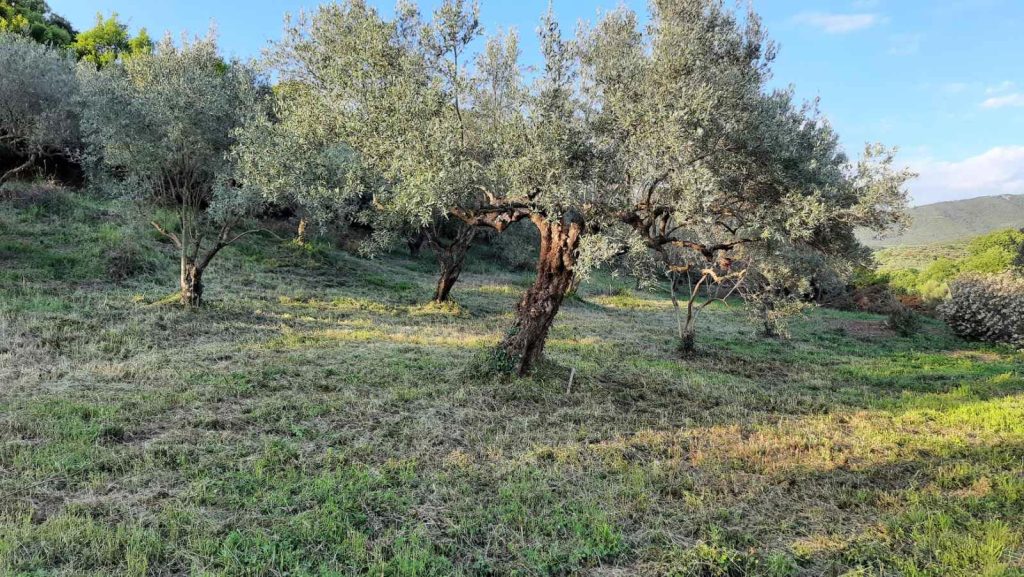
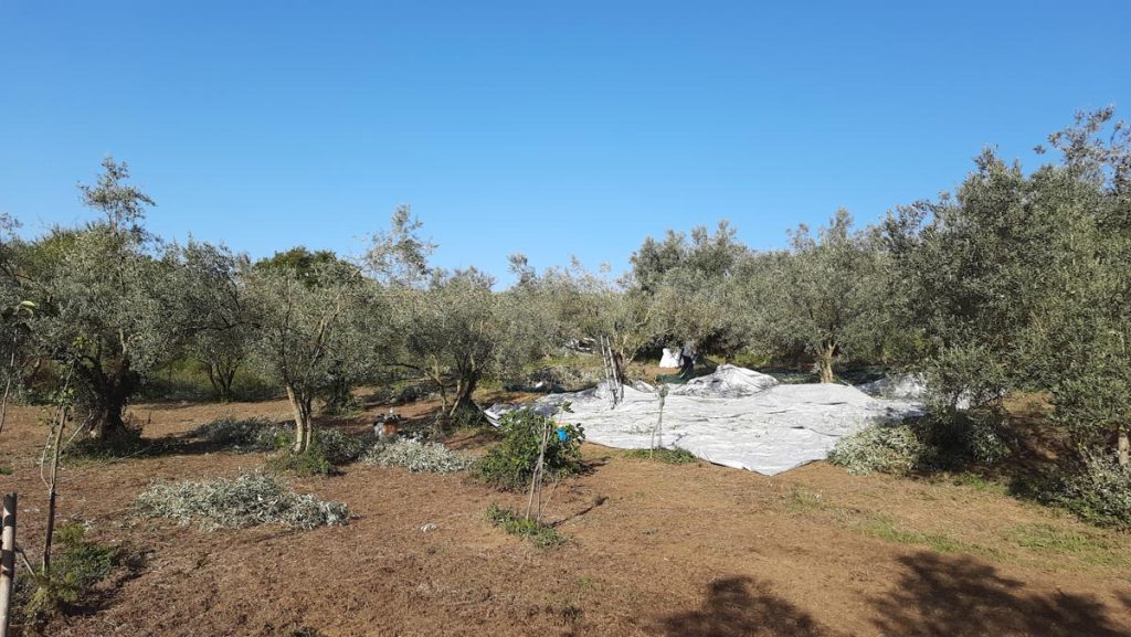
The actual landscape behind the product became source material for the identity.
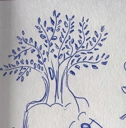
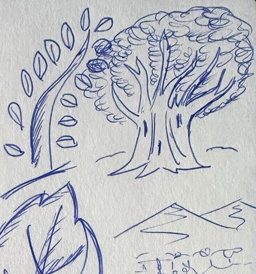
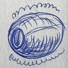
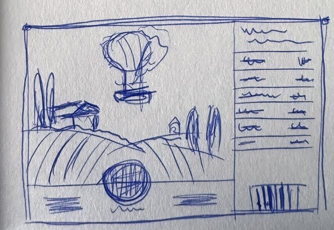

From observation and early sketches to a reproducible vector mark.
BRAND DECISION 2/3
Build a language around the mark, not just a logo
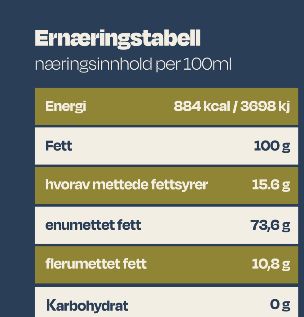
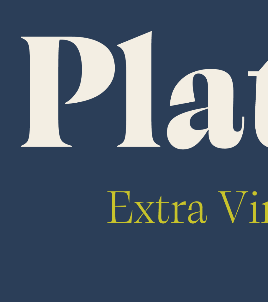
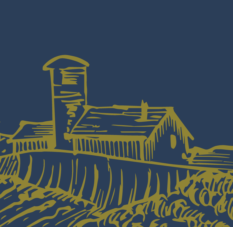
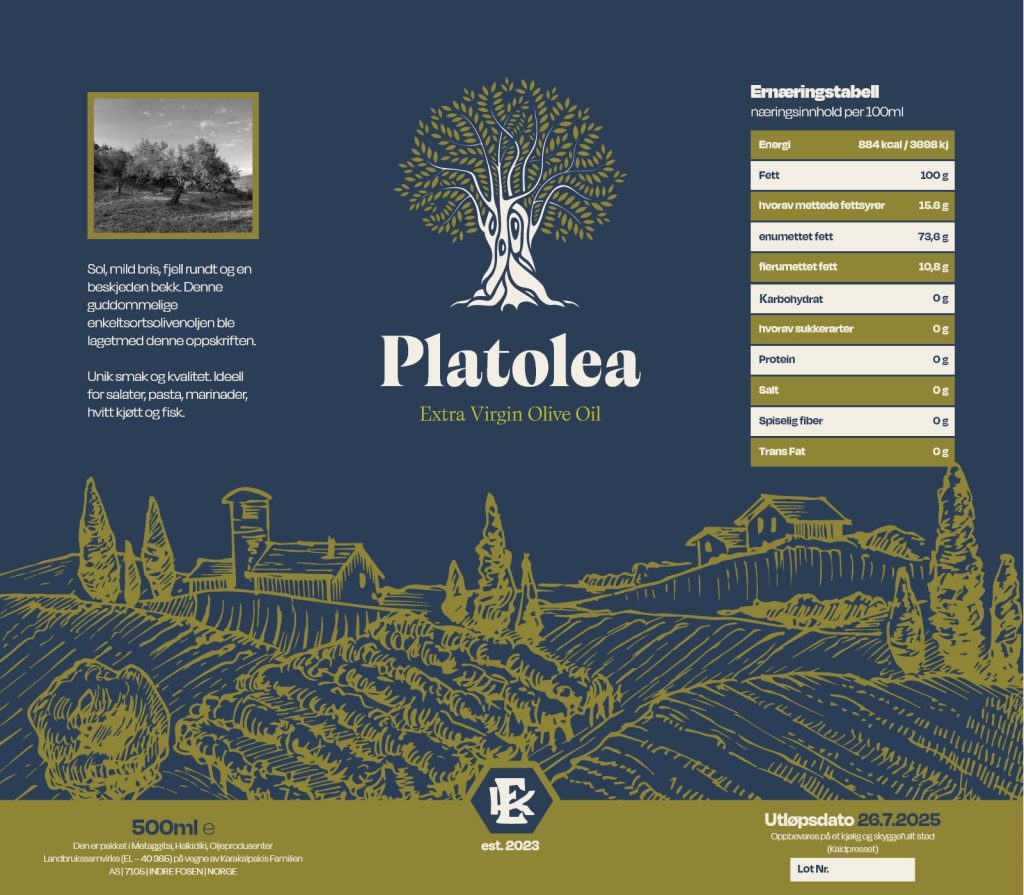
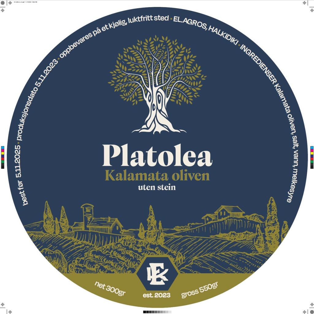
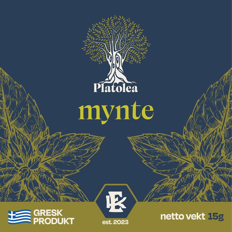
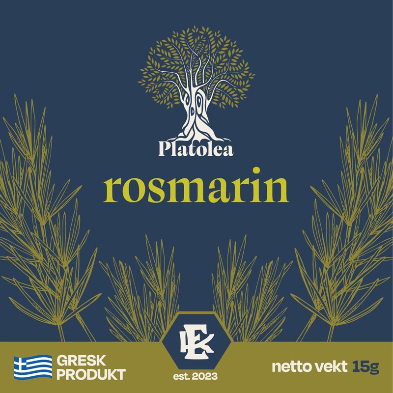
The tree gave the brand a recognisable centre, but the identity needed enough range to work beyond the logo. I built the wider system around earthy colour, expressive typography and illustration that could carry the agricultural character of the brand without relying on photography at every touchpoint.
The combination of Calvino Grande, restrained supporting typography, natural colour and hand-drawn elements created a visual language that could move between premium and informal applications. The objective was consistency without making every product look identical.


BRAND DECISION 3/3
Design a system that could stretch across the range
Platolea was never going to live on one bottle. The range expanded across olive oil, olives, herbs and different pack sizes, which meant the identity needed rules rather than a collection of isolated labels.
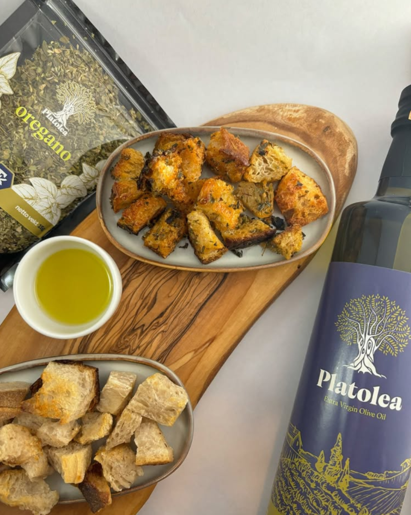
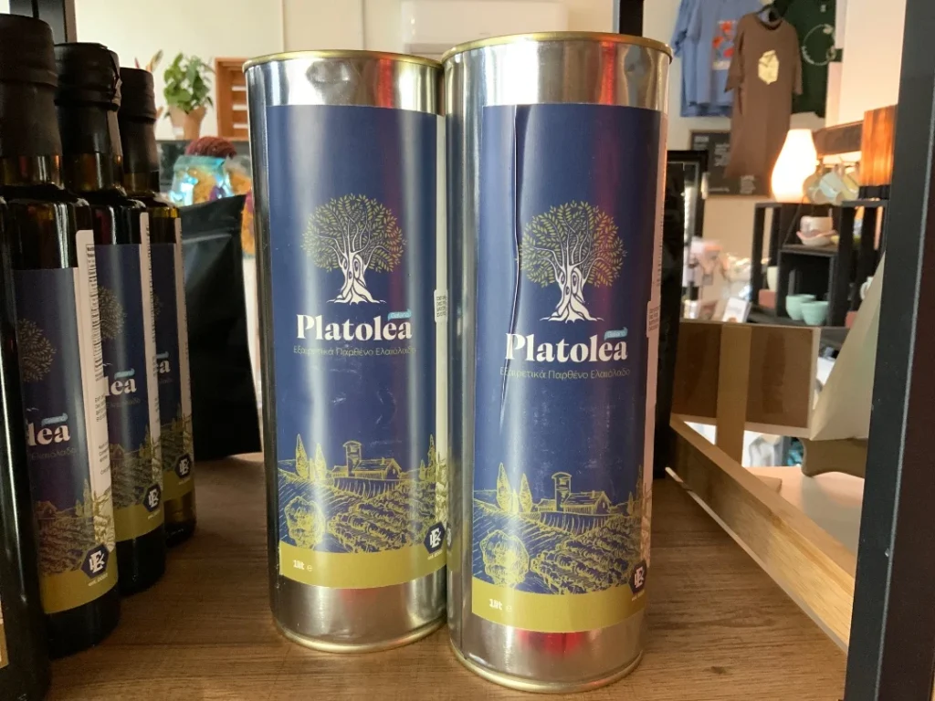
I designed the packaging and individual labels across the product family, keeping the core identity stable while allowing format, product information and category cues to change. The challenge was to make a small herb pouch and a bottle of olive oil unmistakably part of the same brand without forcing them into exactly the same composition.

OUTCOME · shipped
PRODUCTION
Identity and packaging shipped across the product range
INTERNATIONAL REACH
Products sold beyond Greece, including Norway and Canada
SCALABLE SYSTEM
One identity extended across olive oil, olives, herbs and multiple formats
REFLECTION
What made the project work was not inventing a story and then finding visuals to support it. The useful material already existed in the place itself ~ the olive grove, the old tree, the agricultural context and the stories surrounding the land. The design became stronger when I stopped treating those things as decoration and started treating them as source material.
What I learned
A brand system becomes useful when it can absorb change without losing its identity. Platolea began with one story and one mark, but it had to survive different products, packaging formats and markets. That shift ~ from designing a logo to designing a language ~ became the most valuable part of the project.
The land did not need a story invented for it. It needed a visual language that could carry the one it already had.