DIGITAL BRAND · UX/UI · 2021–2022 · PARTIALLY IMPLEMENTED
Extending eyeo’s new visual language into a distinct digital experience for Acceptable Ads ~ from information architecture to an original illustration system.
SURFACE
Corporate / initiative website
Digital brand system
ROLE
Product / Visual Designer
Illustration · UX/UI
SCOPE
IA · UX/UI · Illustration
Visual system · Components
The useful question was not how to make Acceptable Ads look different from eyeo. It was how to make the two feel related without becoming the same product in different colours.
THE CHALLENGE
Acceptable Ads followed directly from the eyeo rebrand. The overall design language was already taking shape, but this was a separate initiative with its own identity, governance and audience. The job was to extend the new system without simply cloning the parent brand.
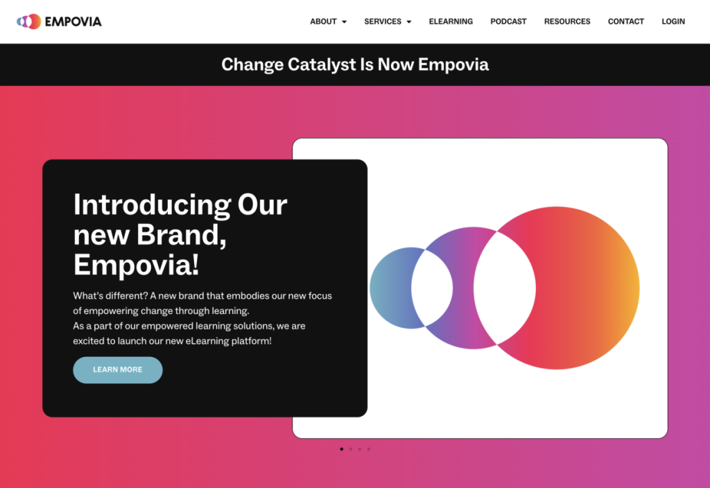
The existing navigation gave us a starting point. Through meetings with eyeo and the Acceptable Ads Committee, plus the same research model used on eyeo.com, we reviewed where the structure still worked and where hierarchy, calls to action and content relationships needed to become clearer.
The UX researcher led the formal analysis. I participated throughout the process, reviewed findings and recorded reactions, contributed to the navigation decisions, and owned the digital visual execution ~ including the illustration system shown throughout this case study.
DESIGN DIRECTION
Extend the system, change the character
Reuse what worked from eyeo while giving Acceptable Ads a recognisable identity of its own.
Make abstract ideas visual
Use illustration to communicate fairness, transparency and user choice without falling into generic ad-tech imagery.
Reduce room for interpretation
Define visual and component rules clearly enough to survive handoff and implementation.
Keep what already worked
Do not redesign established structures simply to make the project feel new.
DESIGN DECISION 1/3
Extend a system without cloning the parent brand
Because the project followed the eyeo redesign, starting again from zero would have thrown away useful work. Instead, I treated the eyeo system as a shared foundation and changed the elements that needed to give Acceptable Ads its own character.
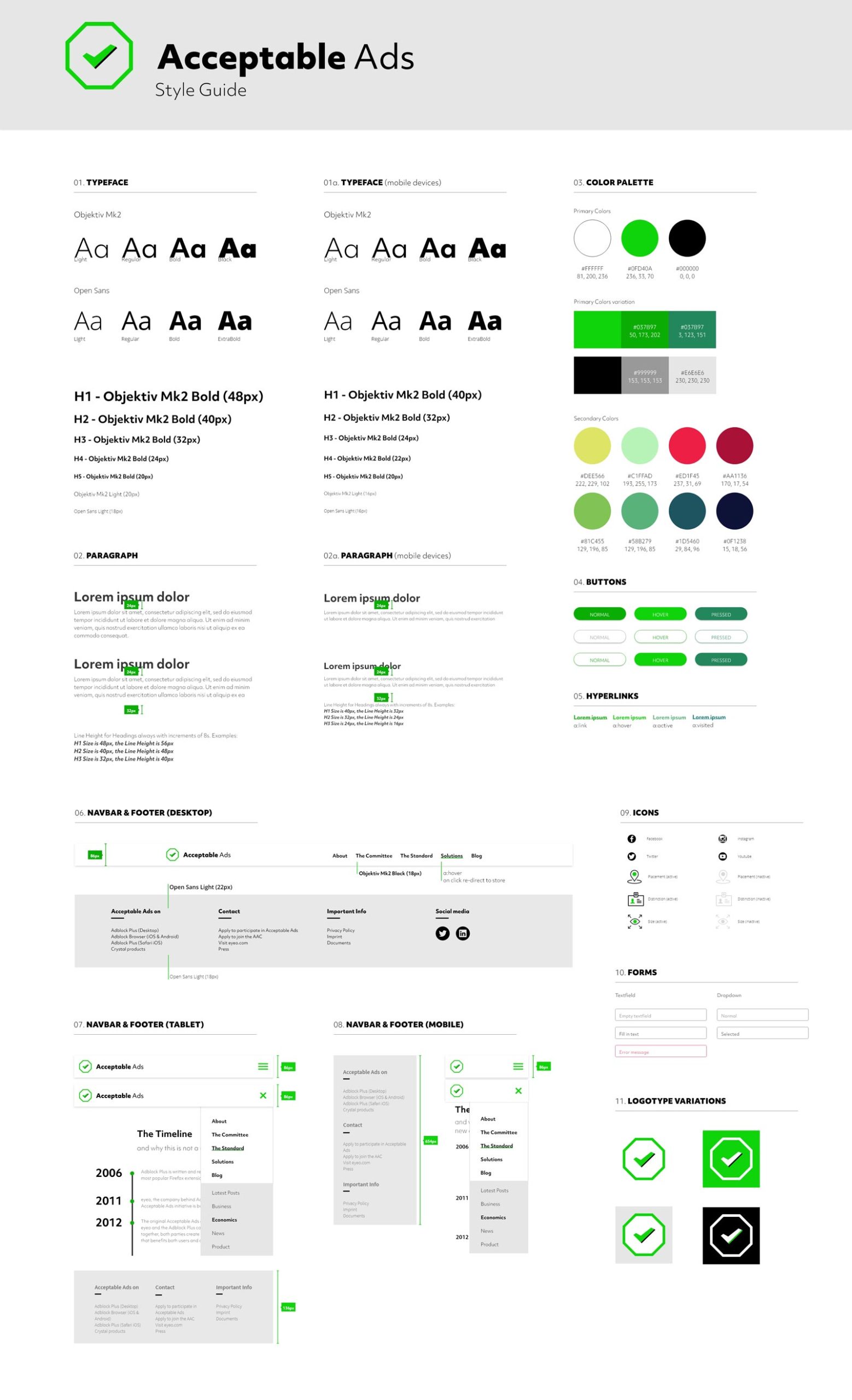
We settled on a strict four-colour palette that echoed the broader eyeo language while remaining recognisably different. Typography, spacing and component logic could stay familiar; colour, illustration and composition carried more of the identity.
This gave the two experiences a family resemblance without making Acceptable Ads feel like a themed section of eyeo.com.
DESIGN DECISION 2/3
Make an abstract initiative understandable through illustration
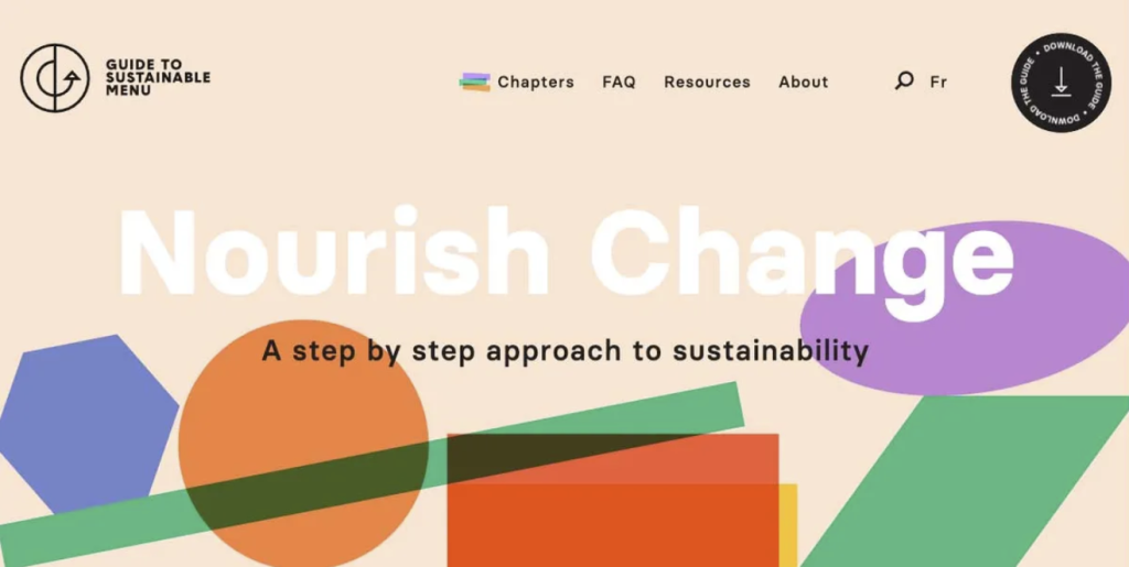
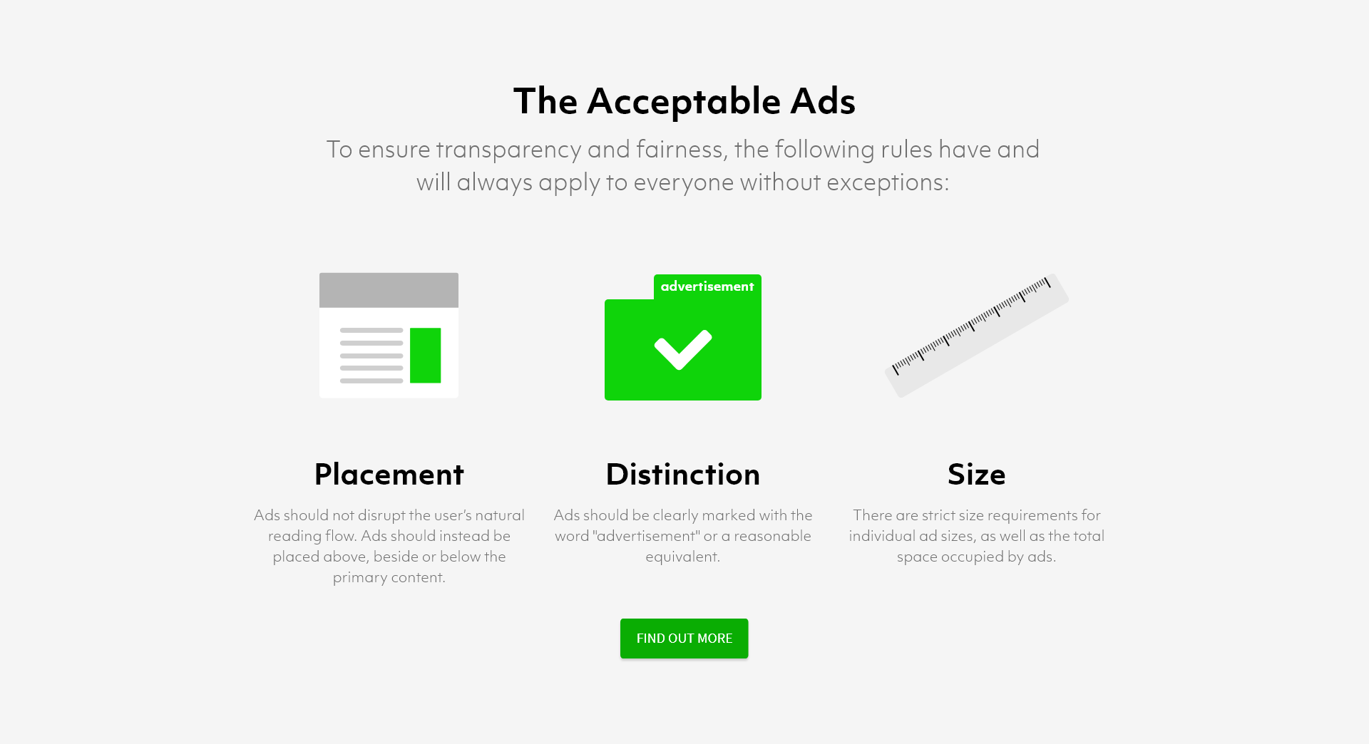
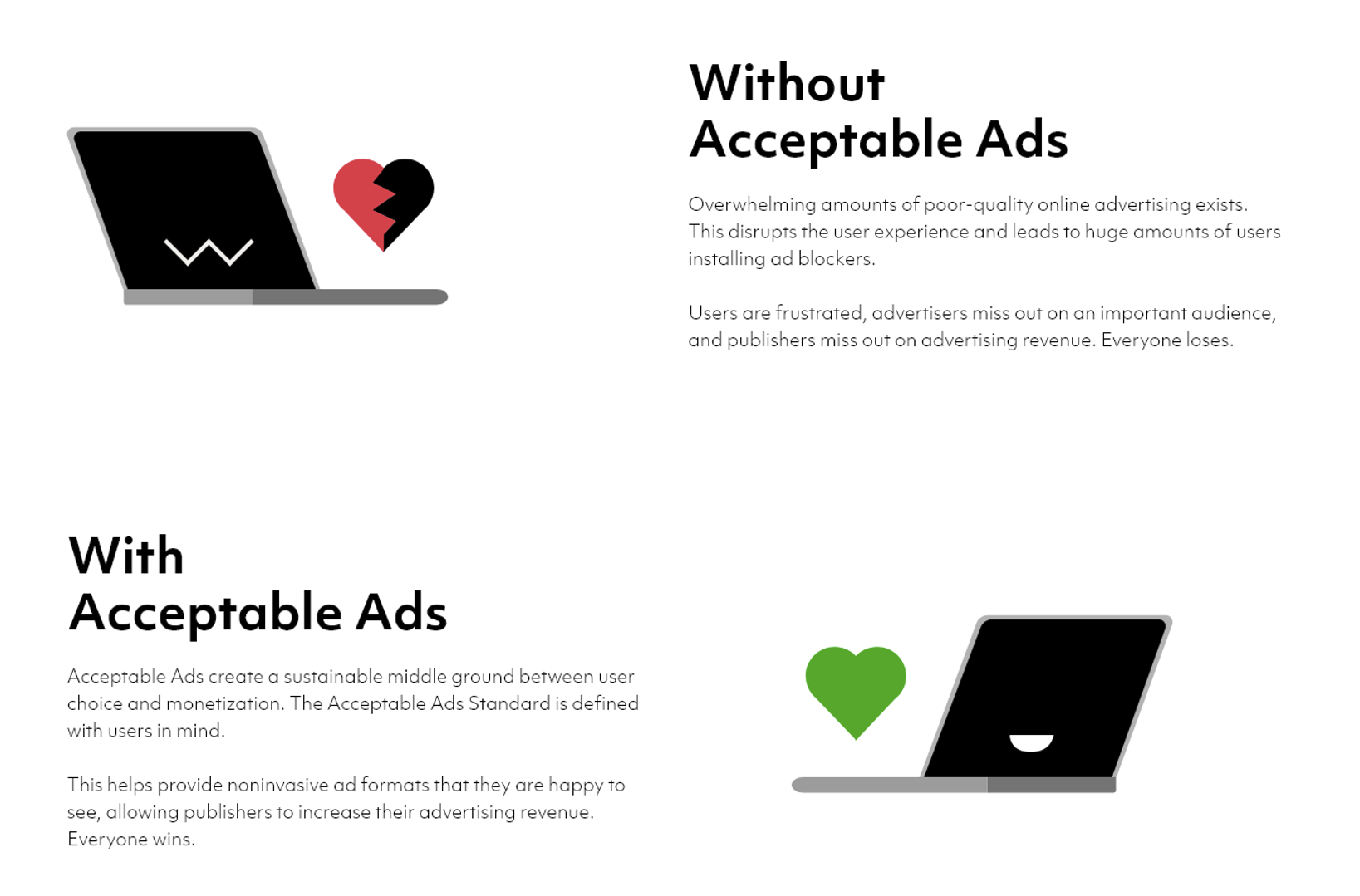
Acceptable Ads is conceptually difficult to visualise. Fairness, non-intrusive advertising, transparency and user choice do not naturally produce obvious interface imagery. Stock photography would have made the experience more generic, while literal ad-tech imagery quickly became technical or clichéd.
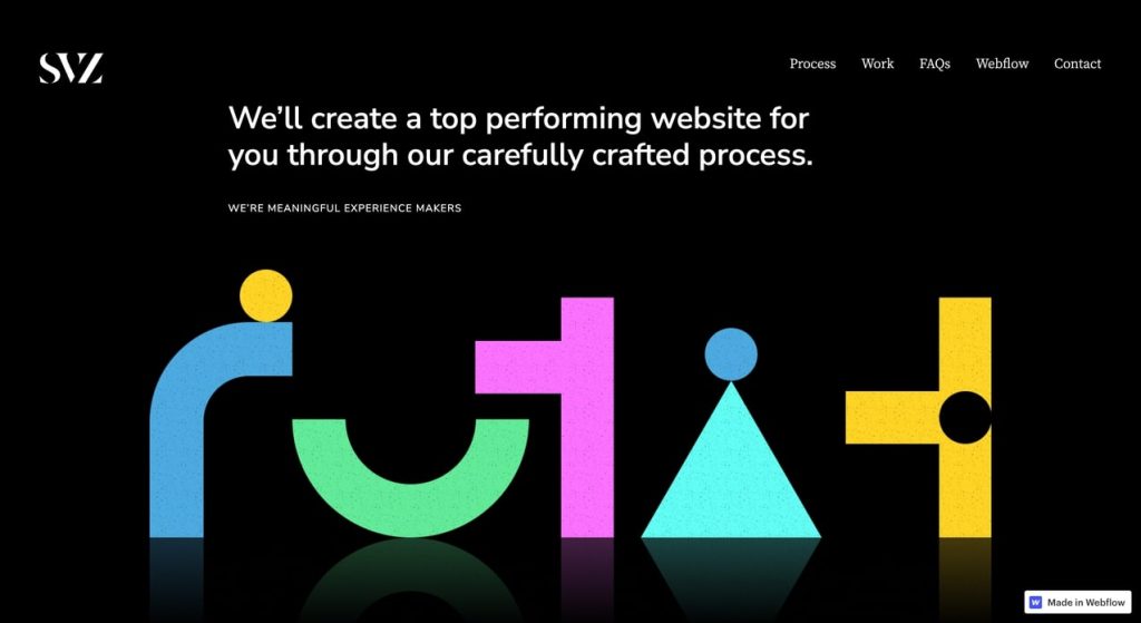
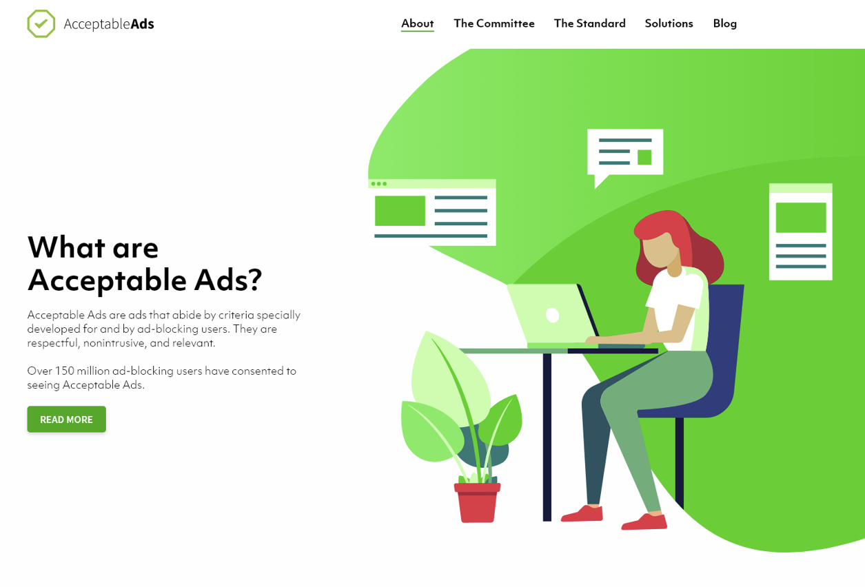
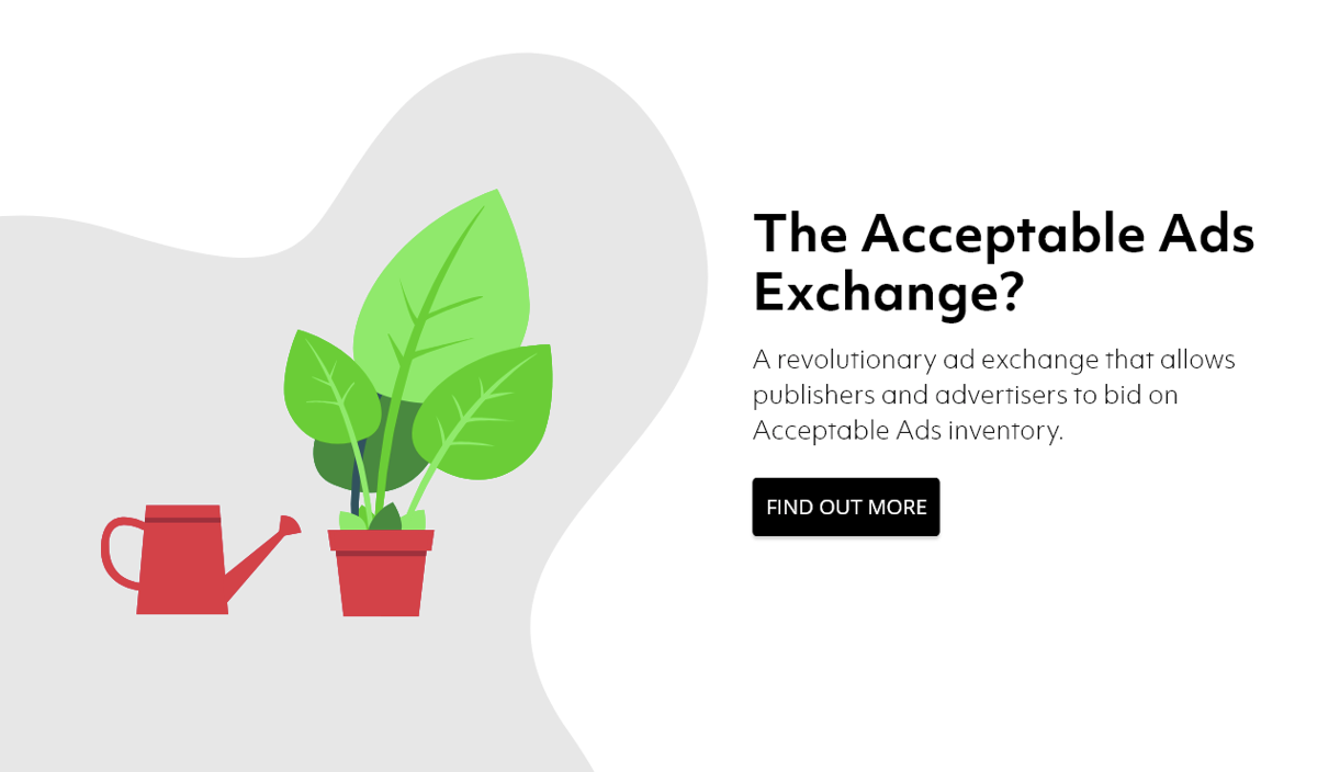
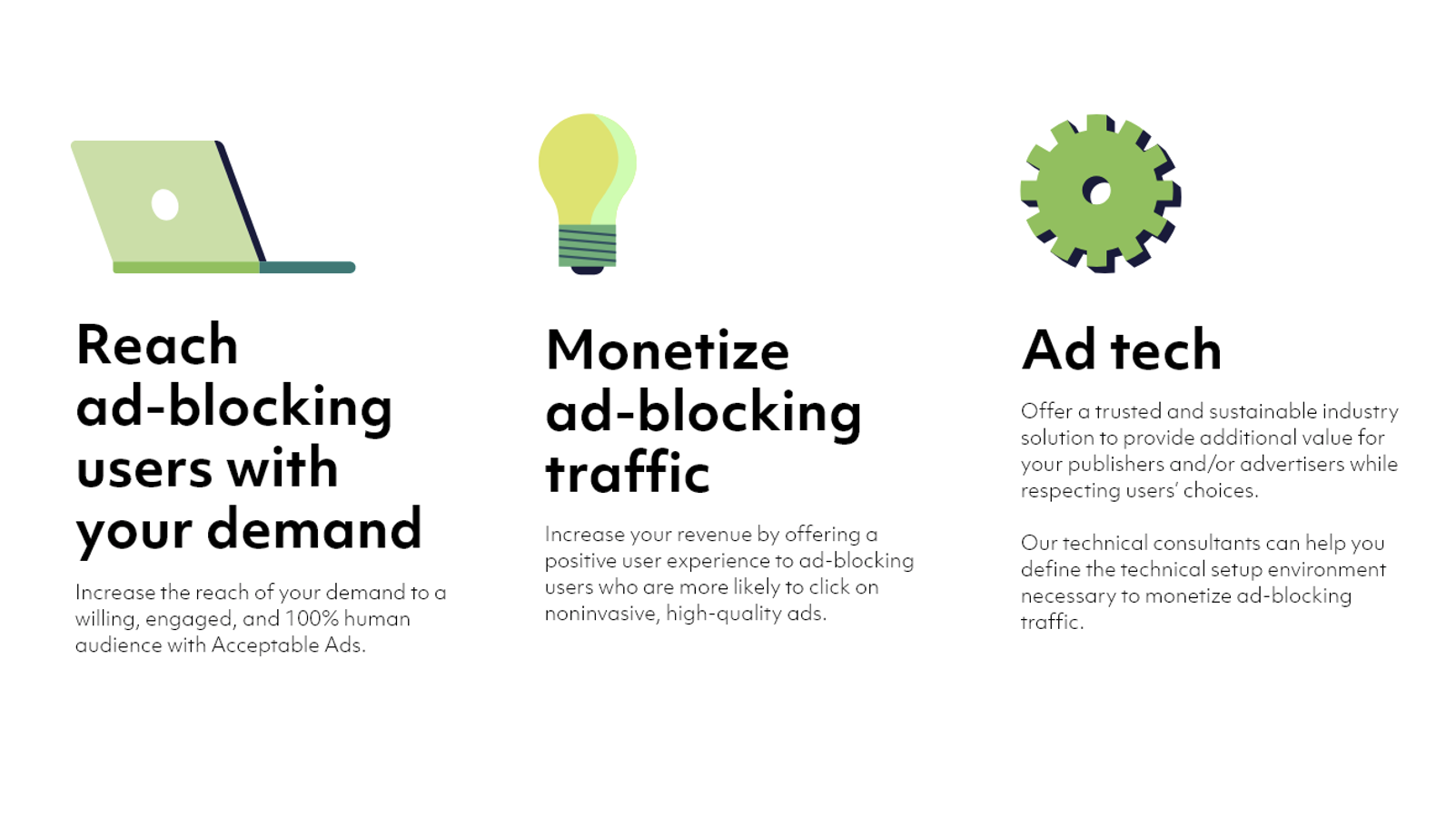
I created the illustration language myself, using simple forms, limited colour and metaphorical scenes to give those ideas a recognisable visual vocabulary. The illustrations were not a decorative layer added after the interface; they became part of how pages introduced and separated concepts.
I explored several relationships between illustration and copy ~ from more playful hero compositions to quieter explanatory layouts ~ then tested them against real content and different page structures.
DESIGN DECISION 3/3
Make the intended system difficult to misinterpret
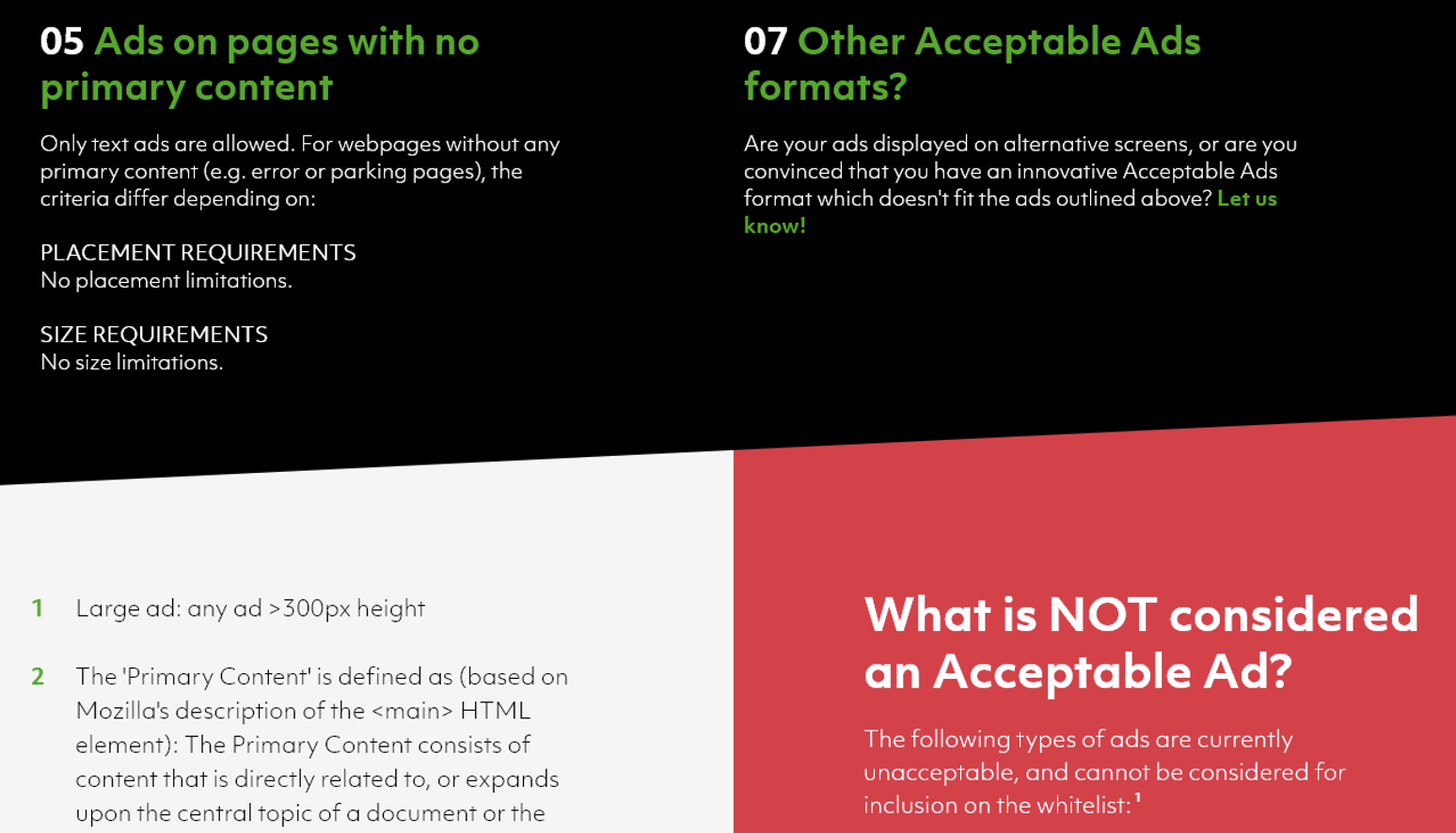
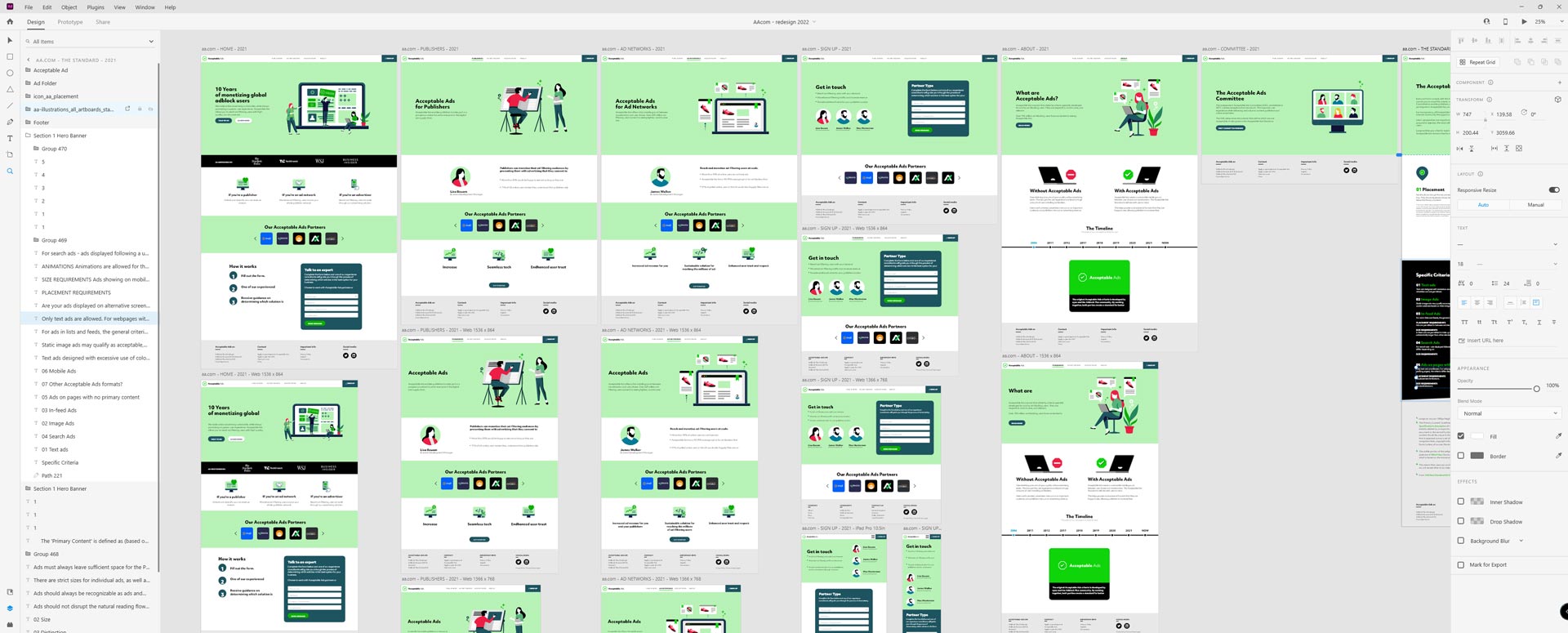
Once the visual direction was established, the work became less about finding another style and more about reducing ambiguity. The palette was deliberately limited, components were repeatable, and spacing and hierarchy followed explicit patterns.
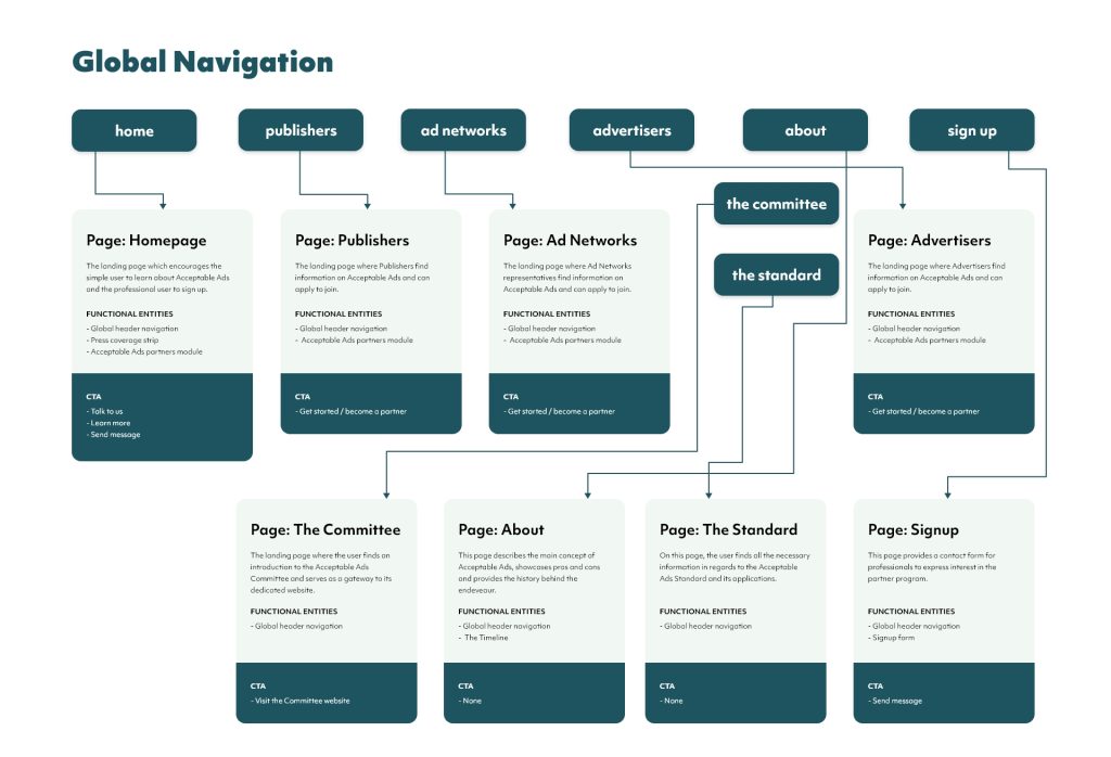
The navigation evolved from the previous site rather than being reinvented for its own sake. After stakeholder and UX discussions, we flattened and reorganised the parts that needed clarification while preserving familiar structural patterns where they still worked.
Accessibility requirements and contrast checks were part of that system thinking. The goal was not to create endless options, but to make sensible defaults obvious enough that future pages could stay coherent.
VALIDATION BEFORE DELIVERY
As with the eyeo redesign, research was collaborative rather than something I owned alone. The UX researcher conducted the formal analysis and shared findings with the team; I participated in reviews, watched recorded reactions and questionnaires around design directions, and used those findings during iteration.
By that point the design language itself was relatively stable. Most discussions were no longer about the overall direction, but about details such as colour usage, component sizing and how individual content needs fitted inside the system.
WHEN THE SYSTEM MEETS IMPLEMENTATION
The design system was deliberately explicit: limited colours, reusable components, defined spacing and repeatable patterns. But documentation could not solve the larger organisational problem. Design and development remained disconnected, implementation moved slowly, and communication with engineering was indirect.
That gap mattered more here than any individual UI disagreement. Parts of the work and individual designs reached production, but the complete redesign shown in this case study did not ship as one coherent system.
In retrospect, the frustrating part was not that the interface was technically difficult to build. Much of it was intentionally straightforward. The difficult part was getting design intent, ownership and implementation to move together.
OUTCOME · PARTIAL PRODUCTION
COMPLETE DIRECTION
IA, UX/UI, illustration and visual system designed
ORIGINAL ILLUSTRATION
Illustration language created in-house by me
RESEARCH-INFORMED
UX findings and stakeholder reviews informed iterations


REFLECTION
Acceptable Ads reinforced something I had already started to see during the eyeo redesign: a clear system can reduce design ambiguity, but it cannot repair a disconnected delivery process on its own.
The work itself became deliberately easier to reproduce ~ a small palette, reusable components, explicit hierarchy and an illustration language with clear rules. That made the gap between design and implementation even more visible.
It is one reason I care much more today about the relationship between design and engineering, not just the quality of the source file. A system only becomes real when the organisation can carry it into production.
You can make a design difficult to misunderstand. You cannot make it impossible to ignore.