DESIGN SYSTEMS · ENTERPRISE PRODUCT · 2026
Finding clarity across a mature design system where Figma, frontend components and the live product were moving at different speeds.
SURFACE
Web platform
Design system
ROLE
Product Designer
Design Systems
SCOPE
Component updates · audits
Patterns · Documentation
Design ↔ Engineering
Sometimes designing the component was the easy part. Finding which version was real wasn’t.
THE CHALLENGE
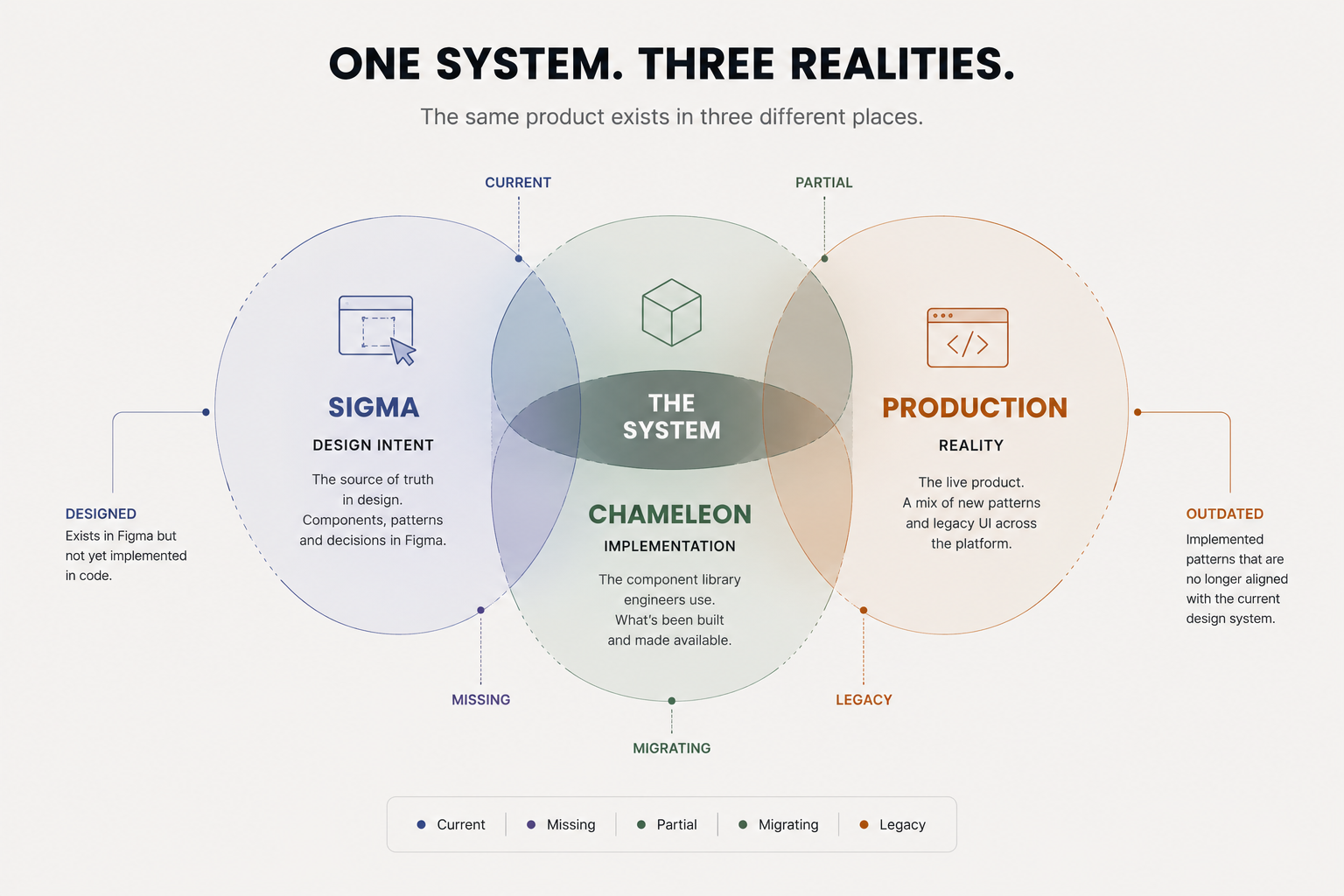
When I joined Schoox, the team was already modernising a large legacy interface through Sigma ~ a newer generation of design-system components gradually being introduced across the platform. The challenge was not starting a system from scratch. It was understanding how an established one actually behaved across design, code and production before adding more decisions to it.
That transition meant the same pattern could exist in several realities: legacy UI in the product, its newer Sigma definition in Figma, its Chameleon implementation in code, and varying levels of adoption in the live product.
Three things made the system harder to reason about
01 · Fragmented sources of truth
A component could be current in Figma but unavailable in Chameleon, or implemented in code but adopted in only a small part of the product.
02 · Historical complexity inside components
Variants, properties and exceptions often mixed genuine product requirements with decisions accumulated over years of product evolution.
03 · Knowledge spread across people and artefacts
Documentation, implementation and team knowledge did not always line up. Finding the right answer could require tracing the same pattern across several people and places.
Product feedback followed a similar path. Customer-facing teams in the US brought recurring feedback from admins, managers and learners into Product, where PMs translated it into tickets and requirements for Design. That gave the team a steady view of where the interface was creating friction, even when designers were not speaking directly with end users.
DESIGN DIRECTION
Understand before standardising
Trace a pattern through design, code and production before deciding what should change.
Treat constraints as information
Legacy behaviour and implementation gaps were not noise to ignore; they explained why the system looked the way it did.
Prefer the smallest useful system
Every new variant creates another decision for designers, developers and documentation. Flexibility should earn its place.
Design for adoption, not only Figma
A component is not successful because it exists in a library. It has to make sense in implementation and in the product where people actually use it.
SYSTEM DECISION 1/3
Map the gap before designing into it
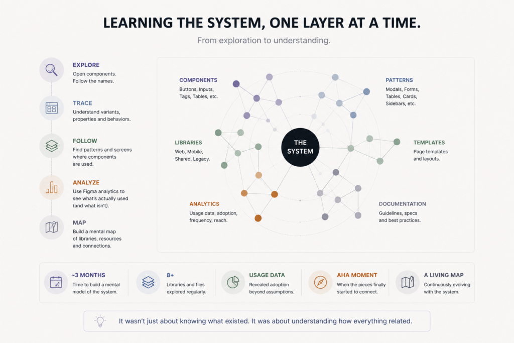
Working with a frontend engineer, I reviewed components across Sigma, Chameleon and the live product. I turned that into a working component inventory showing what existed, what had been implemented, what was still legacy and where adoption was incomplete. Combined with Figma usage data, it separated components that merely existed from patterns people were actually using. Usage became a practical input into decisions about whether older components and variants should be maintained, merged or deprecated; in several cases, low or absent usage helped us question whether inherited complexity was still justified. This became my evidence base: implementation status showed where the system had diverged, while Figma usage helped distinguish theoretical flexibility from patterns designers were actually relying on.
SYSTEM DECISION 2/3
Turn a local UI problem into a reusable pattern
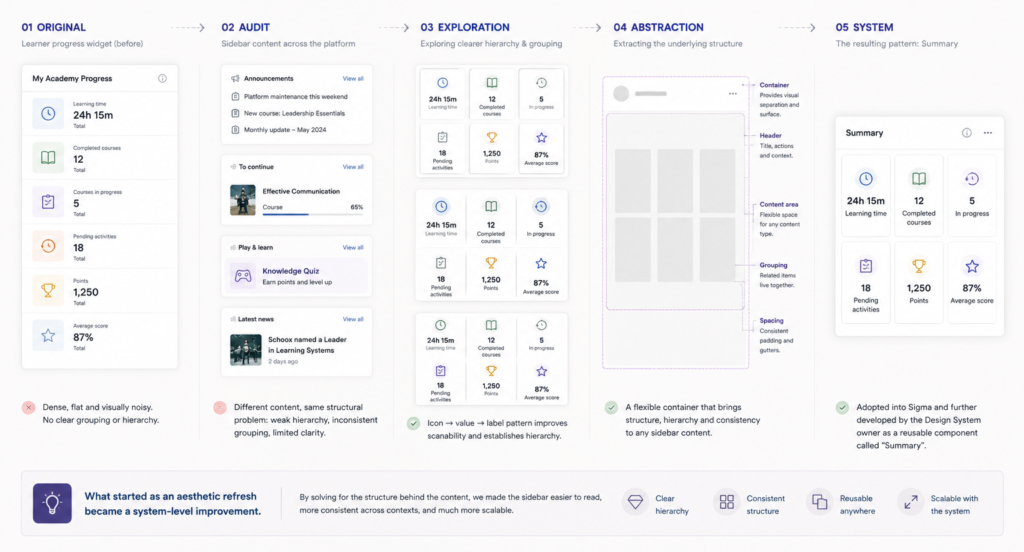
A brief to refresh a learner-progress sidebar initially looked like a small UI task: six metrics in a dense space. But the same sidebar hosted progress, announcements, games, news and other content throughout the platform. Instead of optimising one widget, I explored a container-based hierarchy that could organise different kinds of supporting information. The pattern was adopted into Sigma and developed further by the Design System owner as the reusable component; the Summary Card.
Once the Summary Card became an official Sigma component, I audited existing Figma designs for local, copy-pasted versions of the same container pattern and replaced them with the shared component. What began as a local sidebar exploration therefore became adoption work across the wider design system, reducing duplicated instances and bringing those designs back to a common source.
Redesigning the Quick View
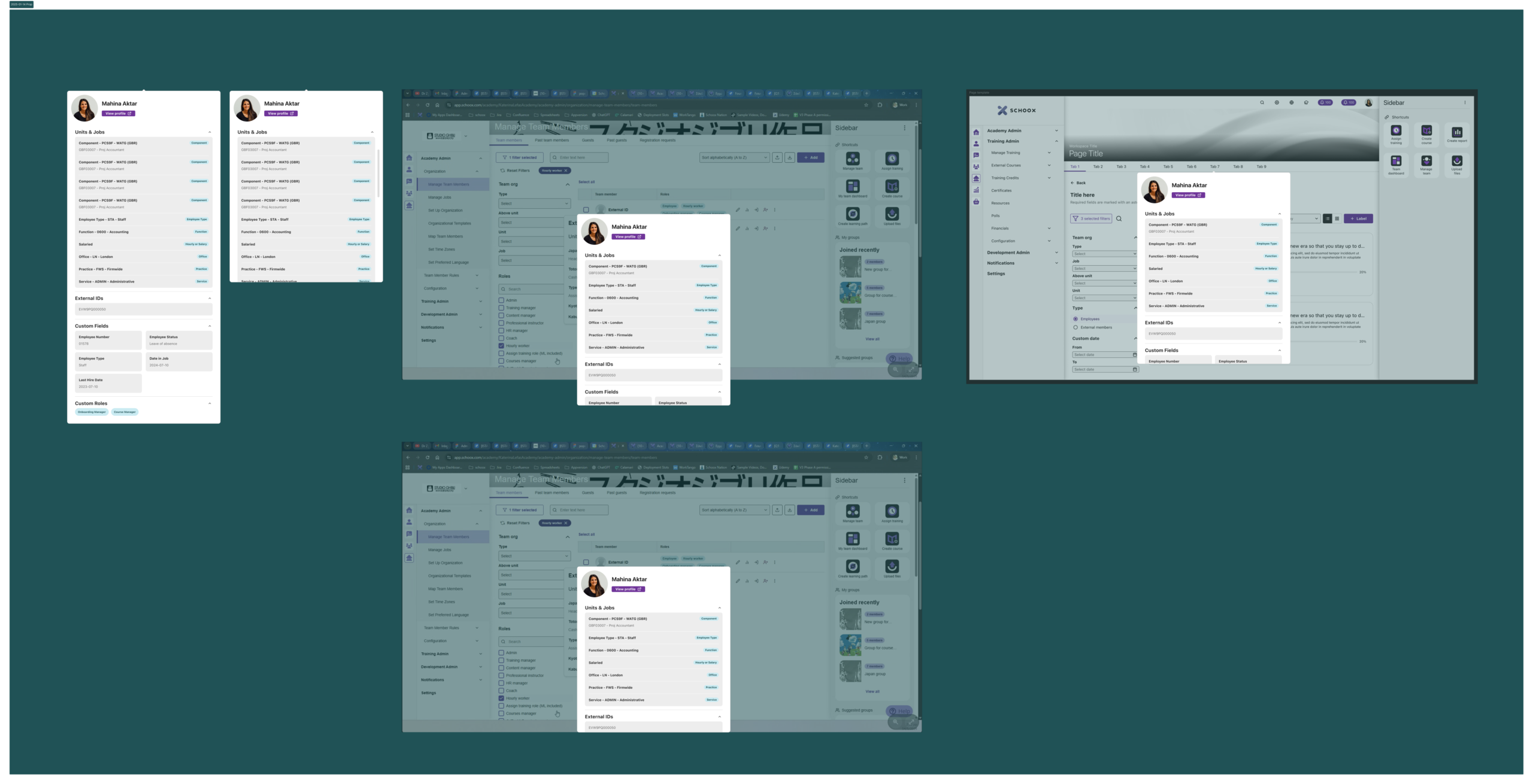
The existing Quick View for team members had grown into a dense list of information, with little distinction between frequently used details and secondary data. It was hard to scan, inconsistent across roles and contained many fields that were rarely needed in day-to-day tasks.
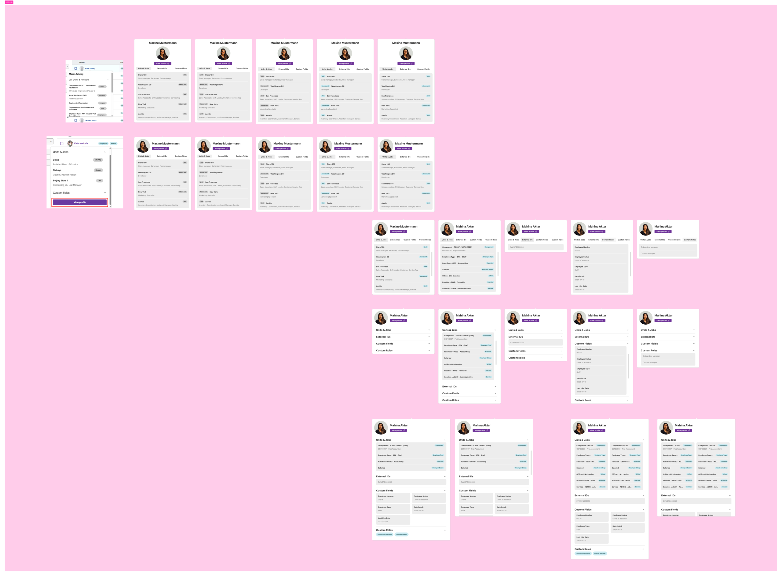
I explored several ways of organising the same information, focusing on a clearer hierarchy and more intentional grouping. The final version keeps the most useful information visible by default, with secondary data in expandable sections, and was tested inside existing Schoox screens rather than as an isolated component.
SYSTEM DECISION 3/3
Make complexity justify itself
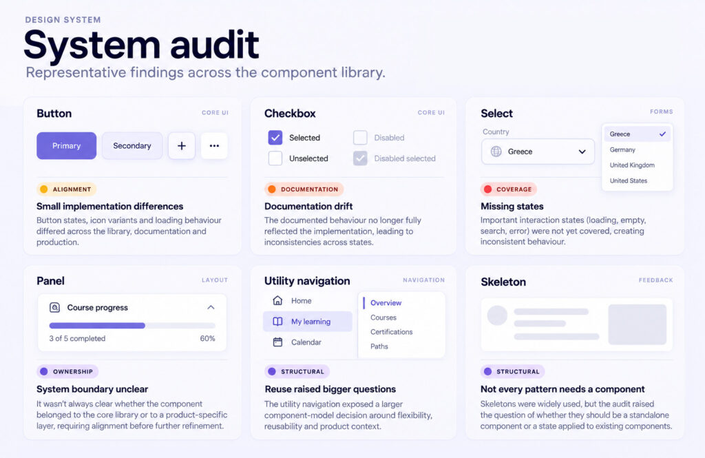
As I worked on buttons, icon buttons, tags, list-view items and other components, I started separating genuine requirements from historical inconsistency. Instead of asking how many configurations a component could support, I looked for the smallest set it actually needed. Sometimes a new variant was justified. Sometimes an existing property already covered the use case. And sometimes the best system decision was not adding anything at all.
OUTCOME · shipped
ADOPTION SIGNALS
Combined implementation status with Figma usage
REUSABLE PATTERN
Sidebar exploration evolved into the Summary Card
SYSTEM AUDIT
Mapped gaps across Figma, code and production
REFLECTION
The visible output of design-system work is usually the component. The less visible work is comparing design with production, checking implementation, questioning exceptions, documenting decisions and coordinating with the people who build and use the system.
That collaboration also extended beyond Figma. On one late-stage UI problem, a fixed banner needed a responsive blur-and-fade treatment that the existing implementation could not provide directly. I used Claude to prototype a CSS-based approach, then worked with the frontend engineer to validate it against the actual implementation constraints. The resulting treatment was incorporated into the production implementation.
The strongest outcome was not a single screen. It was a clearer way of reasoning about the relationship between Sigma, Chameleon and production ~ and recognising when a local product problem could become a reusable system pattern.
Good design systems do not remove complexity. They decide where complexity belongs. Finding consistency often starts with finding clarity first.
The work nobody notices is often the work that keeps the system understandable.