AI UX · DESIGN SYSTEMS · 2026
Designing a consistent way to identify AI-generated content across Schoox, from a small list indicator to an entire page.
SURFACE
Web LMS
AI content disclosure
ROLE
Product Designer
End-to-end ownership
SCOPE
~10 days · Concept exploration
Usage guidance · Motion
CEO presentation
THE BRIEF
Schoox was preparing to introduce AI-generated and AI-assisted content across its LMS. Courses, training plans and recommendations would sit alongside manually created content, but the product lacked a consistent way to communicate their origin.
I had roughly ten days and owned the work end to end: the visual concepts, their application across product screens, the interaction guidance and the presentation. The work anticipated upcoming functionality. It explored how admins and learners could recognise AI content as those features arrived.
DESIGN DECISION 1/4
A shared language with different levels of emphasis
A badge needed to remain recognisable across very different surfaces. A prominent card offers room for a label. A dense table may need a much smaller indicator. A manually written page with one AI paragraph needs to identify the boundary of that contribution.
I built the exploration on the existing tag component and borrowed the gradient and sparkle identity from the AI Assistant in the navigation. Reusing that foundation gave the proposal a familiar relationship to the product and a clear component extension path.
AI Content Badge ~ Concept exploration
1. Tonal chip

Subtle, always-on. Good for dense lists/cards where AI content is common.
2. Gradient chip

High visibility, on-brand with the AI icon. Best for hero/detail placements.
3. Icon-only dot

Minimal, inline next to a title/thumbnail. No label ~ relies on a tooltip on hover or keyboard focus.
4. Outlined gradient

Lighter footprint on white surfaces (e.g. detail pages) while staying on-brand.
DESIGN DECISION 2/4
Applying the proposal across the product
I placed the concepts into existing product layouts to assess their hierarchy and visual density. These were design explorations in context; they did not establish usability results.
On cards, the gradient chip sat in the top-left corner and made the AI origin visible without adding a separate explanatory block. In dense lesson and review lists, the icon-only treatment stayed close to the title and left the row’s other information easy to scan.
The comparison covered lesson lists, review-list items, microlearning cards and dense tables. Seeing the treatments together helped me recommend where a full label was useful and where a smaller indicator was more appropriate.
Applied example ~ (gradient chip) on a microlearning card
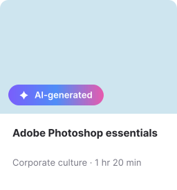
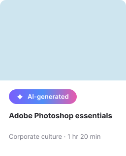
Recommendation: Concept 2 (gradient chip) for card/hero placements ~ most on-brand and visible.
Applied example ~ (icon-only) in a dense list / table row
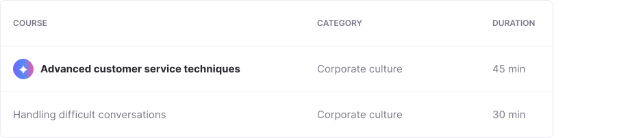
Row 1 is AI-generated (icon-only dot next to the title, no color-only reliance since it also carries a tooltip on hover/focus).
Row 2 is manually created ~ no badge. The dot stays small and quiet so it doesn’t break table scanability.
Applied example ~ (icon-only & gradient) on the real lesson-list component
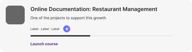
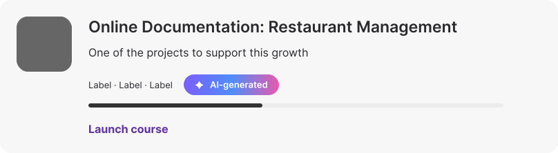
Icon-only dot added next to the existing tags ~ quiet enough not to compete with the progress bar and Launch course action.
Applied example ~ Badge treatments and placements on the preview-list-item component




Four explorations compare a gradient chip on the thumbnail, a gradient chip above the title, a tonal label above the title and an outlined label below the content.
DESIGN DECISION 3/4
Content origin and draft status need different cues
An AI-generated paragraph inside a manually created page needed a precise boundary. I proposed a tonal chip and a thin gradient rule on the left to mark the generated section while keeping it integrated with the rest of the page.
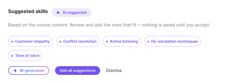
AI suggestions needed a separate treatment because the user had not accepted them yet. A dashed outline and a plus icon communicated that suggested skills or a draft training plan remained proposals. A checkmark could imply that an action had already been completed.
This distinction separated where content came from from whether the user had accepted it. Both matter, but they should not collapse into the same badge.
Applied example ~ (tonal) marking an inline AI-generated section inside manual content
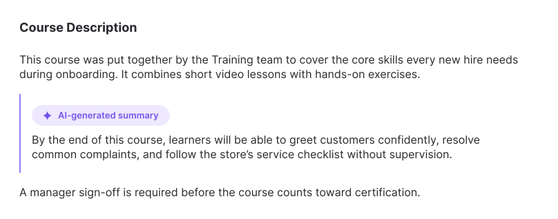
The tonal chip + a thin gradient rule mark exactly which paragraph came from AI, without visually separating it into its own box ~ it still reads as part of the same page.
Applied example ~ AI suggestions / drafts (pending action, not yet accepted)
DESIGN DECISION 4/4
Disclosure at page level
When AI generated the entire page, a small corner badge could understate the scope. I proposed a persistent top banner with the message: “This entire page was generated by AI. Review before publishing.”
The banner included a Review content action and remained until the page had been reviewed and published. This made the disclosure part of the review workflow and gave the user a clear next step.
Applied example ~ Full page generated by AI (page-level banner, not just a badge)
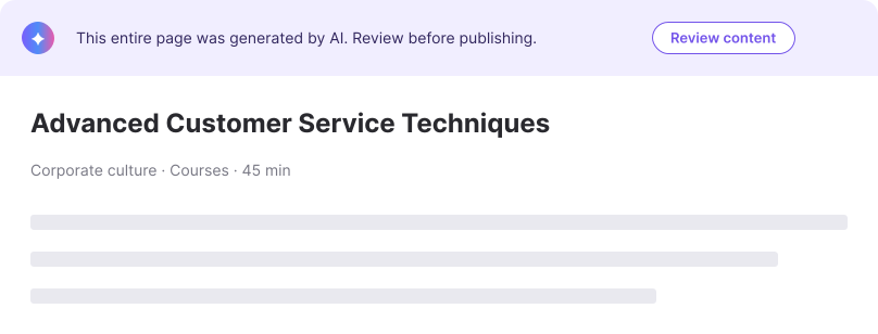
A persistent banner identifies an entirely AI-generated page and prompts review before publishing.
INTERACTION
Guidance and recommendation
For the gradient chip, I proposed a shifting gradient and soft violet glow on hover or focus, drawing on the existing AI Assistant icon. The specification described a loop of approximately 1.6 seconds. The small icon used a related treatment, with an explanatory tooltip after roughly 300 milliseconds.
The proposal respected prefers-reduced-motion by falling back to the static rest state. The icon-only option required a keyboard-accessible explanation, and the outlined option still needed a contrast pass. These were interaction specifications and review requirements, rather than claims of validated production accessibility.
Hover state ~ moving gradient (same idea as the AI assistant icon in the nav)

Proposed gradient-chip hover and focus states, with a static fallback for reduced motion.
Recommended direction
I recommended the gradient chip as the default for cards and prominent placements, with the icon-only dot for dense lists and the tonal chip as a quieter fallback. The outlined treatment needed an accessibility and contrast review before implementation. The proposed next step was to extend the tag component and pilot the approach on microlearning cards.
SO THERE YOU GO…
OUTCOME · PRESENTED
END-TO-END OWNERSHIP
Concept exploration, usage guidance and CEO presentation completed in roughly ten days.
STAKEHOLDER SUPPORT
Positive CEO reception and Senior Manager buy-in on the recommended direction.
IMPLEMENTATION STATUS
Left Schoox before implementation. Shipping and production adoption remain unverified.
REFLECTION
Designing the examples together helped me separate content origin from content status. A badge could identify an AI contribution, but a suggestion awaiting acceptance or a fully generated page needed a different treatment to make the next action clear.
Reusing the existing tag component and AI Assistant identity gave the exploration a familiar foundation. The next step would have been to test whether admins and learners understood those distinctions, especially the icon-only indicator in dense lists.