PRODUCT DESIGN · DESIGN SYSTEMS · MULTI-DEVICE
PROBLEM
The player worked, but had grown one fix at a time: inconsistent sheets, no landscape layout, a single station.
WHAT I DID
Redesigned it as one Figma system on a single unit, added stations, and shipped every change through a sandbox first.
OUTCOME
Three layouts from one design, three stations, clear connection states, and a Reddit bug fixed and confirmed in one day.
SURFACE
Web · PWA
Phone · Landscape · Desktop
ROLE
Product & Design Owner
Founder
SCOPE
UX/UI · Design system
Figma-to-code · Release process
AI-assisted development
The challenge
In the previous chapter I brought Pueblo Vista Radio back as a web player and an installable PWA. People listened, and the roadmap turned into features, each with its own sheet, its own spacing and its own idea of what a heart should do. Nothing was broken, but nothing was a system either. This chapter is about turning a working player into one that can keep growing: one design language on every screen, more than one station, and a release process safe enough for real listeners.
PRODUCT DECISION 1/4
One unit, every screen
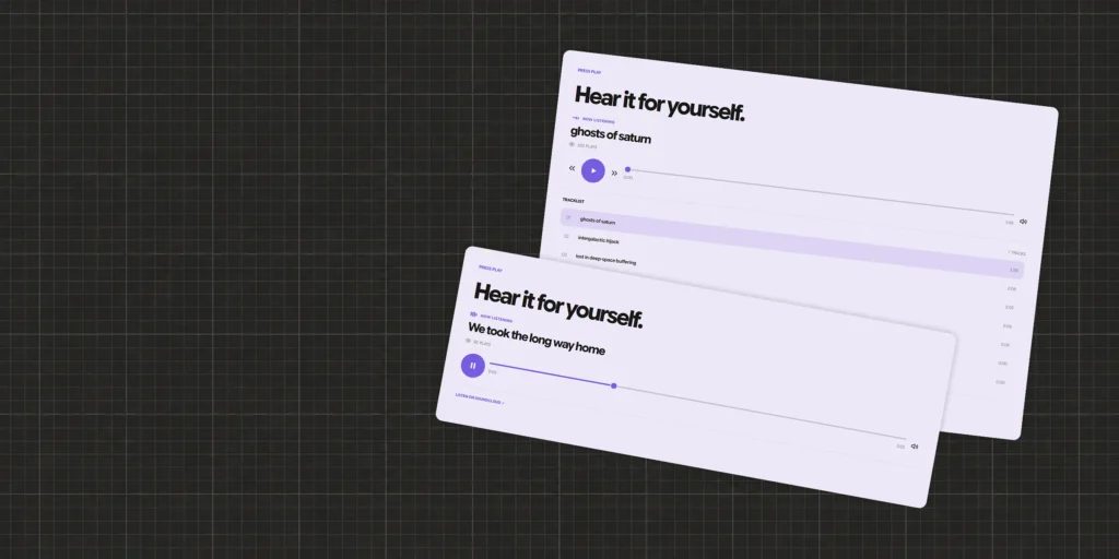
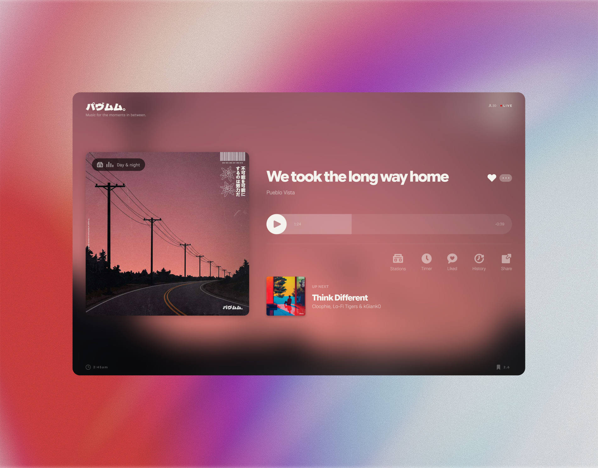
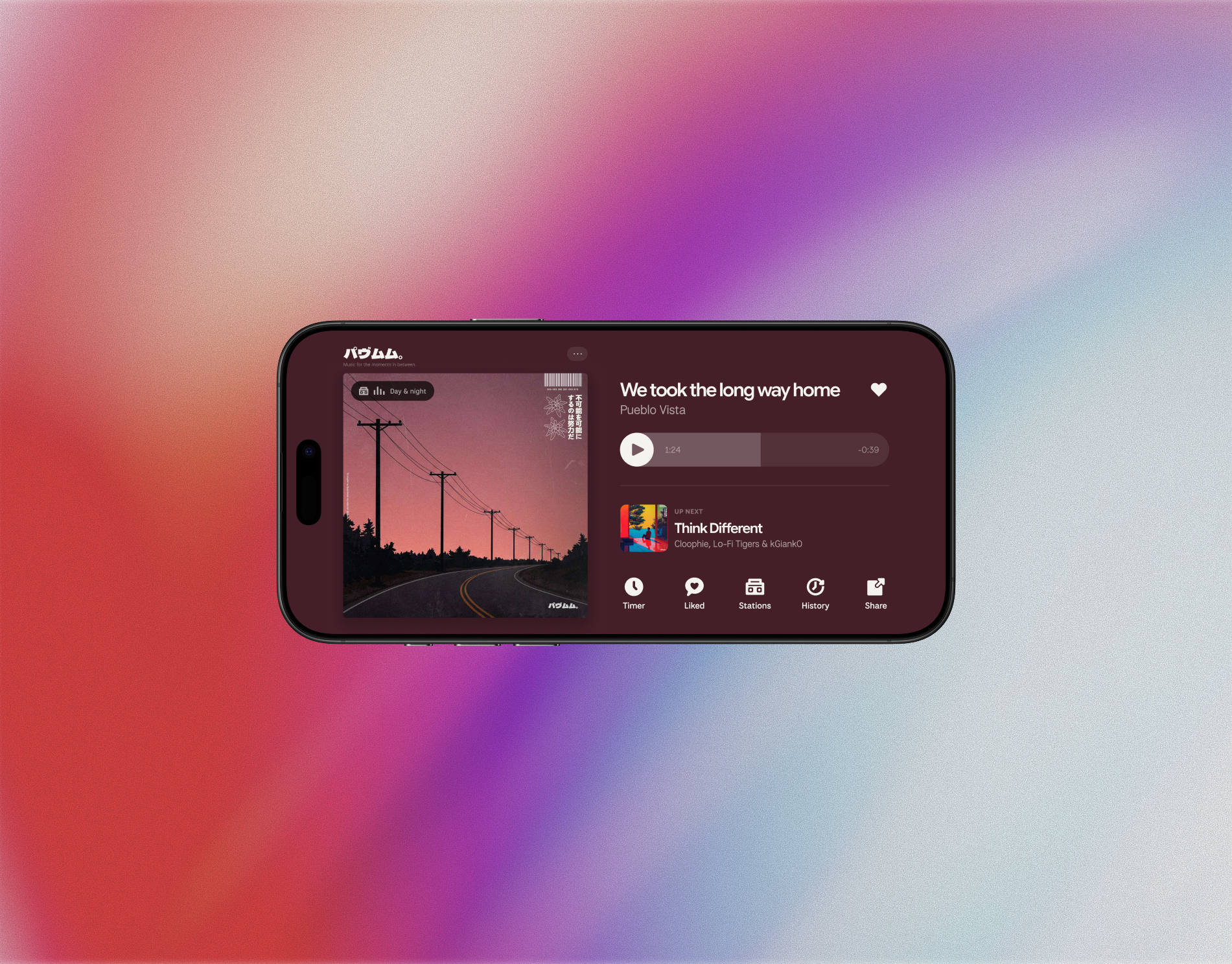
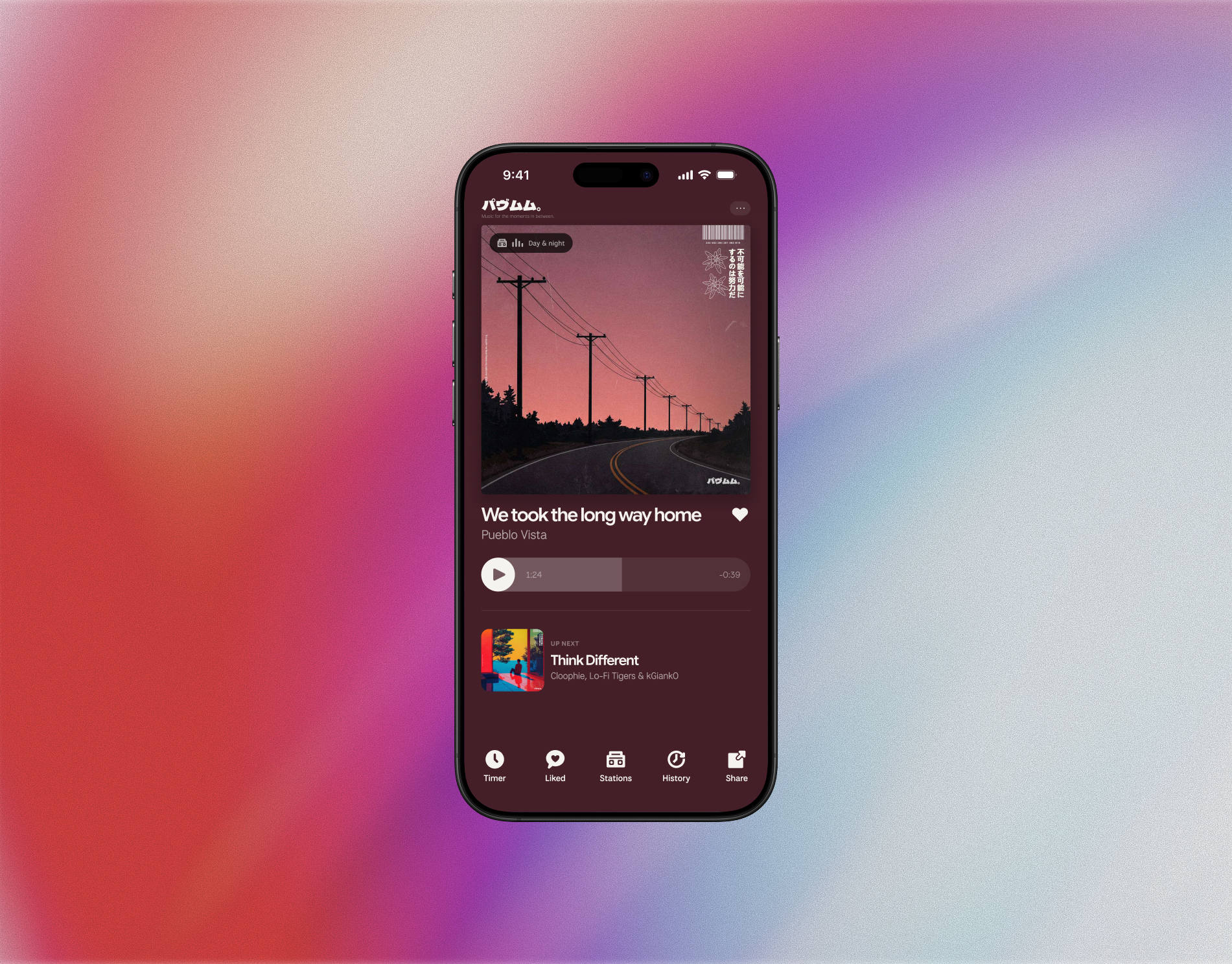
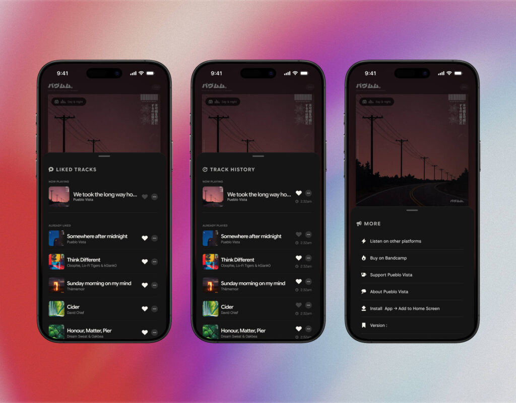
I redesigned the player in Figma as a v2 set: home, timer, liked tracks, history, more, share and stations, each one for phone, phone in landscape and desktop. The question was how to keep three layouts from slowly becoming three different products.
The answer was a single unit. On phones, one unit in code equals one pixel of the Figma frame, scaled to the width of the screen. Spacing, type sizes, radii and icons are all written in that unit, so the code reads like the design file and a value changed in Figma has exactly one place to go. Phones in landscape got their own two-column layout built on the same unit, instead of falling back to the desktop player.
The same thinking went into the patterns. Every sheet now shares one title style with an icon, one list row, one progress bar and one heart behaviour: grey by default, solid white when liked, everywhere. I wrote down the decisions as I made them, so the next feature starts from the system rather than from a blank sheet.
PRODUCT DECISION 2/4
Let real devices decide
The v2 design had a soft gradient with a grain texture behind the navigation. It looked right in Figma. On iPhone, installed as an app, it did not: iOS laid out fixed layers against a shorter screen until the first scroll, which left a visible gap at the bottom and pushed the bottom sheets around. Every workaround made the screen look worse.
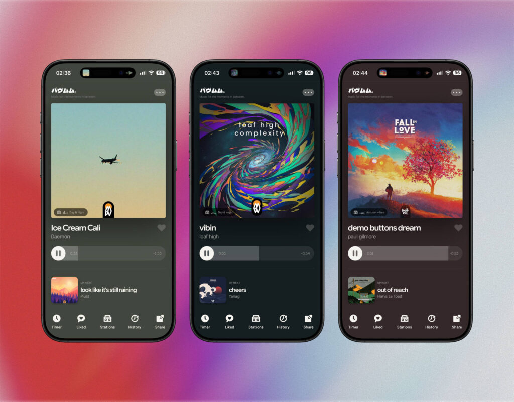
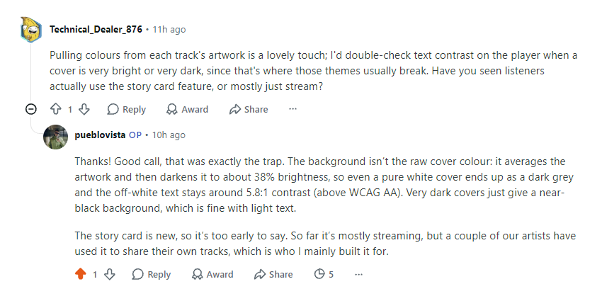
So the gradient went, and the background became a single colour taken from the artwork of the song that is playing. It keeps the idea that the music art-directs the player, without fighting the device. It also needed a rule for readability: the player averages the cover colours and darkens the result, so even a pure white cover becomes a dark grey and the text stays around 5.8:1 contrast, above WCAG AA.
The same principle decided where the station label sits. I moved it to the top left of the cover, then found older covers that print the title and artist exactly there. It went back to the bottom left the same day. The catalogue has thousands of covers I don’t control, so the layout has to work around them.
PRODUCT DECISION 3/4
From a player to a radio
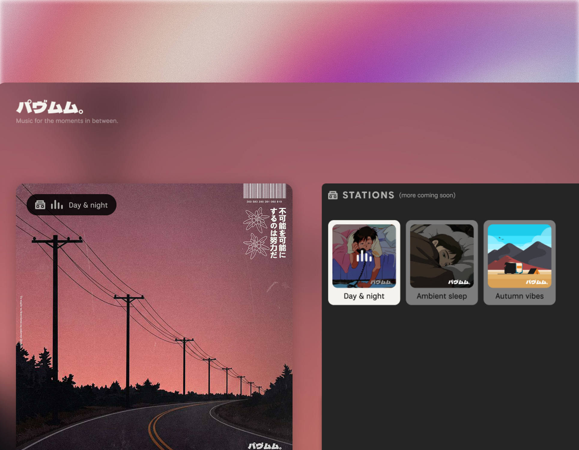
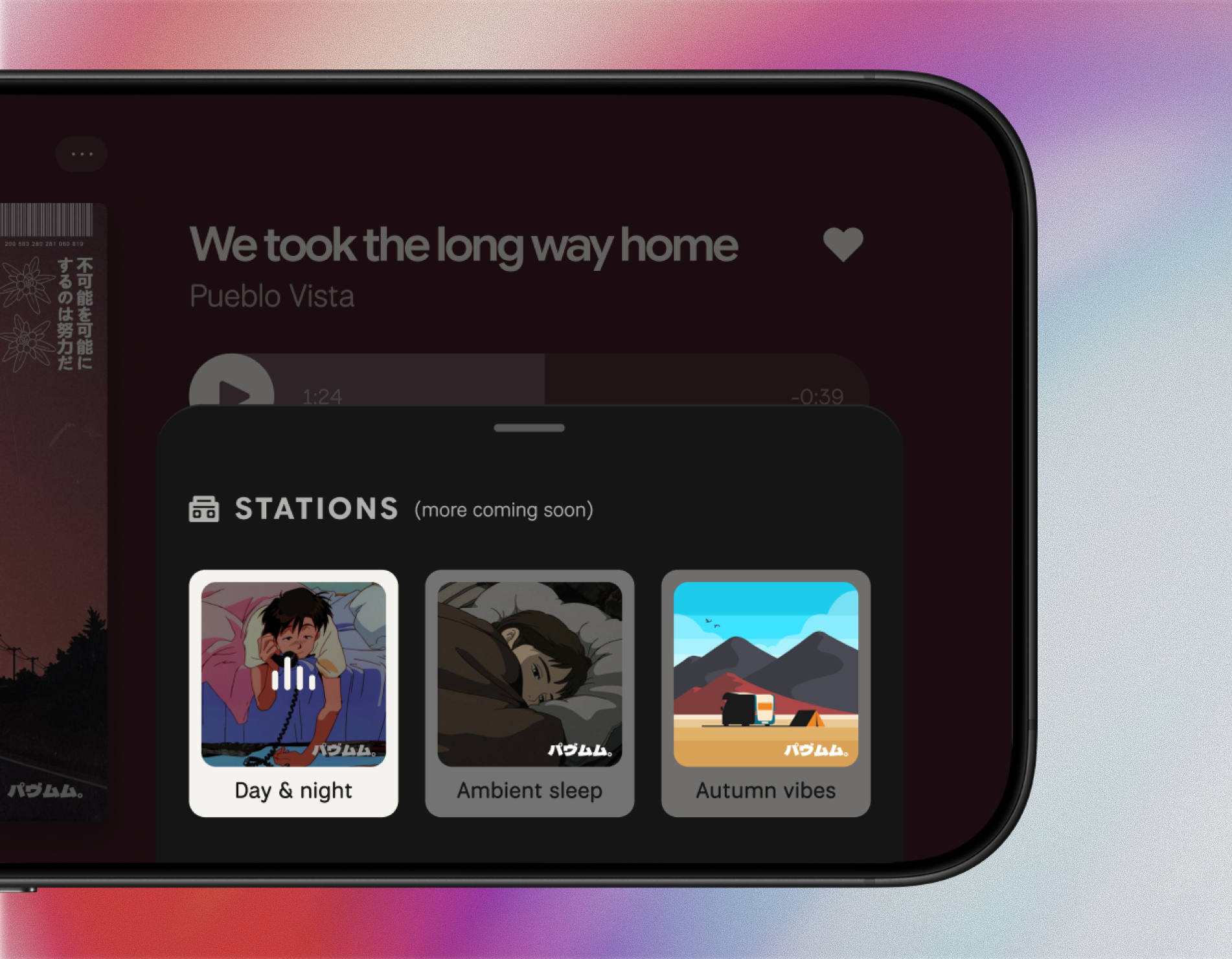
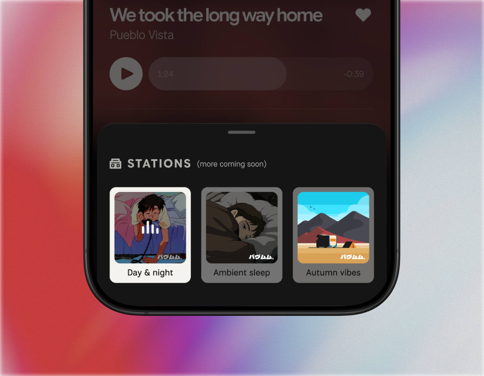
Until now Pueblo Vista Radio was one stream. The catalogue is big enough for moods, so I added themed stations: Day & night, the main station, plus Ambient sleep and Autumn vibes. On the server side they share one music library, so a track can live on several stations without being uploaded twice.
On the listener side the design question was simple: which station am I on? The Stations sheet shows each station as a card. The active one turns white and gets a small equalizer that moves while music plays and rests when it’s paused, so one glance tells you both what is selected and whether it is playing. A quiet label on the cover repeats the station name on the home screen, and the same name appears on the lock screen and on the watch.
Tapping a card switches the stream and starts playing straight away, each station keeps its own Up Next and history, and the player remembers the last station you listened to.
PRODUCT DECISION 4/4
Ship small, ship safely
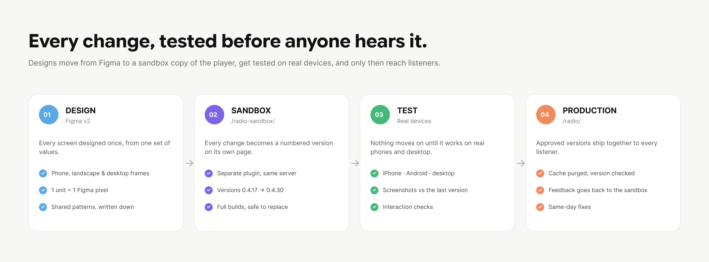
Real listeners use the player every day, so I separated building from releasing. A sandbox copy of the plugin runs on its own page next to the live one. Every change, however small, became a numbered sandbox version that I tested on my own phones and desktop. Only when a set of changes was approved did they move to production together, as one release.
In practice that meant fourteen sandbox versions and a handful of production releases in a few weeks. Each one was checked against the Figma frames, compared screenshot by screenshot with the version before it, and run through automated interaction checks for sheets, hearts, timers, station switching and playback.
The same discipline paid off underneath. Before the desktop redesign I cleaned the stylesheets: a few hundred rules that could never apply anymore, and leftovers from earlier versions, all removed while proving the screens stayed pixel-identical. Not visible to listeners, but it is why the desktop redesign landed cleanly. And when a cached page quietly broke the artwork in shared story cards, I replaced the expiring security token with a stricter image proxy rather than patching around the cache.
AI-assisted development was part of this workflow, as in the previous chapter. I owned the product decisions, the design and the testing on real devices; AI helped me turn Figma values into code, write the checks and keep the release process honest.
From a comment to a fix
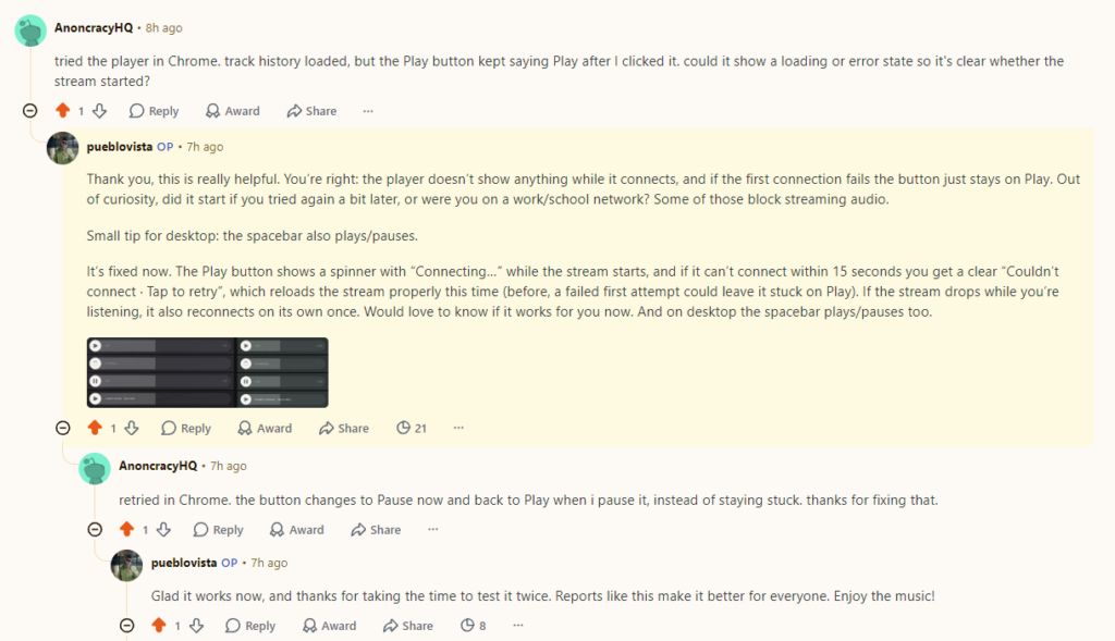
When I shared the player on Reddit, one listener wrote that the track history loaded but the Play button stayed on Play after he clicked it. He asked for a loading or error state, so it would be clear whether the stream had started.
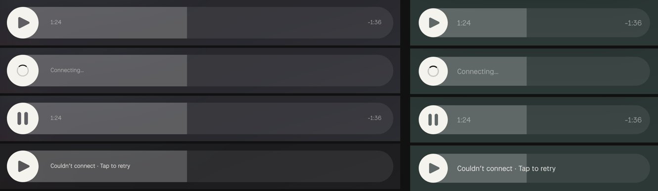
He was right, and it pointed at a real gap. The progress bar always moves, because it follows the song on air, not what you hear, so everything looked fine while nothing played. And if the first connection failed, pressing Play again did not really try again. I mocked up four states on top of the real player (idle, connecting, playing, couldn’t connect), agreed the design, and shipped them: a spinner and “Connecting…” while the stream starts, a clear “Couldn’t connect · Tap to retry” after 15 seconds, one automatic reconnect if the stream drops while playing, and a Play button that tells screen readers what it is doing.
The same evening the same listener replied that it now worked as expected. Comment, mock, sandbox, production and confirmation, all in one day.
OUTCOME · LIVE
ONE SYSTEM
Phone, phone in landscape and desktop from the same Figma values
THREE STATIONS
Day & night · Ambient sleep · Autumn vibes, with their own history
SAME-DAY FIX
From a Reddit comment to a confirmed fix in production in one day
Reflection
The first release was about whether the product still had a reason to exist. This one was about whether it could grow without losing its shape. The answer turned out to be less about any single screen and more about the system around them: one unit that carries Figma into code, patterns that behave the same everywhere, and a release process calm enough to change things while people are listening.
The moments I learned the most were the ones where the design had to give way: a gradient that iOS would not render, a label that collided with old covers, a bug a stranger found in minutes. Each time, the system made the fix small.
A design system is not the components. It’s how quickly a good idea, or a bad bug, can travel from a comment to every screen.