MOBILE UX/UI · 2022 → 2026 · REVISITED CONCEPT
A product design exploration into how a public transport app can become calmer, more contextual and more useful at each stage of a journey.
SURFACE
Mobile app
ROLE
Product Designer
Mobile UX/UI · Research
SCOPE
Journey planning
Route comparison
Ticketing · Wallet
Visual system
Revisiting old work is less about correcting it ~ and more about seeing what you would prioritise differently today.
THE CHALLENGE
Public transport products carry a lot of useful information, but usefulness quickly becomes noise when everything competes for the same attention. I revisited an ATM Milano concept originally created for a Deloitte product design challenge with one question: what deserves the rider’s attention at each step?
The goal was a calmer journey experience with clearer responsibilities across discovery, planning, route comparison and ticketing ~ without adding more functionality.
I ran directional task-based walkthroughs with 7 domestic and international participants, asking them to plan a journey and reach the appropriate ticket outcome using the existing ATM experience. Completion times ranged from roughly 45 seconds to 4.5 minutes, exposing recurring friction around information density, unnecessary steps and inconsistent terminology.
Three things were getting in the way
The challenge is not simply getting someone from A to B. It is supporting a sequence of different decisions without turning the interface into a transport dashboard.
01 · Information density
Useful information competed for attention across the journey, making it harder to identify what mattered at each step.
02 · Unnecessary interaction overhead
Reaching the ticket outcome could involve more screens and taps than the task itself seemed to require.
03 · Inconsistent language and conventions
English terminology and time notation were not always consistent, adding small but repeated moments of friction.
DESIGN DIRECTION
Prioritise the next decision
Every screen should make the most likely next action obvious.
Use colour with a job
ATM orange carries brand and primary action; metro colours identify lines; green, amber and red communicate operational status; warm neutrals create hierarchy without noise.
Keep context while comparing
Route alternatives should be comparable without repeatedly moving backwards through the flow.
Let transactions be transactional
Once a rider has chosen a route, ticket purchase should become short, functional and predictable.
DESIGN DECISION 1/4
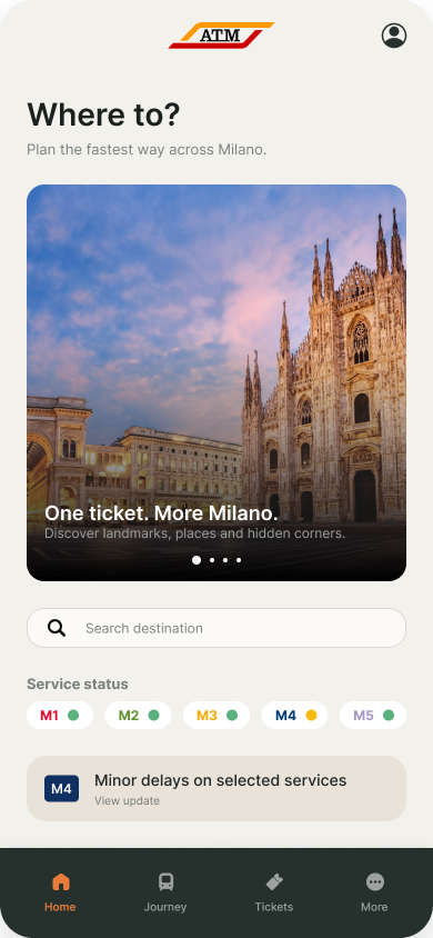
Home that is useful before the journey starts
Journey search remains the primary task. A city discovery card gives the product a small editorial role through One ticket. More Milano. Service status stays immediately visible, while line colours identify services and a separate traffic-light system communicates disruption.
DESIGN DECISION 2/4
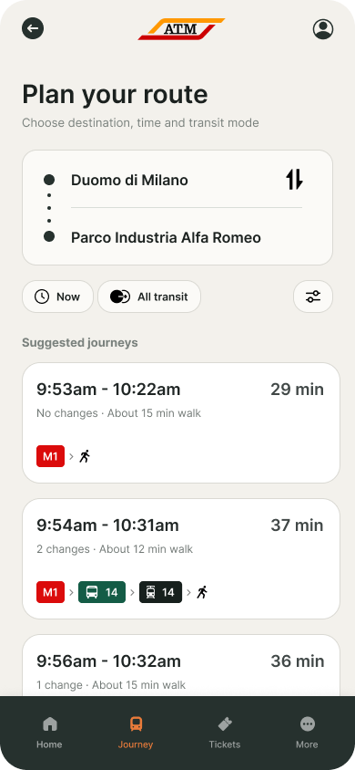
Plan first. Compare second.
Origin and destination lead the screen. Time and transport preferences become lightweight controls rather than another step. Suggested journeys appear immediately below, with departure, arrival, duration, changes, walking and line information arranged by decision value.
DESIGN DECISION 3/4
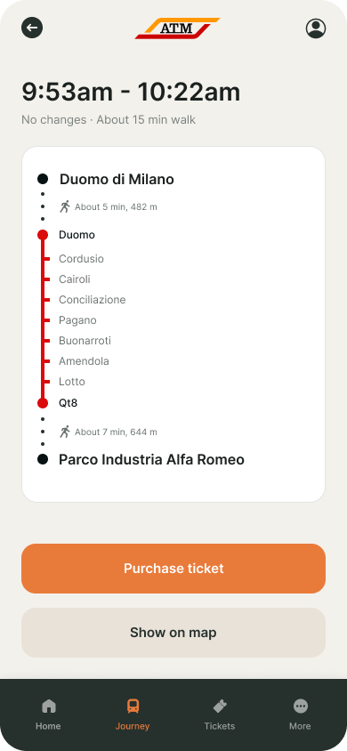
Keep the map in the comparison
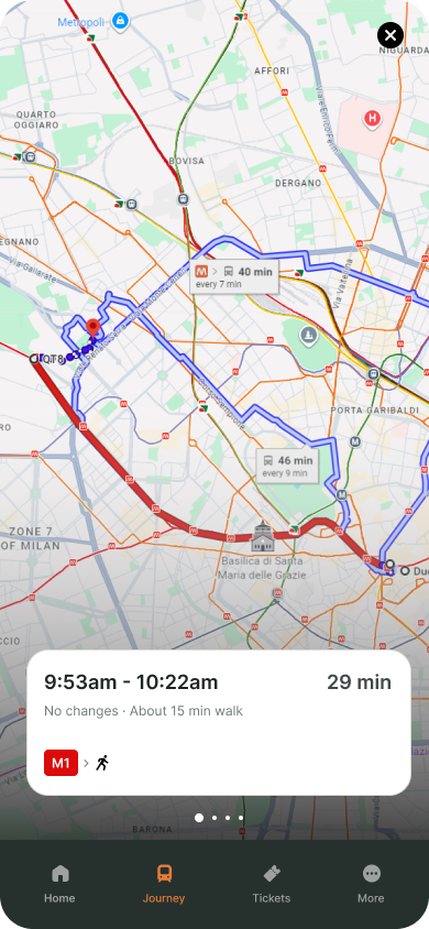
The journey detail view focuses on the route and the two most likely next actions: buy the required ticket or inspect the journey geographically. In the fullscreen map, the selected journey stays in context through a floating route card while alternatives remain swipeable. Changing route updates both the summary and the route on the map.
DESIGN DECISION 4/4
Ticketing stays transactional
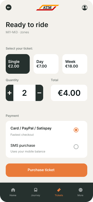
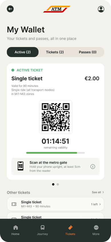
Once the route is chosen, the interface stops trying to inspire and gets out of the way. Ticket type, quantity, total and payment method form a short transactional flow. The wallet then extends the experience into the physical network by keeping active tickets, remaining validity and gate access immediately available.
THE EXPERIENCE
The resulting flow has four distinct modes: discover → plan → compare → transact. The visual language remains consistent across them, but hierarchy changes according to what the rider is trying to accomplish.
VALIDATION & REFLECTION
The difference between the original concept and the revisit is less about adding features and more about assigning clearer responsibilities. The original concentrated on reducing screens. The revisit keeps that efficiency, but adds stronger hierarchy, a calmer semantic colour system, more contextual route comparison and a clearer separation between discovery, planning, navigation and payment.
How I would validate it
Because this is a concept, success should be tested rather than invented.
- Test journey planning with riders unfamiliar with Milan and measure whether they can identify the best route without explanation.
- Compare comprehension of line identity versus operational status.
- Observe whether riders discover geographic route comparison without leaving the map.
- Test the transition from selected journey to ticket purchase and active wallet.
- Measure task completion, hesitation points and unnecessary backtracking against the current experience.
Reflection
Revisiting the same problem years later made the change in my design thinking easier to see. Earlier, I was primarily trying to make the flow shorter. Today I care more about assigning the right amount of attention to the right information at the right moment.
The most useful lesson is that simplicity is not the absence of information. It is hierarchy, timing and context.
What I would explore next ~ real-time disruption states, accessibility and step-free routing, tourist-specific ticket guidance, saved journeys and the relationship between the digital ticket wallet and the physical metro network.