CORPORATE WEB · UX/UI · 2018 · SHIPPED
Turning an ambitious redesign into a website that could survive real implementation constraints ~ without losing the ideas that made the first direction worth pursuing.
SURFACE
Corporate website
Product ecosystem
ROLE
Product / Visual Designer
100% design ownership
SCOPE
Information architecture · UX/UI
Visual design · Responsive patterns
The first redesign defined the ambition. The second had to survive reality.
THE CHALLENGE
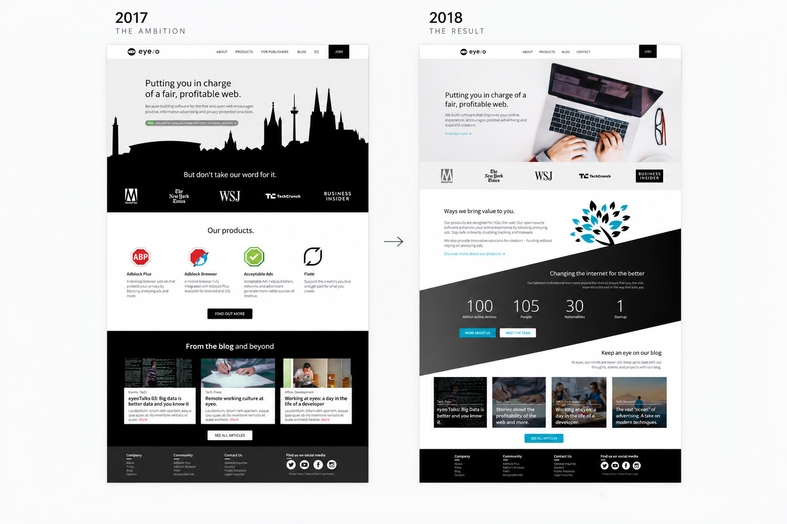
This was not a fresh redesign. It was the second attempt to move eyeo.com forward after my 2017 concept had remained unimplemented for roughly a year. The first direction had already clarified what I wanted the website to become ~ more product-led, easier to navigate and visually more confident. What it had not solved was how that ambition would fit the platform and delivery reality around it.
In 2018 I again owned the information architecture, UX/UI and visual design. The difference was that implementation constraints entered the process much earlier. Those constraints were not hypothetical ~ they came directly from what had prevented the 2017 direction from reaching production, giving the second attempt a much clearer picture of what the platform and delivery process could realistically support. Communication with development still happened mainly through the Creative Director, with only occasional direct contact, so the design itself needed to make the path to production considerably clearer.
DESIGN DIRECTION
Keep the ambition
Preserve the clearer hierarchy, stronger product focus and more confident visual language established in 2017.
Make constraints visible early
Treat architecture, content models, engineering capacity and timelines as design inputs rather than handoff problems.
Prefer repeatable structures
Reduce one-off layouts and build pages from patterns the existing platform could realistically support.
Ship the meaningful change
Judge the redesign by what could become a coherent production experience, not by how closely it reproduced an exploratory concept.
DESIGN DECISION 1/3
Keep the ambition, remove what prevented it from shipping
I did not want the second attempt to become a retreat to the old site simply because the first redesign had stalled. The useful ideas were still useful: clearer hierarchy, larger typography, stronger product presentation and more space for different parts of the company to explain themselves.
Instead of reproducing the 2017 screens page for page, I separated the underlying ideas from the layouts that expressed them. Patterns that depended on flexibility the platform did not have were simplified or dropped; the principles behind them were retained.
DESIGN DECISION 2/3
Treat implementation constraints as design inputs
The first redesign had exposed where the existing architecture, content model and development setup would struggle. In 2018 those constraints became part of the brief rather than something to discover after handoff.
Navigation, hierarchy and product presentation were designed around what the platform could realistically support. That meant fewer bespoke behaviours, a clearer content structure and less dependence on engineering work that was unlikely to happen within the available resources and timeline.
The result was visually simpler than parts of the 2017 concept, but it was not less intentional. The trade-off was deliberate: preserve the change users and the business would actually experience, and remove complexity that existed mainly in the concept.
DESIGN DECISION 3/3
Build repeatable structures instead of bespoke pages
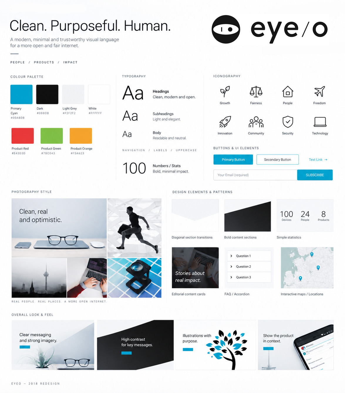
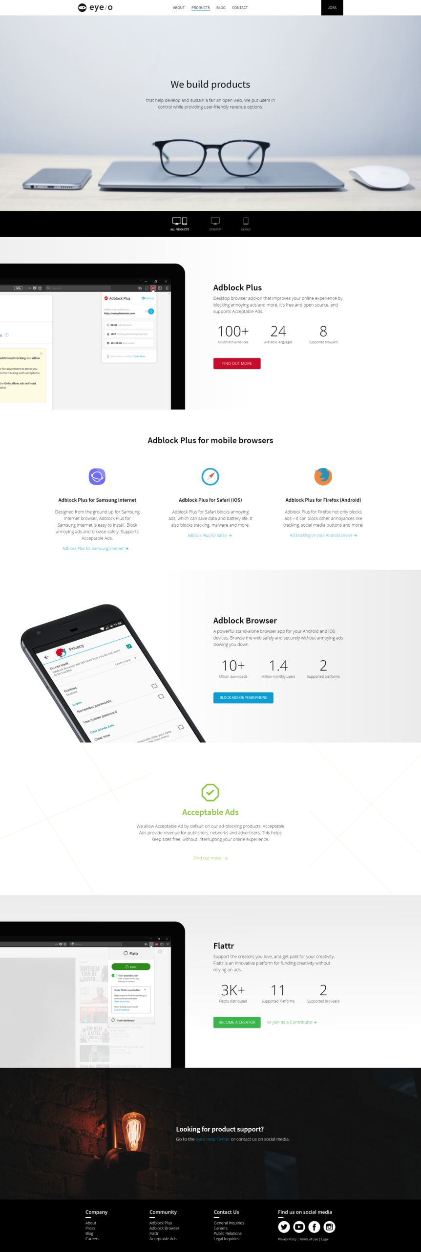
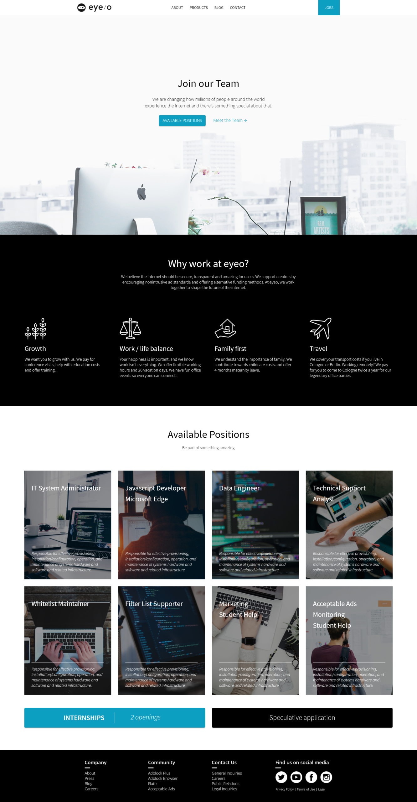
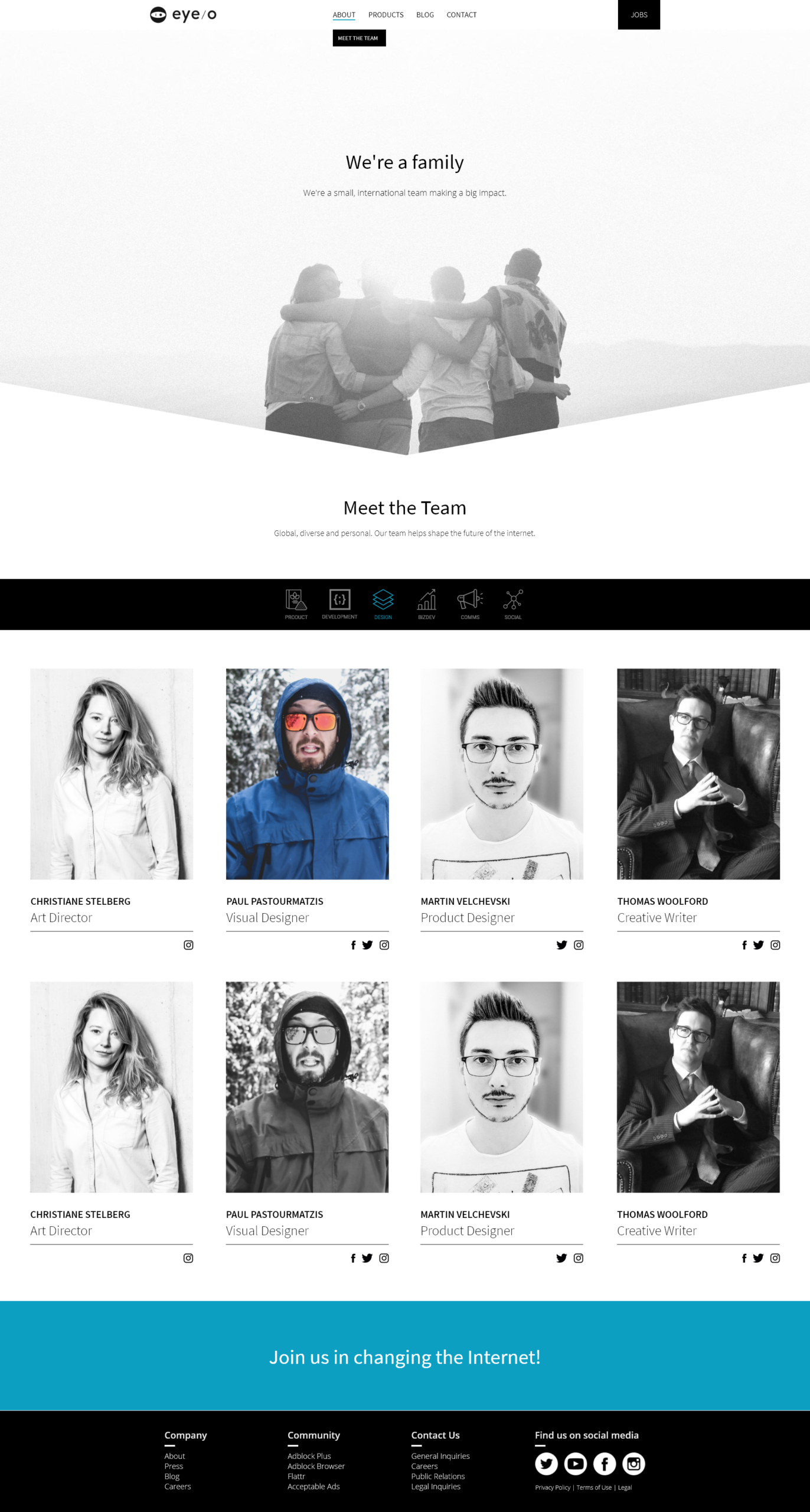
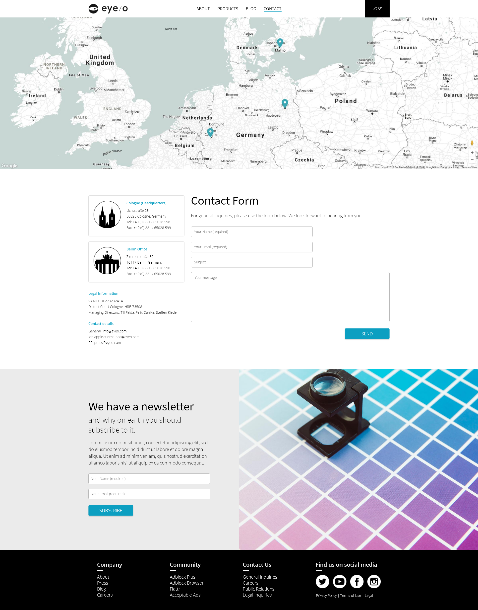
The core pages were organised around a smaller set of reusable section patterns. Home, About, Products, Jobs, Team, Contact and Press could have different content and character without requiring every page to become its own design and development project.
This gave the interface enough flexibility for photography, product colours and different types of content while making the underlying structure much more predictable. It also created a clearer handoff: fewer one-off layouts, fewer exceptions and a more realistic implementation surface.
FROM DESIGN TO PRODUCTION
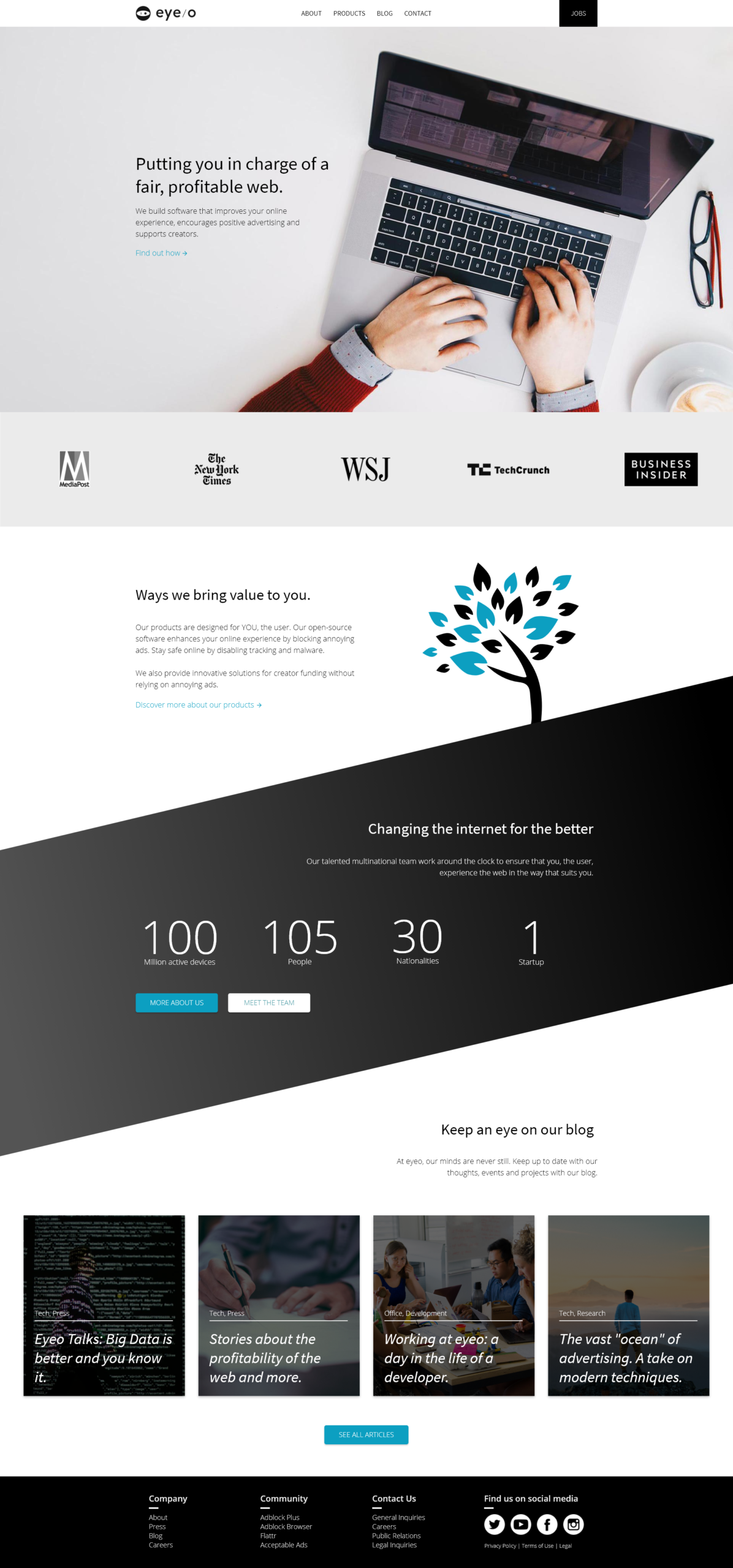
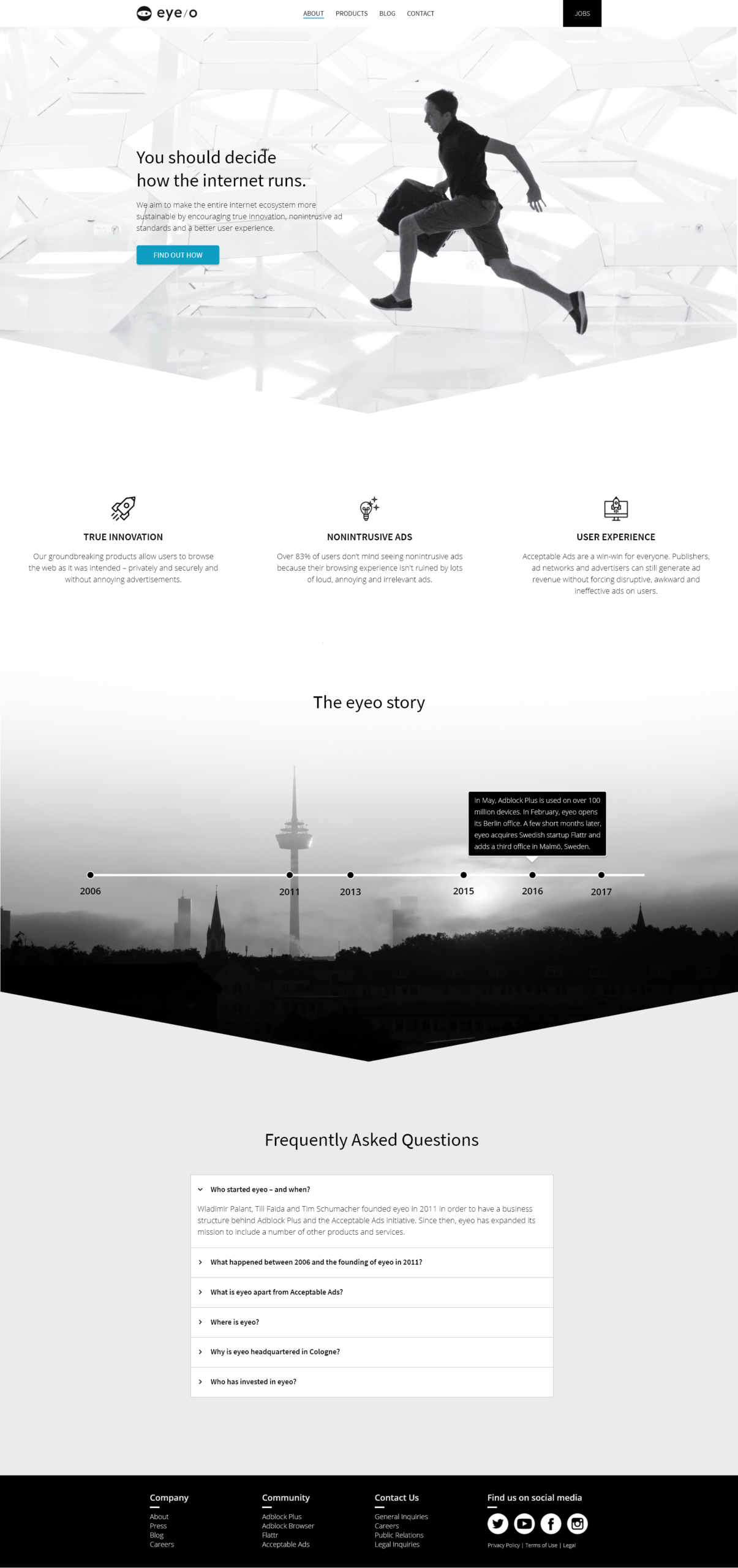
The redesigned eyeo.com launched in 2018 and remained highly faithful to the direction shown here. Not every idea from 2017 survived, nor should it have. What reached production was the clearer product structure, dedicated spaces for different parts of the company and a reusable page logic that no longer required designing the site from scratch one page at a time.
The response internally was also notably different from the earlier attempts. This version was received very positively at C-level, particularly by the CEO at the time. I no longer have access to the analytics from that period, so I treat that as qualitative internal feedback rather than inventing performance metrics.
OUTCOME · shipped
FULL OWNERSHIP
IA · UX/UI · Visual Design
HIGH FIDELITY
Production closely reflected the designed direction
INTERNAL RESPONSE
Strong C-level reception, particularly from the CEO at the time
REFLECTION
I see the 2017 and 2018 redesigns as two parts of the same project. The first created room to ask what eyeo.com could become. The second forced me to decide which parts of that ambition were important enough to protect when real constraints entered the picture.
That distinction changed how I thought about compromise. Simplifying an interaction or reusing a page structure was not automatically a loss of design quality. Sometimes it was the decision that allowed the meaningful part of the design to exist outside the source file.
The strongest outcome was therefore not that the second redesign looked exactly like the first concept. It was that it became a coherent production website while still carrying the ideas that had motivated the redesign in the first place.
Constraints did not make the second redesign less ambitious. They made the ambition executable.