BRAND IDENTITY · PACKAGING · 2024–2025 · SHIPPED
Building a premium Greek olive brand from nothing ~ from naming and identity to packaging that reached production.
SURFACE
Brand identity
Packaging
ROLE
Brand Designer
Art Direction
SCOPE
Naming · Identity
Typography · Packaging
Visual system
The brief did not start with a logo. It started with an empty brand.
THE CHALLENGE
Karakalpakis Family Co. wanted to create a second olive-focused brand alongside Platolea, positioned around a more premium product offer. There was no name, logo or visual identity to inherit. I was responsible for creating the brand from the ground up ~ naming it, defining its visual character and translating that identity into packaging.
The opportunity was to make the new brand feel related to the same family and land without becoming a premium-looking copy of Platolea. It needed its own reason to exist.
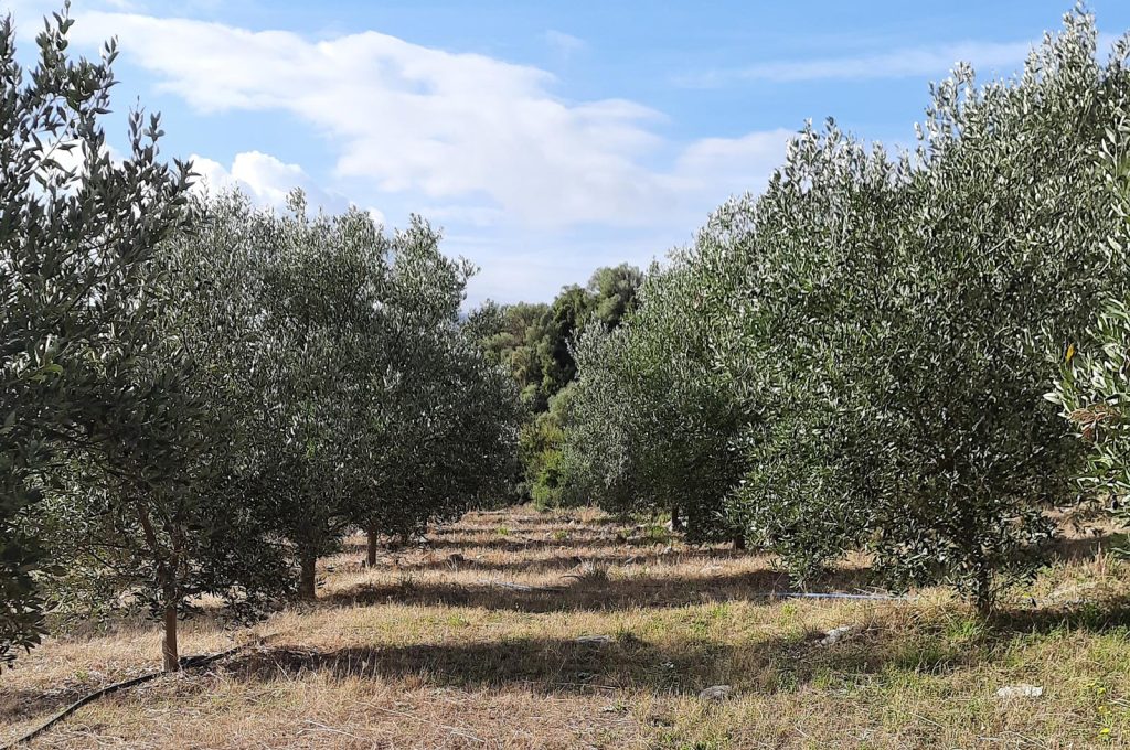
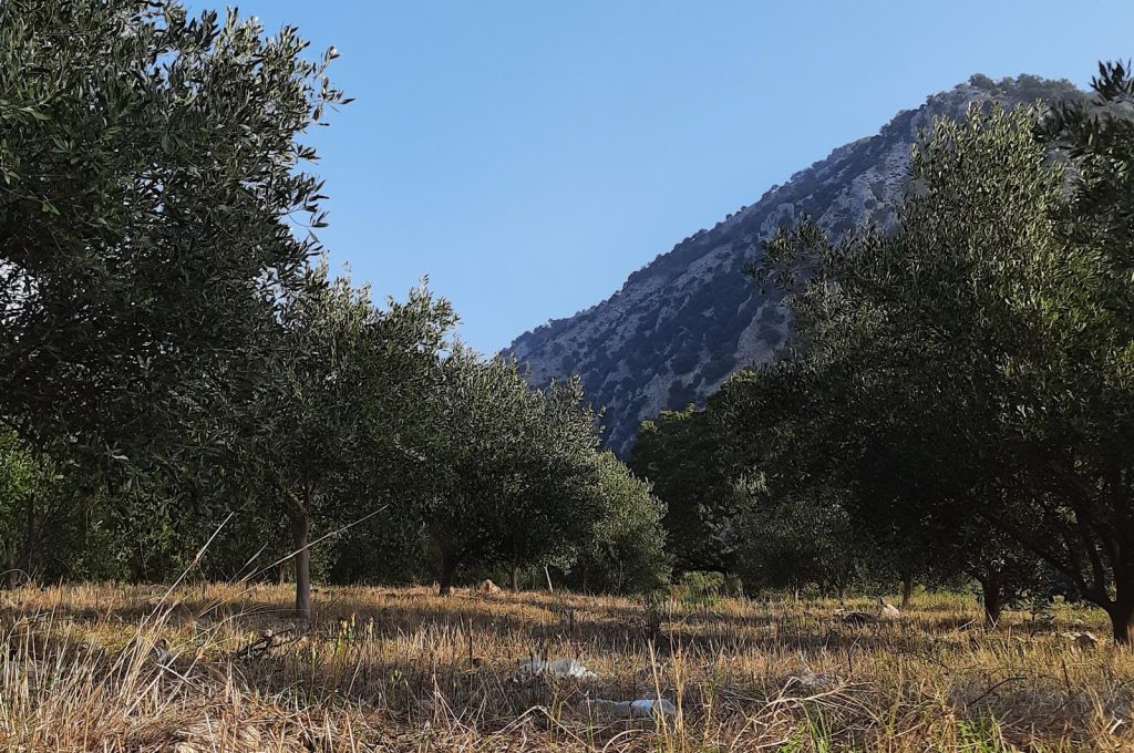
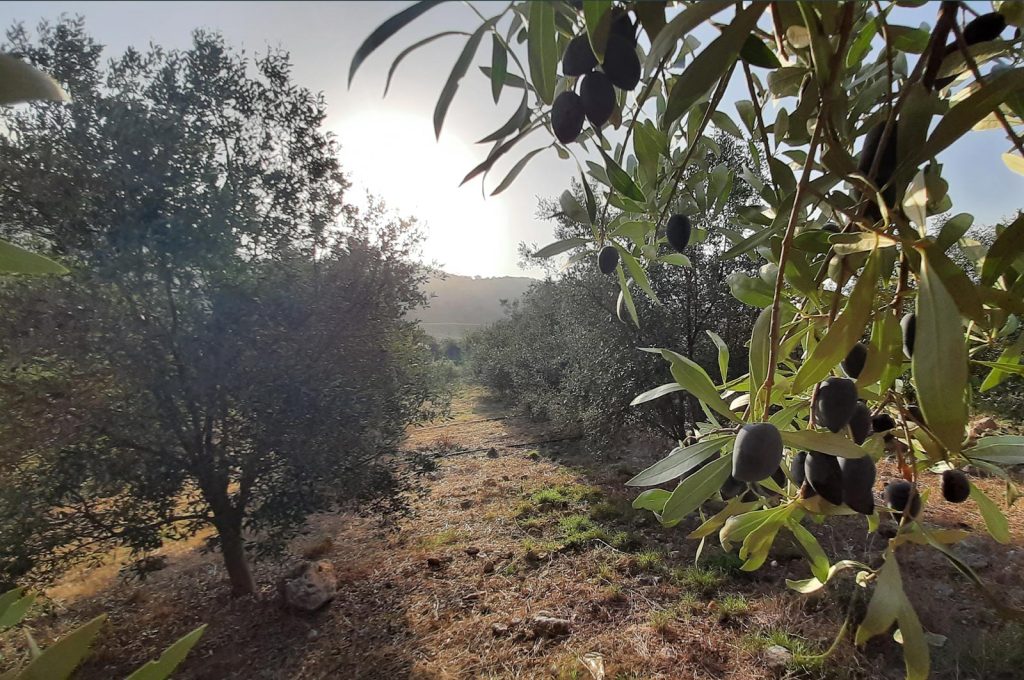
The direction grew from material that already existed around the family and the product ~ photographs of the land, the olive groves, conversations with Stathis Karakalpakis and the visual context established through Platolea. Rather than inventing a premium story around the product, I used those references to decide what should carry forward and where Palaia Gi needed its own character.
BRAND DIRECTION
Premium without becoming ornamental
Use restraint, materiality and typography rather than familiar luxury clichés.
Let provenance carry meaning
The identity should feel connected to the actual land and family story, not an invented version of Greek heritage.
Related, not repeated
Palaia Gi could share a visual lineage with Platolea while establishing a quieter, more focused character of its own.
Design for the object
The identity had to survive the transition from screen to label, bottle and real production.
BRAND DECISION 1/3
Let the land create the mark
The name Palaia Gi ~ Ancient Land anchored the brand in something real: a family history of olive cultivation and trees more than a century old. During the early concept phase, a photograph shared by Stathis Karakalpakis became the unexpected starting point for the symbol. The final mark abstracts the olive branch into a compact form that can feel both contemporary and rooted in older visual traditions.

BRAND DECISION 2/3
Build Greek character instead of borrowing it
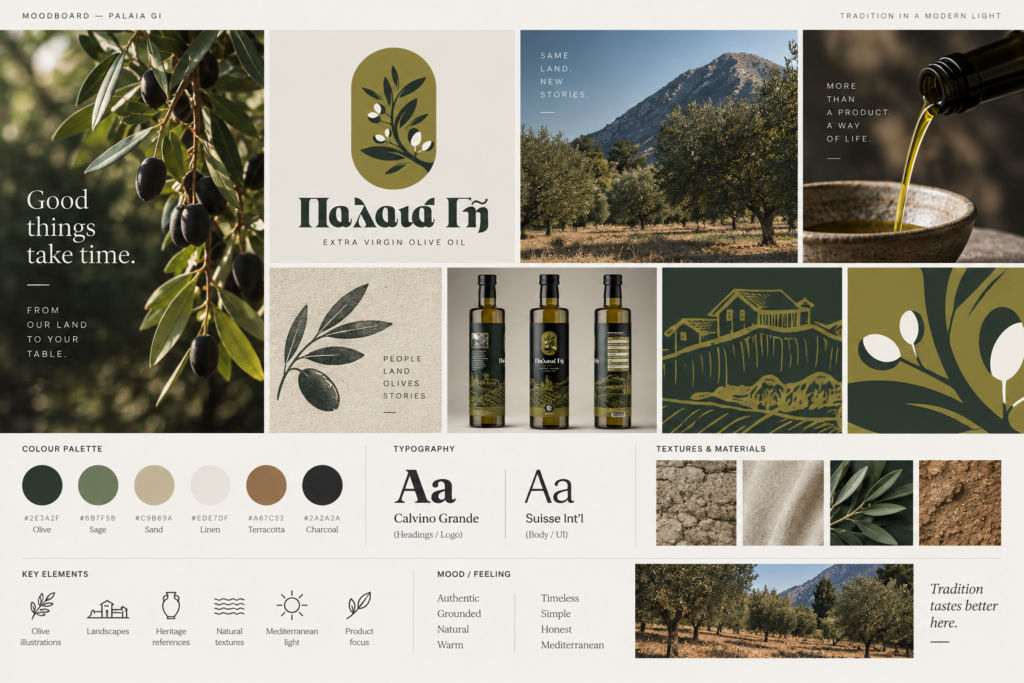
The selected typeface, Calvino Grande, had the character I wanted but no Greek glyph set. Rather than switch to a visually unrelated Greek typeface, I constructed the required Greek lettering manually from modified Latin forms. It was a small but important decision: the Greek identity had to belong to the same typographic voice, not feel attached afterwards.
The wider system used a restrained earthy palette, minimal linework and deliberately imperfect illustration cues. The goal was heritage without turning the brand into nostalgia.
BRAND DECISION 3/3
Make the identity survive production
Packaging was where the identity stopped being an exercise in composition and became a physical system. The bottle needed to communicate provenance and product information clearly while allowing the central identity to remain recognisable at shelf distance. The mockups helped establish proportion and hierarchy before the work moved into production.

OUTCOME · shipped
PRODUCTION
Packaging moved from concept into physical production
IN MARKET
Products were sold using the completed identity system
ONGOING USE
Final brand assets remained in use for printing and applications
REFLECTION
A second brand does not need to reject everything that came before it to feel distinct. The more useful question is which parts create continuity, and which parts need to create difference?
What I would extend next
The physical identity was completed and shipped, but the digital expression was not part of my original scope. A future extension would translate the same principles into a product and commerce experience rather than simply placing the packaging language onto a website.
A brand can inherit a history without inheriting its exact visual language.