FINTECH · 0→1 PRODUCT THINKING · 2026 · CONCEPT
A goal-first investing concept for people who want to build wealth over time without making investing part of their identity.
SURFACE
Mobile app
Consumer FinTech
ROLE
Product Designer
Independent concept
SCOPE
Product definition
Category research · UX/UI
Journey design
The investment is the mechanism. The goal is the product.
THE CHALLENGE
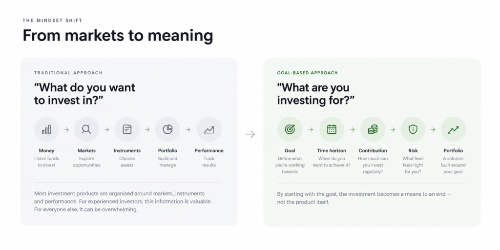
Investing has become remarkably easy to access. The harder part is knowing what to do once the account is open. Many products still ask people to think in terms of portfolios, instruments and performance before answering the more human question: what is this money actually for?
I explored a product for someone comfortable investing roughly €400–600 every month for years, but with little interest in turning investing into a hobby. The design question became: how might the product provide enough understanding to create confidence without requiring the user to become an investor first?
The category changed the hypothesis
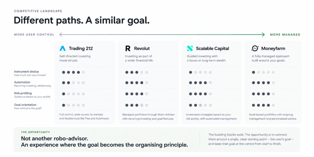
My starting assumption was that investing products were still primarily execution-first. Looking across self-directed apps, robo-advisors and managed portfolios challenged that. Recurring investing, risk profiling, recommendations and automation already existed. Goal-based investing was not the new idea.
The opportunity was in hierarchy: making the goal the persistent reference point rather than something collected during onboarding and then replaced by the portfolio.
DESIGN DIRECTION
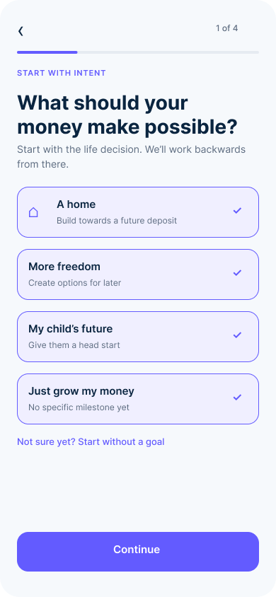
Start with intent, not instruments
Understand what the money is for before discussing where it goes.
Translate risk into consequences
Use recognisable situations instead of asking people to interpret an abstract score.
Make progress more important than performance
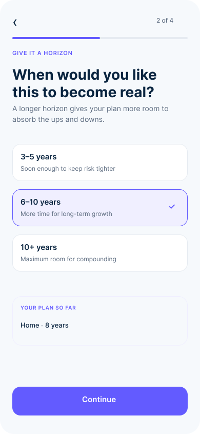
For a long-term plan, being on track can be more useful than knowing what the portfolio did today.
Keep the investment inspectable
Goal-first should simplify the default experience, not hide where the money is invested.
PRODUCT DECISION 1/3 ~ Let the goal organise the journey
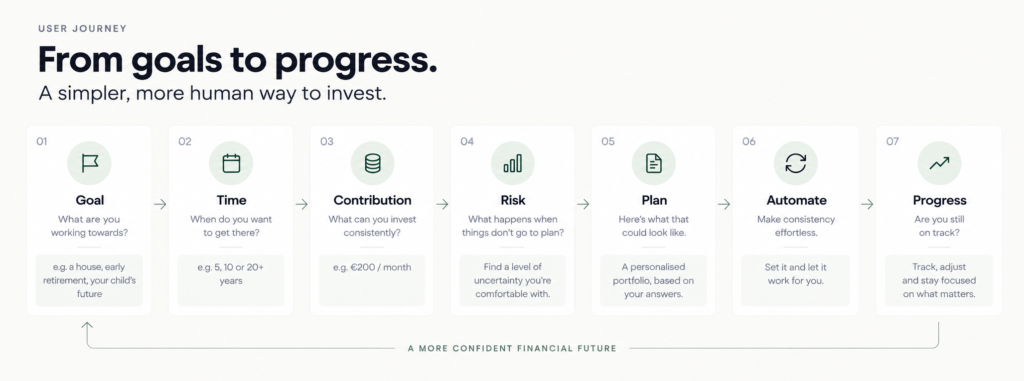
The experience moves from Goal → Time → Contribution → Risk → Plan → Automate → Progress. The portfolio becomes an outcome of the conversation rather than its starting point. This keeps each step focused on a decision the user can understand before introducing the financial mechanism behind it.
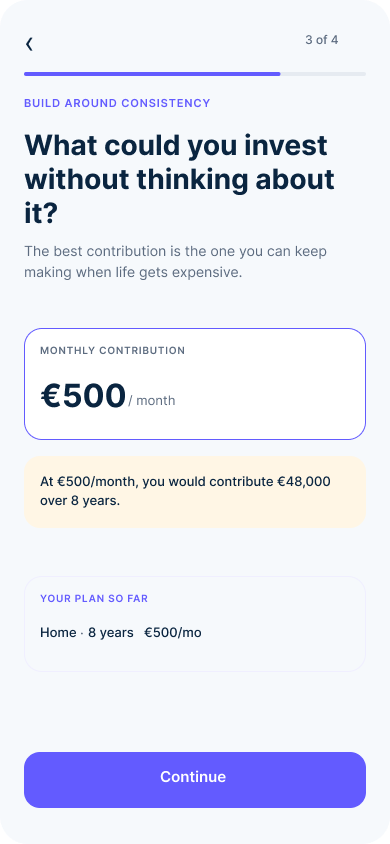
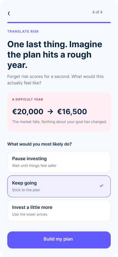
PRODUCT DECISION 2/3 ~ Recommend a plan, not another menu
The user’s answers are translated into a recommended strategy instead of another list of funds to choose from. The product explains why the plan fits, then makes recurring contributions and rebalancing part of the system. The user chooses the goal; the product carries more of the investment complexity.
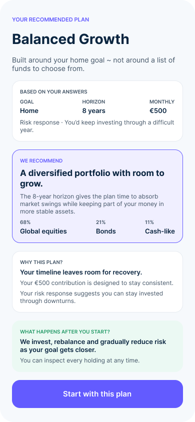
PRODUCT DECISION 3/3 ~ Make progress the interface
Once the plan is running, the home experience leads with progress towards the goal rather than daily profit and loss. A market drop can be visible without automatically becoming a problem with the plan. When life changes, the user adjusts the variables they understand ~ contribution, timeframe or target ~ and sees the consequence before changing the investment itself.
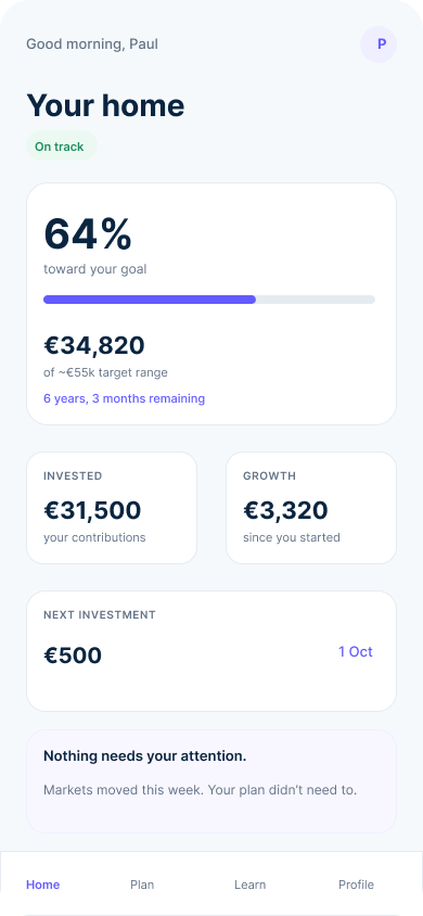
VALIDATION & REFLECTION
This is a product concept, so success should be tested rather than invented. I would validate whether people can create a plan without needing investment vocabulary, understand the recommended level of risk, recognise whether they are on track, and respond appropriately when markets fall or their circumstances change.
What changed through the exploration
The category research corrected the original premise. The problem was not that existing products lacked automation or goal-based features. It was that the investment often remained the centre of gravity. That shifted the concept from inventing new financial functionality to changing what the product keeps visible.
The principle I would carry forward is simple: the plan should be visible before the portfolio is.