BRAND IDENTITY · PRODUCT DESIGN · WEB + APP · 2026
An independent reimagining of BODYfit as one connected fitness ecosystem ~ from identity and information architecture to website and member app.
SURFACE
Brand identity
Responsive website
Mobile app
ROLE
Product Designer
Brand + UX/UI
IA · Prototyping
SCOPE
Identity system
Navigation + IA
Website · Member app
THE OPPORTUNITY
BODYfit already had the ingredients of a broader ecosystem: physical clubs, different ways to train, memberships, group classes, member services and a digital product used for everyday gym tasks. What interested me was the gap between those parts. The opportunity was not simply to redraw a website or reskin an app, but to ask how the whole experience could feel like one product.
I treated the project as an independent concept rather than commissioned work. The existing BODYfit experience became the starting point for understanding the content, services and member tasks; the redesign explores how a clearer identity and product hierarchy could connect them.
01 · Fragmented identity
The physical brand, marketing site and member product did not yet read as one deliberate visual and interaction system.
02 · Navigation by organisation
Useful services existed, but the structure often reflected internal categories more than the questions a visitor or member arrives with.
03 · Features hidden in the product
Check-in, classes, plans, videos, progress and club information were valuable member actions that deserved clearer hierarchy.
RESEARCH → STRUCTURE
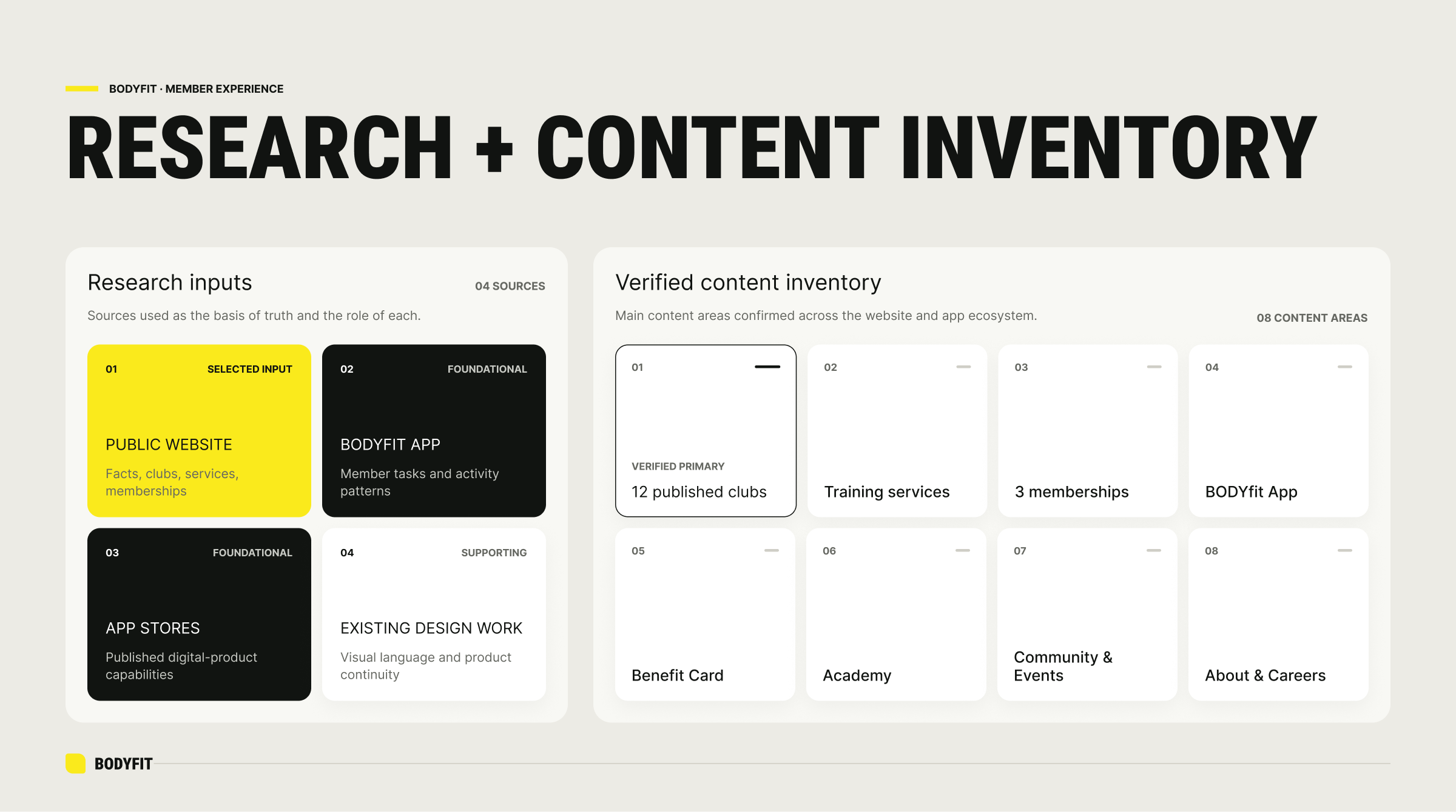
Before designing screens, I treated the existing BODYfit ecosystem as source material. The public website, current member app, app-store information and existing design work were mapped into a content inventory, then separated into verified facts, user needs and items that would still require operational confirmation.
I also came to the project as an existing BODYfit member. After roughly a year with the current app, I had largely stopped using it beyond occasional entry via its barcode. Even basic account tasks had proved difficult to locate: finding the barcode required unnecessary navigation, while checking my membership contract and expiry date was unclear enough that I had misremembered when my own membership ended. That experience gave the redesign a practical starting point: make the most common member information and actions immediately understandable.
I reviewed Alterlife, BODYfit’s major local competitor, as a reference point as well. The goal was not to reproduce another fitness product, but to understand the category language and where a stronger hierarchy could help. I kept the confidence and boldness common to the category, while deliberately reducing visual noise and fragmented messaging.
That distinction mattered. Club and service pages could support the core offer; the app revealed recurring member tasks; conflicting member counts, live hours, pricing and club-by-club eligibility were deliberately treated as content that should not be invented.
DESIGN DIRECTION
One brand. One fitness experience.
The visual system should be bold enough to survive on a gym facade and restrained enough to work inside a product interface.
Organise around intent
Website navigation should support discovery and joining. App navigation should support training, repetition and progress.
Make the next action obvious
Find a club, check in, book a class, follow a plan, see progress. Primary tasks should not compete with secondary account functions.
SYSTEM 1/3 · IDENTITY
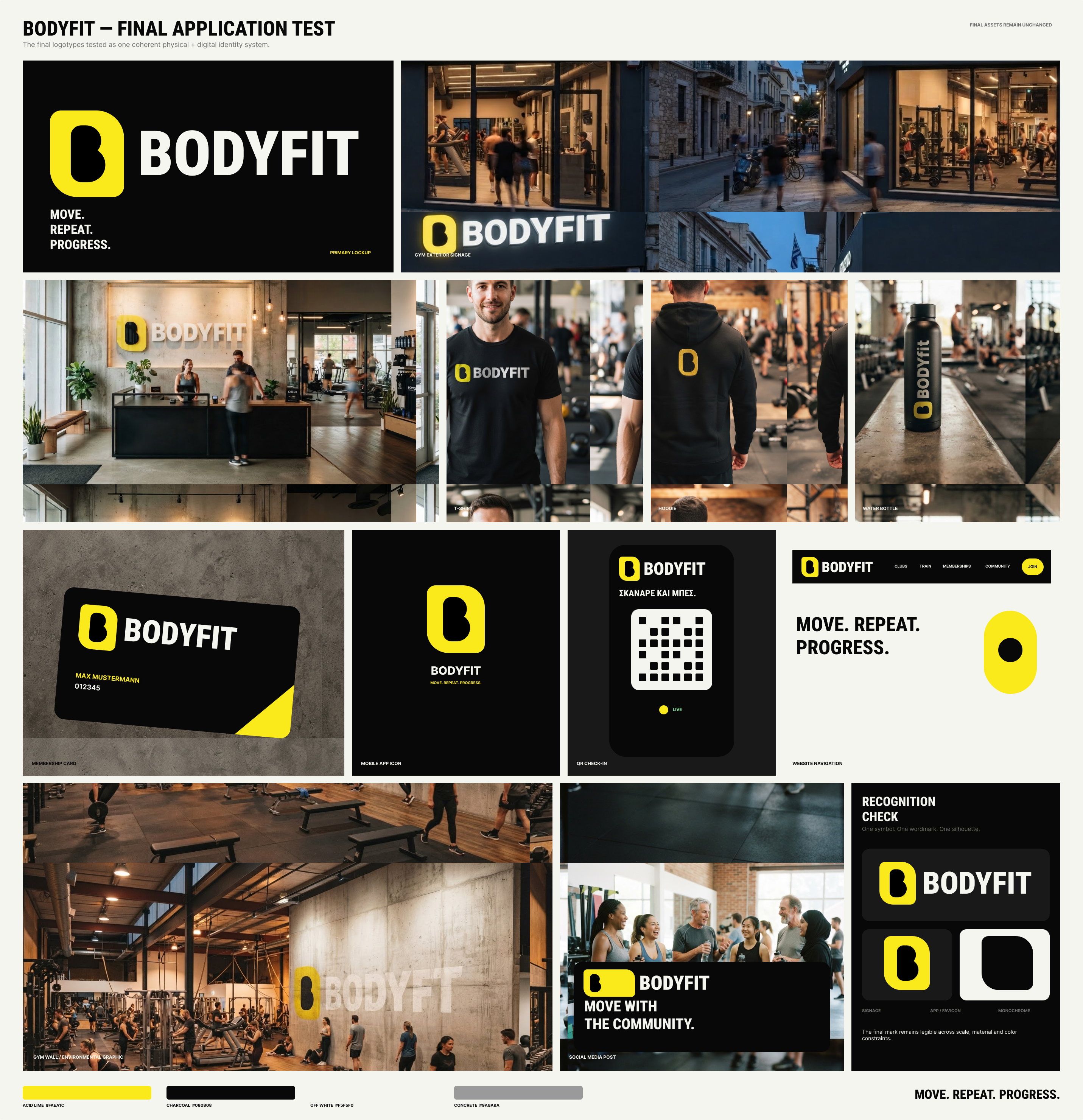
Reduce the brand to something unmistakable
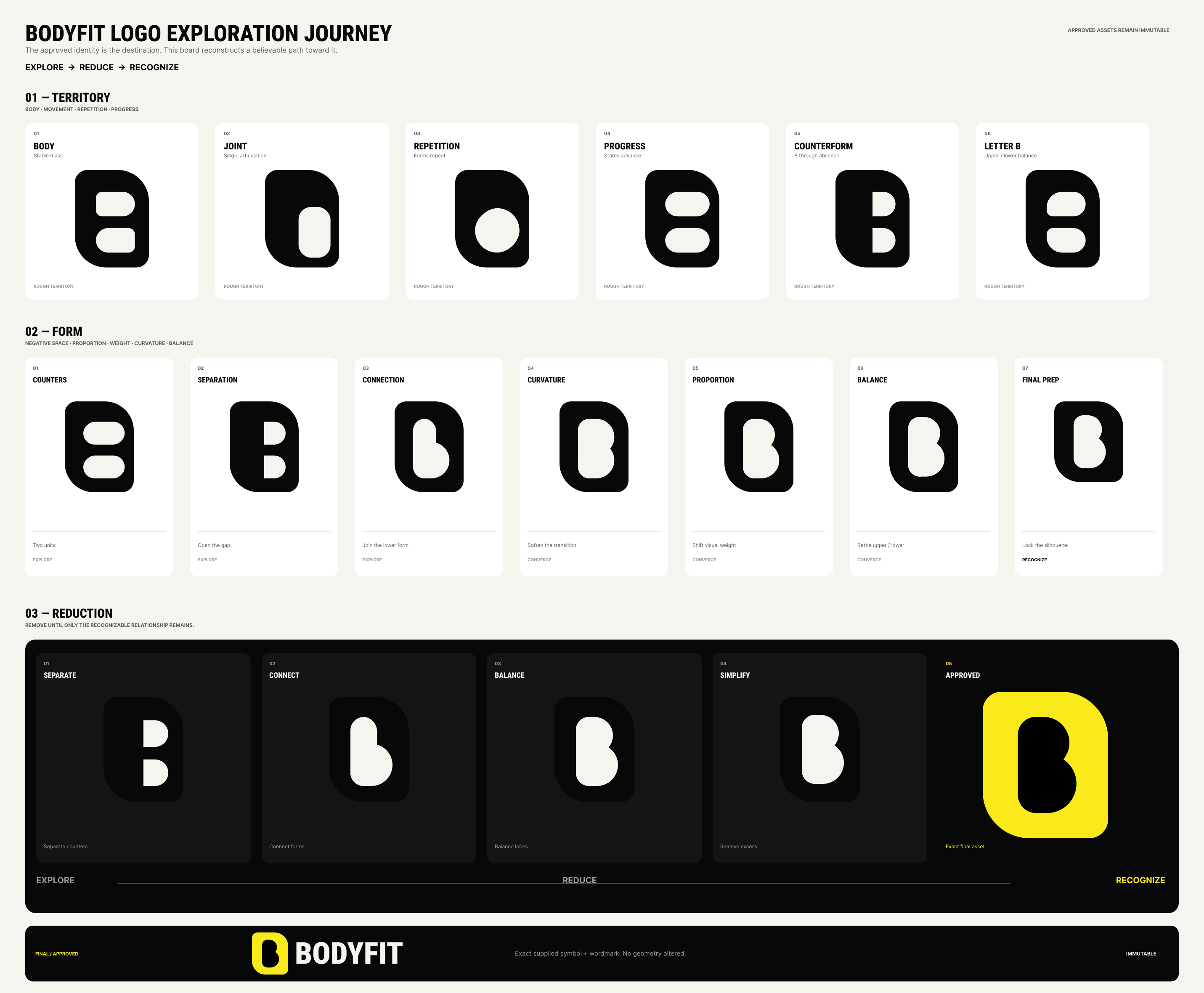
The identity exploration moved away from familiar fitness shorthand ~ speed lines, aggressive sports typography and equipment-led symbols ~ toward a simpler idea: a bold BODYfit mark that could work at the scale of an app icon, a T-shirt or a building sign.
The first direction was more complex than it needed to be. Simplifying the mark into the joint-and-limb idea became a turning point for the wider product language: the rounded container geometry that emerged from the identity began to inform the website, and then carried naturally into the member app. Rather than treating brand, web and product UI as separate exercises, each iteration helped tighten the next.
The final direction keeps the existing yellow-and-black recognition but gives it a much stronger silhouette. The symbol and wordmark become the anchor for the wider system rather than decoration added after the interface is designed.
SYSTEM 2/3 · WEBSITE
Turn the website into a discovery path
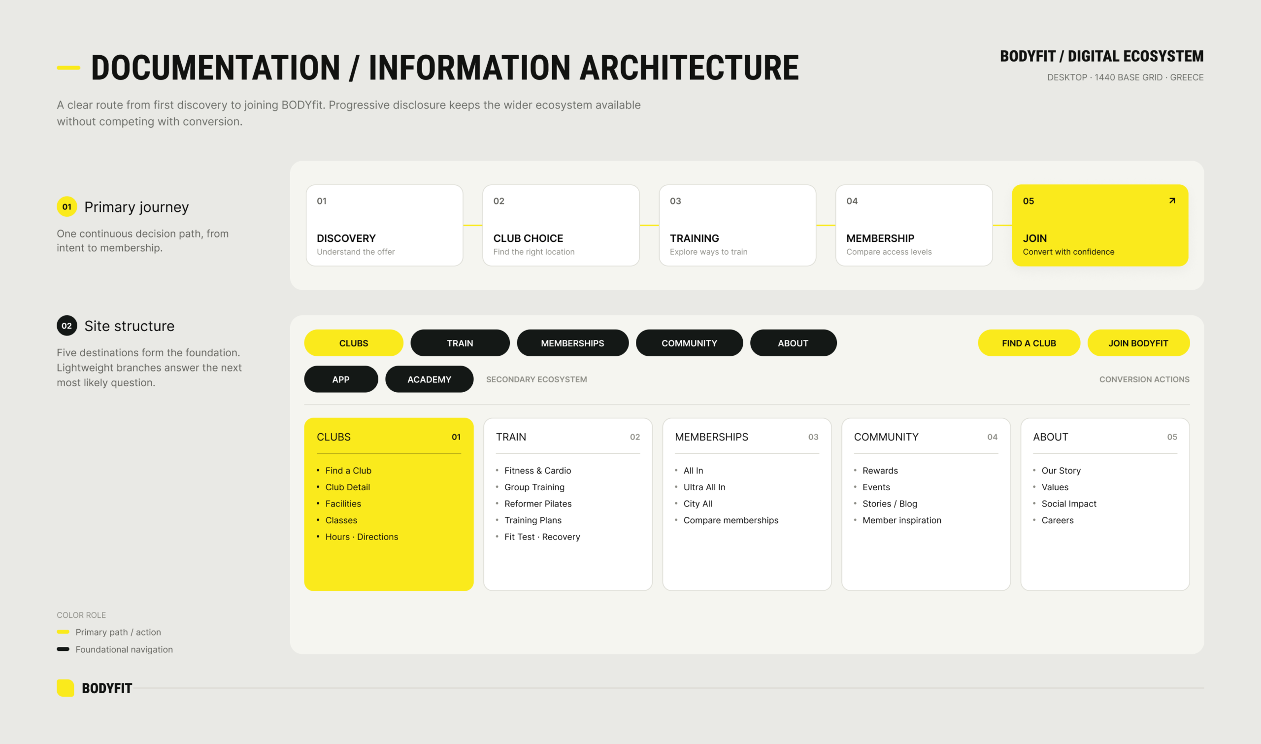
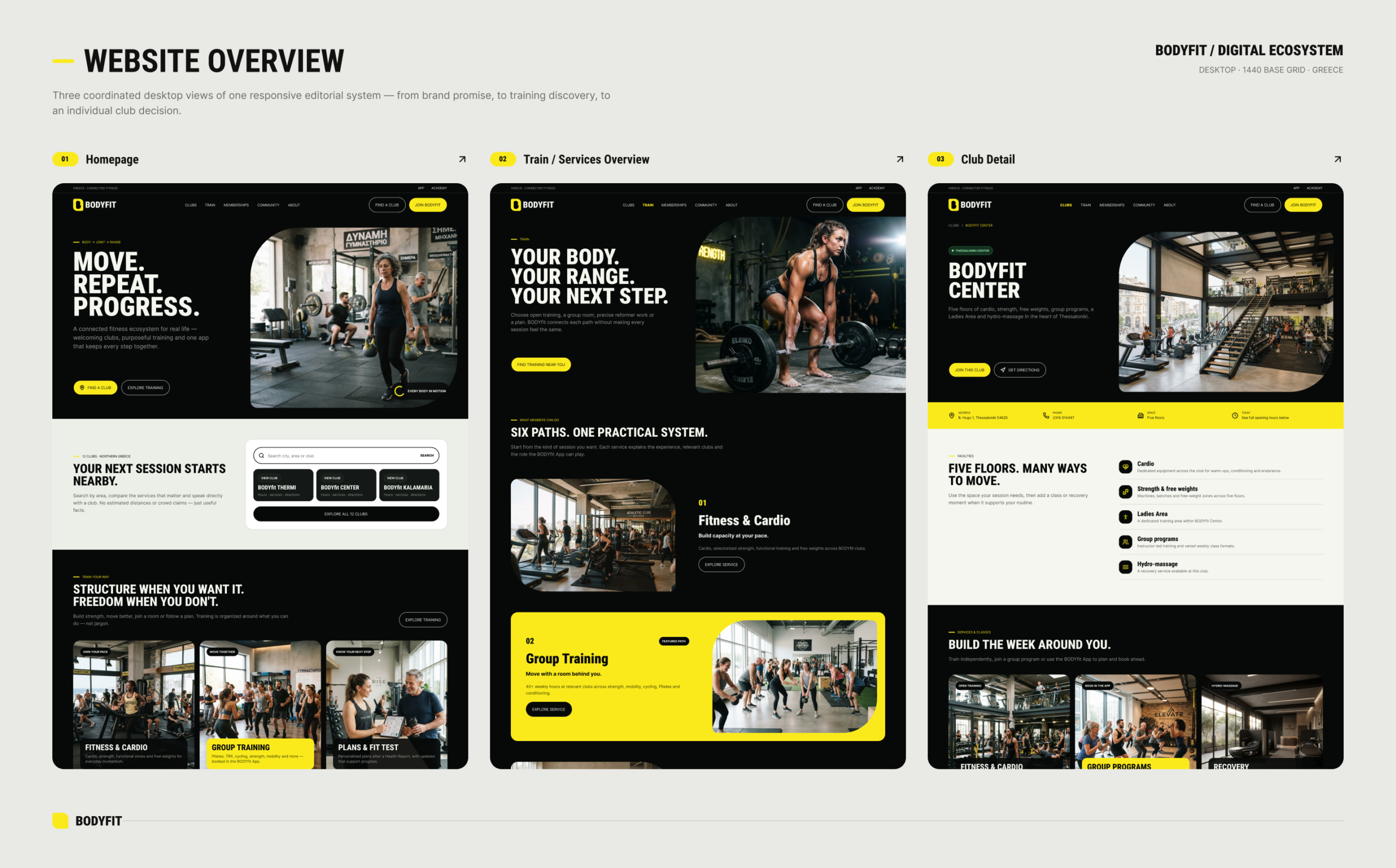
The website has a different job from the member app. It needs to help someone understand BODYfit, find the right club, see how they can train and make sense of membership before asking them to join.
I reorganised the experience around five clearer destinations: Clubs, Train, Memberships, Community and About. Club discovery becomes a primary journey; training services are separated from membership products; Academy and the member app sit as connected but secondary parts of the ecosystem.
SYSTEM 3/3 · MEMBER APP
Move everyday gym tasks out of the profile
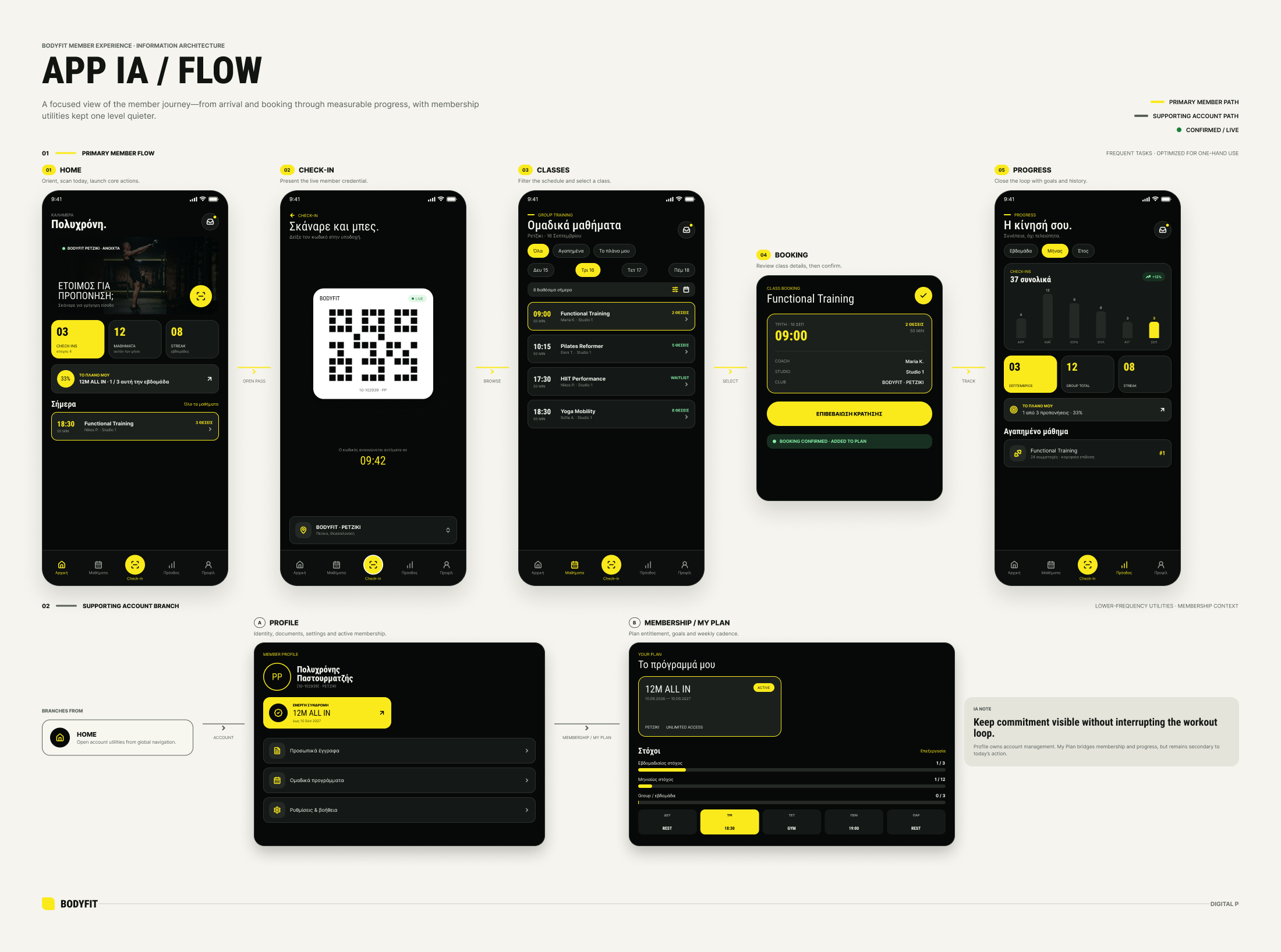
The existing product contains much more than account settings: QR entry, live club information, group classes, bookings, training plans, exercise videos, statistics, membership details and communication. The redesign promotes those tasks into a member-first structure instead of asking Profile to behave like a sitemap.
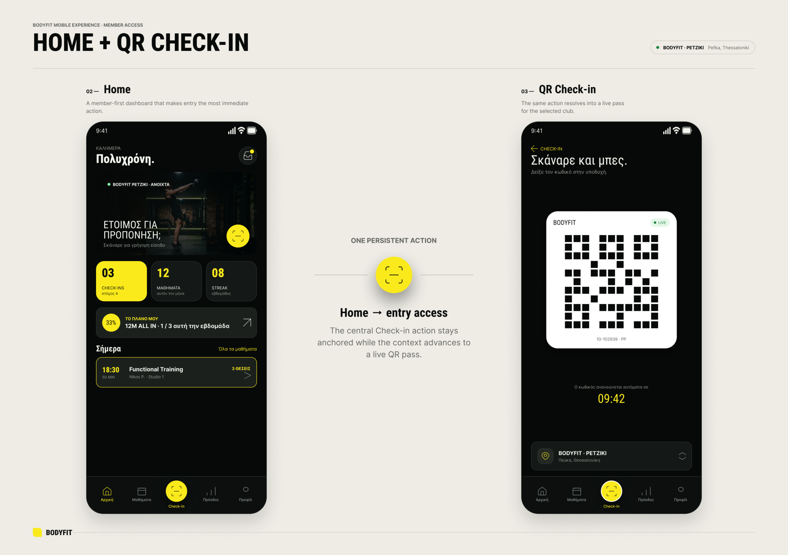
The primary navigation becomes Home, Classes, Check-in, Progress and Profile. Home prioritises what matters now; Check-in becomes a first-class action; Classes focuses on discovery and booking; Progress turns attendance and activity into something legible; Profile returns to membership and account responsibilities.
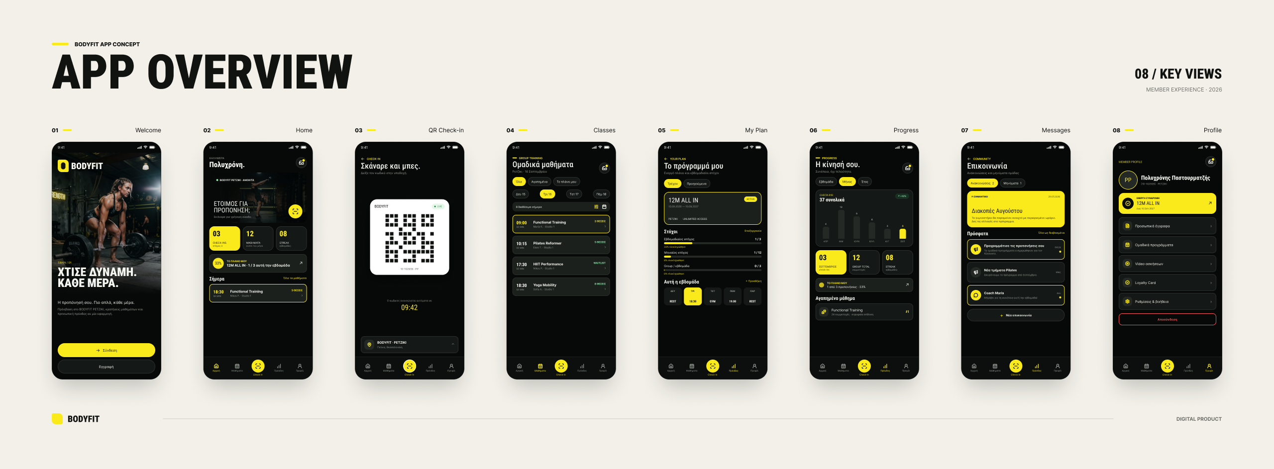
Designing the home around “now”
The member home is deliberately operational. A prominent check-in feature sits above weekly activity, the current plan and the next class. Instead of asking members to browse the product to discover what matters, the interface brings the likely next action forward.
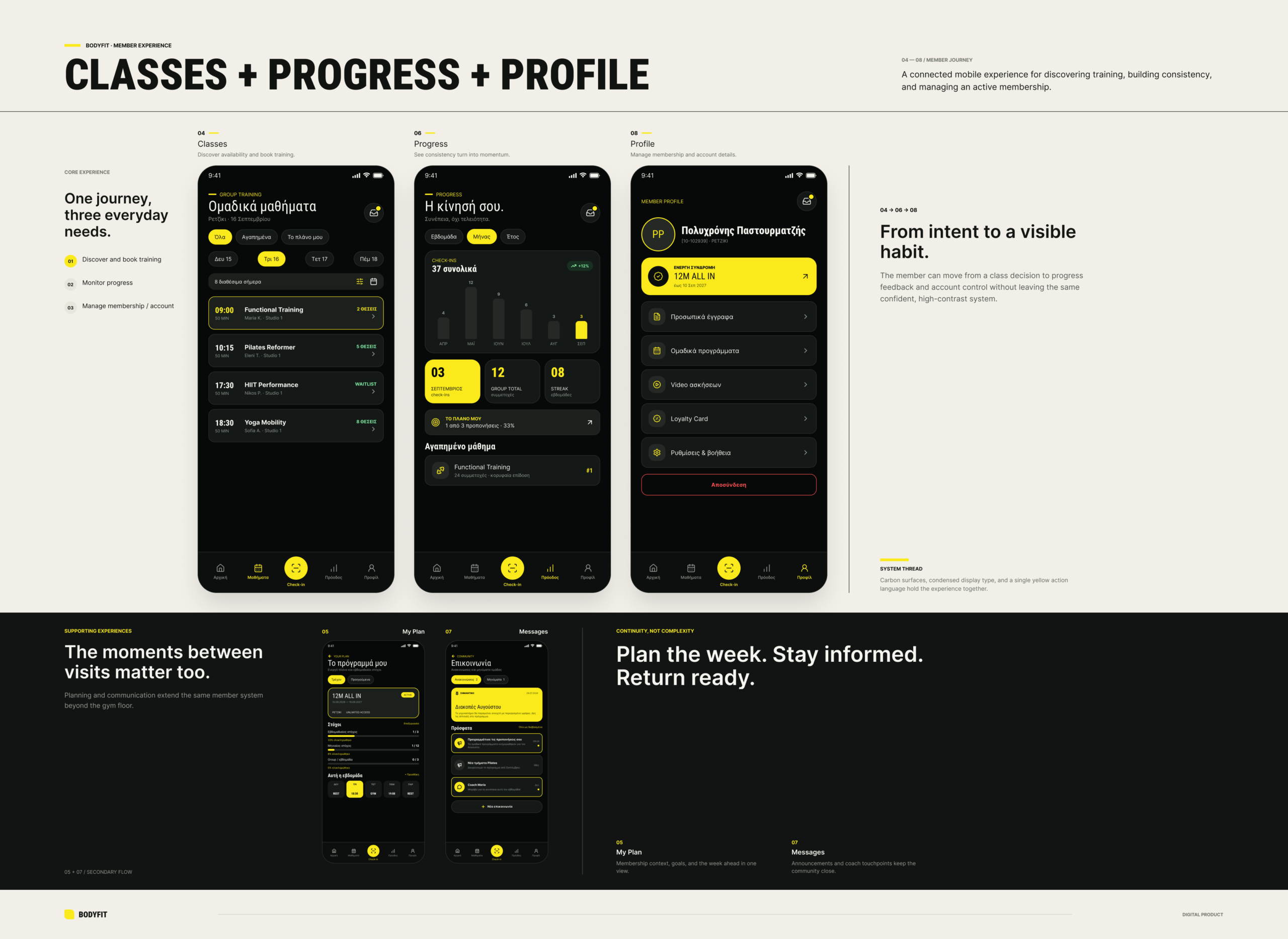
Classes, progress and membership become product surfaces
Classes are organised as a task rather than an accordion option. Progress gets its own destination for activity and goals. Membership information moves into a clearer profile structure alongside documents, settings and communication. The result is not more functionality; it is a stronger hierarchy around functionality that was already meaningful to members.
PROTOTYPE · from entry to progress
The prototype is intentionally small. Rather than wiring every possible screen, the useful story is a short member journey: arrive, check in, move into the next relevant action and see how activity feeds back into progress. It turns the static UI into a demonstration of hierarchy and product behaviour.
I used the prototype as a simple comprehension check with people outside design and technology, asking them to compare the existing experience with the concept and work through basic tasks by showing where they would go next. This was informal validation rather than a formal usability study, but it helped test whether the new hierarchy and navigation were understandable without explanation. Building the journey also exposed interaction details that static screens had hidden, including places where clearer back-navigation would be needed in a production version.
Prototype scope ~ The prototype demonstrates the primary navigation model and key member journeys. Secondary navigation, edge cases and production-level states are intentionally outside the scope of this concept.
OUTCOME · CONCEPT SYSTEM
ONE IDENTITY
A bold mark and visual system that can move from app icon to physical gym.
TWO PRODUCT JOBS
Website for discovery and acquisition. App for member action and progress.
ONE ECOSYSTEM
A shared language connecting brand, physical space and digital touchpoints.
REFLECTION
This started as the kind of redesign that could easily have become cosmetic: a fresher gym identity, cleaner screens, a better-looking website. The more useful question was whether the three surfaces could reinforce each other.
The identity provides recognition, the website explains the offer, and the app supports the repeat behaviours that make a membership useful. Treating them as one system shifted the work from a branding exercise into a broader product problem ~ deciding what each touchpoint is responsible for and what should stay consistent between them.
Independent concept project. Not commissioned by BODYfit.